Tabpanels"
From Documentation
Jumperchen (talk | contribs) |
Jumperchen (talk | contribs) |
||
| Line 62: | Line 62: | ||
=Version History= | =Version History= | ||
| − | + | {{LastUpdated}} | |
{| border='1px' | width="100%" | {| border='1px' | width="100%" | ||
! Version !! Date !! Content | ! Version !! Date !! Content | ||
Revision as of 08:26, 17 November 2010
Tabpanels
Employment/Purpose
A tabpanels is the container for the tab panels, i.e., a collection of tabpanel components.
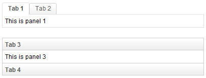
Example
<zk>
	<tabbox width="400px">
		<tabs>
			<tab label="Tab 1" />
			<tab label="Tab 2" />
		</tabs>
		<tabpanels>
			<tabpanel>This is panel 1</tabpanel>
			<tabpanel>This is panel 2</tabpanel>
		</tabpanels>
	</tabbox>
	<space />
	<tabbox width="400px" mold="accordion">
		<tabs>
			<tab label="Tab 3" />
			<tab label="Tab 4" />
		</tabs>
		<tabpanels>
			<tabpanel>This is panel 3</tabpanel>
			<tabpanel>This is panel 4</tabpanel>
		</tabpanels>
	</tabbox>
</zk>
Supported Events
| None | None |
- Inherited Supported Events: XulElement
Supported Children
Use Cases
Version History
| Version | Date | Content |
|---|---|---|
