Detail"
From Documentation
(→Detail) |
|||
| Line 7: | Line 7: | ||
*JavaScript API: <javadoc directory="jsdoc">zkex.grid.Detail</javadoc> | *JavaScript API: <javadoc directory="jsdoc">zkex.grid.Detail</javadoc> | ||
*Style Guide: [http://books.zkoss.org/wiki/ZK_Style_Guide/XUL_Component_Specification/Detail Detail] | *Style Guide: [http://books.zkoss.org/wiki/ZK_Style_Guide/XUL_Component_Specification/Detail Detail] | ||
| + | *Available in ZK PE and EE only | ||
= Employment/Purpose = | = Employment/Purpose = | ||
Revision as of 10:02, 29 November 2010
Detail
- Demonstration: Grid (Master detail)
- Java API: Detail
- JavaScript API: Detail
- Style Guide: Detail
- Available in ZK PE and EE only
Employment/Purpose
The detail component is used to display a detailed section where a master row and
multiple detail rows are on the same row.
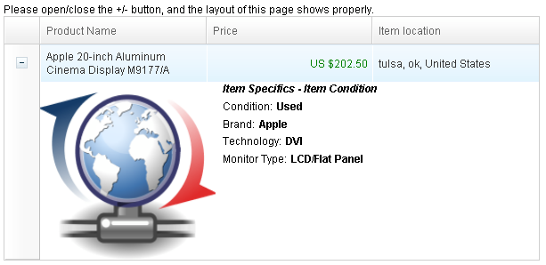
Example
<?xml version="1.0" encoding="UTF-8"?>
<zk>
	Please open/close the +/- button, and the layout of this page shows
	properly.
	<grid fixedLayout="true" width="600px">
		<columns>
			<column width="40px" />
			<column>Product Name</column>
			<column>Price</column>
			<column>Item location</column>
		</columns>
		<rows>
			<row>
				<detail>
					<hbox>
						<image width="200px" height="200px" src="/img/icon_update.png" />
						<vbox>
							<label value="Item Specifics - Item Condition    " style="font-weight:bold;font-style: italic;" />
							<hbox>
								<label value="Condition:" />
								<label value="Used" style="font-weight:bold;" />
							</hbox>
							<hbox>
								<label value="Brand:" />
								<label value="Apple" style="font-weight:bold;" />
							</hbox>
							<hbox>
								<label value="Technology:" />
								<label value="DVI" style="font-weight:bold;" />
							</hbox>
							<hbox>
								<label value="Monitor Type:" />
								<label value="LCD/Flat Panel" style="font-weight:bold;" />
							</hbox>
						</vbox>
					</hbox>
				</detail>
				<label value="Apple 20-inch Aluminum Cinema Display M9177/A" />
				<label style="color:green;float:right;" value="US $202.50" />
				<label value="tulsa, ok, United States" />
			</row>
		</rows>
	</grid>
</zk>
Supported Events
| Event: OpenEvent
Denotes user has opened or closed a component. Note: unlike onClose, this event is only a notification. The client sends this event after opening or closing the component. It is useful to implement load-on-demand by listening to the onOpen event, and creating components when the first time the component is opened. |
- Inherited Supported Events: XulElement
Supported Children
*ALL
Use Cases
| Version | Description | Example Location |
|---|---|---|
Version History
| Version | Date | Content |
|---|---|---|
