Toolbarbutton"
Jumperchen (talk | contribs) |
Tmillsclare (talk | contribs) |
||
| Line 100: | Line 100: | ||
! Version !! Date !! Content | ! Version !! Date !! Content | ||
|- | |- | ||
| − | | | + | | |
| − | | | + | | |
| − | | | + | | |
|} | |} | ||
{{ZKComponentReferencePageFooter}} | {{ZKComponentReferencePageFooter}} | ||
Revision as of 09:12, 19 May 2010
Toolbarbutton
- Demonstration: Toolbarbutton and Fileupload
- Java API: Toolbarbutton
- JavaScript API: Toolbarbutton
Employment/Purpose
The behave of Toolbarbutton is similar to the button except the appearance is different. The button component uses HTML BUTTON tag, while thetoolbarbutton component uses HTML A tag.
A toolbarbutton could be placed outside a toolbar, However toolbarbuttons change their appearance if they are placed inside a toolbar.
Toolbarbutton supports getHref(). If getHref() is not null, the onClick handler is ignored and this element is degenerated to HTML's A tag.
Within ZK 5, the file upload has been redesigned so it can be integrated with any widget. For example, The toolbarbutton can now be used to upload a file. In addition to this, the display of the upload status has been enhanced and can be customized easily.
Example
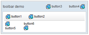
<window title="toolbar demo" border="normal" width="300px">
	<caption>
		<toolbarbutton label="button3" image="/img/folder.gif" />
		<space />
		<toolbarbutton label="button4" image="/img/folder.gif"
			dir="reverse" />
	</caption>
	<toolbar>
		<toolbarbutton label="button1" image="/img/folder.gif" />
		<space />
		<toolbarbutton label="button2" image="/img/folder.gif" />
	</toolbar>
	<hbox>
		<toolbarbutton label="button5" image="/img/folder.gif"
			orient="vertical" />
		<space />
		<toolbarbutton label="button6" image="/img/folder.gif"
			orient="vertical" dir="reverse" />
	</hbox>
</window>
Fileupload Example
<toolbarbutton upload="true" label="Fileupload"/>
Supported events
| MouseEvent
Description: Denotes user has clicked the component. | |
| MouseEvent
Description: Denotes user has right-clicked the component. | |
| UploadEvent
Description: Denotes user has uploaded a file to the component. |
Supported Children
*NONE
Use cases
| Version | Description | Example Location |
|---|---|---|
Version History
| Version | Date | Content |
|---|---|---|
