Combobutton"
From Documentation
(Created page with "{{ZKComponentReferencePageHeader}} = Button = = Employment/Purpose = = Example = =Properties= =Supported Events= =Supported Molds= =Supported Children= =Use Cases= ...") |
|||
| Line 1: | Line 1: | ||
{{ZKComponentReferencePageHeader}} | {{ZKComponentReferencePageHeader}} | ||
| − | = | + | = Combobutton = |
| + | *Demonstration: | ||
| + | *Java API: <javadoc>org.zkoss.zul.Combobutton</javadoc> | ||
| + | *JavaScript API: <javadoc directory="jsdoc">zul.wgt.Combobutton</javadoc> | ||
| + | *Style Guide: [[ZK_Style_Guide/XUL_Component_Specification/Combobutton | Combobutton]] | ||
| + | = Employment/Purpose = | ||
| + | |||
| + | You could assign a <tt>label</tt> and an <tt>image</tt> to a combobutton by the <tt>label</tt> and <tt>image</tt> properties. If both are specified, the <tt>dir</tt> property control which is displayed up front, and the <tt>orient</tt> property controls whether the layout is horizontal or vertical, the <tt>autodrop</tt> property control whether the child popup/menupopup open while mouseover and close while mouseout combobutton automatically. | ||
| − | + | When the user clicks the drop down icon of combobutton, the child popup/menupopup of the combobutton will be displayed. | |
= Example = | = Example = | ||
| + | *Combobutton with Popup | ||
| + | |||
| + | [[Image:ZKComRef_Combobutton_with_Popup.jpg]] | ||
| + | |||
| + | <source lang="xml" > | ||
| + | <combobutton label="popup" image="/img/network.gif"> | ||
| + | <popup> | ||
| + | <vbox> | ||
| + | <hbox> | ||
| + | Search | ||
| + | <textbox /> | ||
| + | </hbox> | ||
| + | <listbox width="200px"> | ||
| + | <listhead> | ||
| + | <listheader label="Name" /> | ||
| + | <listheader label="Description" /> | ||
| + | </listhead> | ||
| + | <listitem> | ||
| + | <listcell label="John" /> | ||
| + | <listcell label="CEO" /> | ||
| + | </listitem> | ||
| + | <listitem> | ||
| + | <listcell label="Joe" /> | ||
| + | <listcell label="Engineer" /> | ||
| + | </listitem> | ||
| + | </listbox> | ||
| + | </vbox> | ||
| + | </popup> | ||
| + | </combobutton> | ||
| + | </source> | ||
| + | |||
| + | *Combobutton with Menupopup | ||
| + | |||
| + | [[Image:ZKComRef_Combobutton_with_Menupopup.jpg]] | ||
| + | |||
| + | <source lang="xml" > | ||
| + | <combobutton label="menu popup" image="/img/network.gif"> | ||
| + | <menupopup> | ||
| + | <menuitem label="Index"/> | ||
| + | <menu label="Menu"> | ||
| + | <menupopup> | ||
| + | <menu label="Color Picker" content="#color=#029BCB" /> | ||
| + | </menupopup> | ||
| + | </menu> | ||
| + | </menupopup> | ||
| + | </combobutton> | ||
| + | </source> | ||
Revision as of 11:36, 20 September 2011
Combobutton
- Demonstration:
- Java API: Combobutton
- JavaScript API: Combobutton
- Style Guide: Combobutton
Employment/Purpose
You could assign a label and an image to a combobutton by the label and image properties. If both are specified, the dir property control which is displayed up front, and the orient property controls whether the layout is horizontal or vertical, the autodrop property control whether the child popup/menupopup open while mouseover and close while mouseout combobutton automatically.
When the user clicks the drop down icon of combobutton, the child popup/menupopup of the combobutton will be displayed.
Example
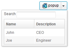
- Combobutton with Popup
	<combobutton label="popup" image="/img/network.gif">
		<popup>
			<vbox>
				<hbox>
					Search
					<textbox />
				</hbox>
				<listbox width="200px">
					<listhead>
						<listheader label="Name" />
						<listheader label="Description" />
					</listhead>
					<listitem>
						<listcell label="John" />
						<listcell label="CEO" />
					</listitem>
					<listitem>
						<listcell label="Joe" />
						<listcell label="Engineer" />
					</listitem>
				</listbox>
			</vbox>
		</popup>
	</combobutton>
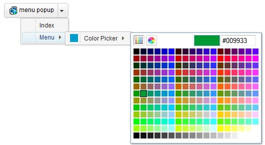
- Combobutton with Menupopup
	<combobutton label="menu popup" image="/img/network.gif">
		<menupopup>
			<menuitem label="Index"/>
			<menu label="Menu">
				<menupopup>
					<menu label="Color Picker" content="#color=#029BCB" />
				</menupopup>
			</menu>
		</menupopup>
	</combobutton>
Properties
Supported Events
Supported Molds
Supported Children
Use Cases
Version History

