New Features of ZK 6.5"
Tmillsclare (talk | contribs) |
Tmillsclare (talk | contribs) |
||
| Line 73: | Line 73: | ||
</tabbox> | </tabbox> | ||
</source> | </source> | ||
| − | |||
| − | |||
| − | |||
| − | |||
=Further HTML 5 Support= | =Further HTML 5 Support= | ||
Revision as of 02:10, 6 September 2012
Timothy Clare, Potix Corporation
September 12, 2012
ZK 6.5
Device Transparency - desktop, tablet & smartphone support
The Web and mobile development market are growing rapidly with more and more enterprises needing a strong presence on both platforms. This leads to a need for significant time and money investment creating applications which fulfil the needs of both platforms.
Most vendors provide separate component set for touch devices does not alleviate the problem of having to write two or more applications which support different devices. The fact that multiple applications or multiple pages for each view have to be written introduces a lot of cost and risk to the project which is not good for an uncertain enterprise mobile market.
With ZK 6.5 this pain is alleviated as we not only implemented responsive web design but have taken it further to enable developers to provide an optimal user experience across all devices without writing two applications or using multiple pages.
This is a big plus for developers that want to create a tablet or smartphone application but do not want to spend time and money implementing two separate applications or sets of pages using different component sets.
Touch Event Detection
Using ZK it is possible to detect touch events and handle them at the server, or if you so wish you can do so at the client. The following code demonstrates how to capture a swipe event on a tabpanel. This will then enable developers to perform a custom action upon swipe of the tabpanel.
<tabbox height="300px" width="300px">
	<tabs>
		<tab label="tab 1" />
	</tabs>
	<tabpanels>
		<tabpanel>
			<attribute name="onSwipe"><![CDATA[
				SwipeEvent se = (SwipeEvent) event;
				lbl1.setValue("Horizontal: " + se.getSwipeX() + "px");
				lbl2.setValue("Vertical: " + se.getSwipeY() + "px");
				lbl3.setValue("Duration: " + se.getSwipeDuration() + " milliseconds");
				lbl4.setValue("Direction: " + se.getSwipeDirection());
			]]></attribute>
			<vlayout>
				Swipe information
				<label id="lbl1"/>
				<label id="lbl2"/>
				<label id="lbl3"/>
				<label id="lbl4"/>
			</vlayout>
		</tabpanel>
	</tabpanels>
</tabbox>
Detect orientation changes
Following on from the ability to capture swipe events it is also possible to capture changes in orientation using the onClientInfo event. This enables developers to change the layout and behaviour of their application when they want to. The code below demonstrates how to do this.
	<tabbox id="tbx" height="400px" width="600px">
		<attribute name="onClientInfo"><![CDATA[
			ClientInfoEvent oe = (ClientInfoEvent) event;
			String orient = oe.getOrientation();
			lbl.setValue(orient);
			if (orient.equals("portrait")) {
				tbx.setHeight("600px");
				tbx.setWidth("400px");
			} else {
				tbx.setHeight("400px");
				tbx.setWidth("600px");
			}
		]]></attribute>
		<tabs>
			<tab label="tab 1" />
		</tabs>
		<tabpanels>
			<tabpanel>
				Current Orientation: <label id="lbl"/>
			</tabpanel>
		</tabpanels>
	</tabbox>
Further HTML 5 Support
HTML 5, or a subset of it, is implemented in all modern browsers today. Therefore ZK 6.5 is excited to introduce further support for the specification.
File Upload now supports dragging & dropping local files
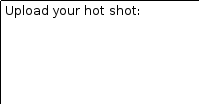
ZK now has an upload component which supports dragging and dropping of local files from the user's filesystem. The following code and images demonstrate an example of drag and drop upload:
Drop area
File dragged over area
Image uploaded and displayed
<zk>
    <vlayout>
        <image id="img" />
        Upload your hot shot:
        <dropupload maxsize="-1" content="content" detection="browser" onUpload="img.setContent(event.media)" />
    </vlayout>
</zk>
Input elements support HTML 5 types
The input elements of ZK now support the suitable HTML 5 defined types meaning developers can take advantage of the latest technology within their applications. The following code shows which types the input elements support.
<textbox type="tel" />
<textbox type="password" />
<textbox type="url" />
<textbox type="email" />
Other HTML 5 types are all supported using various ZK components.
Input element supports placeholder
ZK 6.5 has introduced support for HTML 5's placeholder text. This is very useful for indicating to users what they should do in a textbox and is a widely regarding UI pattern.
The following image and code show the look of the placeholder as well as the code to replicate it.
<textbox placeholder="Please type some text" />
Closable Notification
ZK 6.5 introduces a close button to notification enabling users to take charge and close said notifications rather than waiting for them to time away.
The following code and image demonstrates this:
Clients.showNotification(msg, true); // add close icon on the top right corner of notification box
For more information please refer to the Developer's Reference.
Calendar support shows the week's number
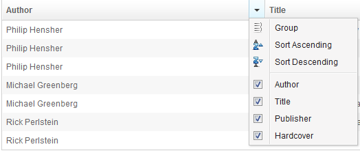
The Listbox now supports a default menu just like the Grid. TO use this default menu developers can set the attribute menupopup to auto on the listhead component. The following image and code outlines the result and how to do it.
<zk>
	<listbox>
		<listhead menupopup="auto">
			<listheader label="Author" sort="auto"/>
			<listheader label="Title" sort="auto"/>
			<listheader label="Publisher" sort="auto"/>
			<listheader label="Hardcover" sort="auto"/>
		</listhead>
		// omitted...
	</listbox>
</zk>
Scrollview Component
- Available for ZK:
-

In ZK 6.5 where responsive design and one codebase for multiple devices is the key, we therefore introduce users to a new scrollview component, which is a component designed to easily construct a scroll-able web page on both tablet and mobile browsers.
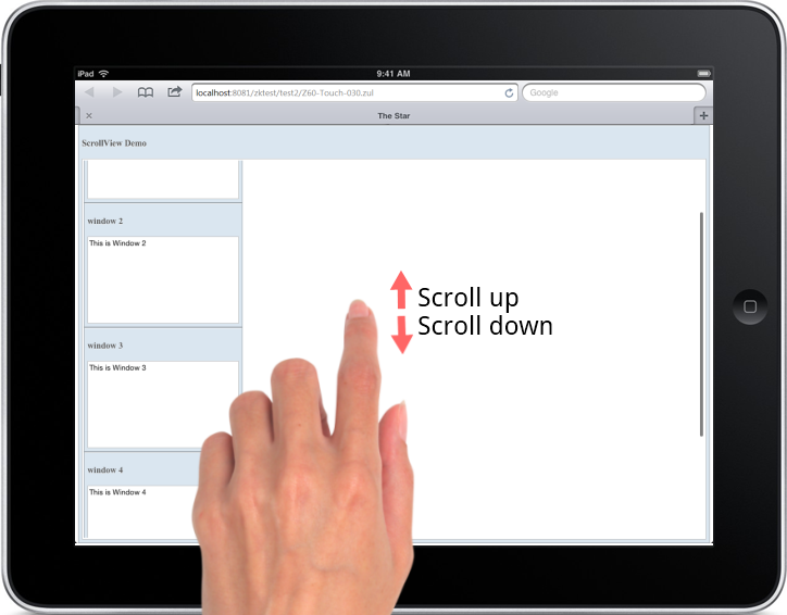
When end users access your application via a Tablet or any mobile devices, scrollview component detects and triggers this feature. If the application was accessed via a desktop browser, scrollview remains un-triggered while desktop browser will automatically generate scroll bars when needed just like before.
You can scroll up/down to see other window components with the following sample ZUL.
<scrollview vflex="1" hflex="1">
    <zk forEach="1,2,3,4,5">
        <window title="window ${each}" border="normal" width="255px" height="200px">
        This is Window ${each}
        </window>
    </zk>
</scrollview>
The following video demonstrates usage of the scrollview component.
Cardlayout Component
- Available for ZK:
-

The Cardlayout is a new component which enables end-users to switch components like switching cards. On tablet, this navigation operation is supported by simply swiping or switching through components.
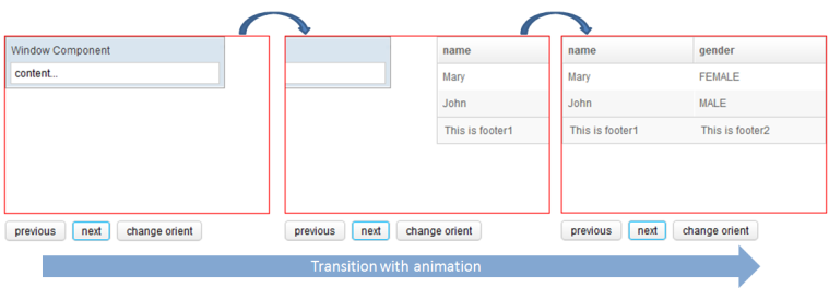
Cardlayout is a layout that allows end-users to change component like changing cards. The selectedIndex will decide which component will be shown in the view port. When the value of selectedIndex changes or when next() or previous() is called, transition of components through animation will occur whereas the orient attribute decides whether the direction of the animation is horizontal or vertical.
The image and source below shows an example of the Cardlayout component being used.
	<cardlayout id="card" width="300px" height="200px" style="border:1px solid red" selectedIndex="1">
		<div vflex="1" hflex="1" style="background-color:yellow;padding:20px">flex component</div>
		<window title="Window Component" border="normal" width="250px">content...</window>
		<listbox>
			<listhead sizable="true">
				<listheader label="name" sort="auto" />
				<listheader label="gender" sort="auto" />
			</listhead>
			<listitem>
				<listcell label="Mary" />
				<listcell label="FEMALE" />
			</listitem>
			<listitem>
				<listcell label="John" />
				<listcell label="MALE" />
			</listitem>
			<listfoot>
				<listfooter>
					<label value="This is footer1" />
				</listfooter>
				<listfooter>
					<label value="This is footer2" />
				</listfooter>
			</listfoot>
		</listbox>
	</cardlayout>
	<hlayout>
		<button onClick="card.previous()">previous</button>
		<button onClick="card.next()">next</button>
		<button onClick='card.setOrient("horizontal".equals(card.getOrient()) ? "vertical" : "horizontal")'>change orient</button>
	</hlayout>
For more information please refer to the ZK Component Reference.
In addition to the ability to change the Cardlayout view using commands (next and previous) ZK also includes default swipe behaviour for tablets. On swipe in an appropriate direction, the viewport will change which component is shown. The following video demonstrates this behaviour.
