Navitem"
From Documentation
Raymondchao (talk | contribs) (→Nav) |
Raymondchao (talk | contribs) |
||
| Line 12: | Line 12: | ||
= Example = | = Example = | ||
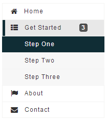
| + | [[Image:ZKComRef_Nav.png]] | ||
| + | |||
| + | <source lang="xml" > | ||
| + | <navbar orient="vertical" width="200px"> | ||
| + | <navitem label="Home" iconSclass="z-icon-home" /> | ||
| + | <nav label="Get Started" iconSclass="z-icon-th-list" detailed="true"> | ||
| + | <navitem label="Step One" /> | ||
| + | <navitem label="Step Two" /> | ||
| + | <navitem label="Step Three" /> | ||
| + | </nav> | ||
| + | <navitem label="About" iconSclass="z-icon-flag" /> | ||
| + | <navitem label="Contact" iconSclass="z-icon-envelope"/> | ||
| + | </navbar> | ||
| + | </source> | ||
= Properties = | = Properties = | ||
Revision as of 06:57, 14 August 2013
- Demonstration:
- Java API:
- JavaScript API:
- Style Guide:
- Available for ZK:
-

Employment/Purpose
A single choice in a Navbar or Nav element. It acts much like a button but it is rendered on a navbar.
Example
<navbar orient="vertical" width="200px">
	<navitem label="Home" iconSclass="z-icon-home" />
	<nav label="Get Started" iconSclass="z-icon-th-list" detailed="true">
		<navitem label="Step One" />
		<navitem label="Step Two" />
		<navitem label="Step Three" />
	</nav>
	<navitem label="About" iconSclass="z-icon-flag" />
	<navitem label="Contact" iconSclass="z-icon-envelope"/>
</navbar>
Properties
Supported Events
- Inherited Supported Events: LabelImageElement
Supported Children
*NONE
Use Cases
| Version | Description | Example Location |
|---|---|---|
Version History
| Version | Date | Content |
|---|---|---|
| None | None |
