Nav"
From Documentation
Raymondchao (talk | contribs) |
Raymondchao (talk | contribs) |
||
| Line 59: | Line 59: | ||
= Supported Children = | = Supported Children = | ||
| − | *[[ZK_Component_Reference/Essential_Components/Nav | Nav]], [[ZK_Component_Reference/Essential_Components/Nav/Navitem | Navitem]] | + | *[[ZK_Component_Reference/Essential_Components/Nav | Nav]], [[ZK_Component_Reference/Essential_Components/Nav/Navitem | Navitem]], |
| + | [[ZK_Component_Reference/Essential_Components/Nav/Navseparator | Navseparator]] | ||
= Use Cases = | = Use Cases = | ||
Revision as of 02:25, 17 October 2013
Employment/Purpose
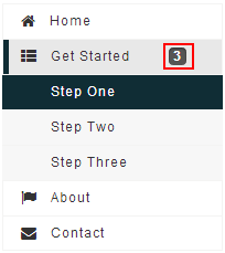
A container is used to display navitem, it should be placed inside a navbar.
Example
<navbar orient="vertical" width="200px">
	<navitem label="Home" iconSclass="z-icon-home" />
	<nav label="Get Started" iconSclass="z-icon-th-list" badgeText="3">
		<navitem label="Step One" />
		<navitem label="Step Two" />
		<navitem label="Step Three" />
	</nav>
	<navitem label="About" iconSclass="z-icon-flag" />
	<navitem label="Contact" iconSclass="z-icon-envelope"/>
</navbar>
Properties
Badge Text
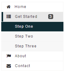
This property set the badge text for the Nav. For example, Nav Get Started 's contains three Navitem components - Step One, Step Two, Step Three. So we can set Get Started 's badgeText to "3" to display the number of children. The code snippets as shown below:

|
<nav label="Get Started" iconSclass="z-icon-th-list" badgeText="3">
	<navitem label="Step One" />
	<navitem label="Step Two" />
	<navitem label="Step Three" />
</nav>
|
Supported Events
| Event: OpenEvent
Denotes user has opened or closed a nav component. |
- Inherited Supported Events: LabelImageElement
Supported Children
* Nav, Navitem,
Use Cases
| Version | Description | Example Location |
|---|---|---|
Version History
| Version | Date | Content |
|---|---|---|
| 7.0.0 | August, 2013 | Nav was introduced. |
