Signature"
(→Step) |
|||
| Line 30: | Line 30: | ||
[Since 8.6.0] | [Since 8.6.0] | ||
There are some attributes to control the basic properties of the signature pad. The penSize is the pen size of the signature pad, the penColor is the pen color of the signature pad, and the backgroundColor is the backgroundColor of the signature pad. | There are some attributes to control the basic properties of the signature pad. The penSize is the pen size of the signature pad, the penColor is the pen color of the signature pad, and the backgroundColor is the backgroundColor of the signature pad. | ||
| − | |||
| − | |||
| − | |||
| − | |||
| − | |||
| − | |||
| − | |||
| − | |||
| − | |||
| − | |||
| − | |||
| − | |||
| − | |||
| − | |||
| − | |||
| − | |||
| − | |||
| − | |||
| − | |||
| − | |||
| − | |||
=Supported Events= | =Supported Events= | ||
| Line 67: | Line 46: | ||
|} | |} | ||
*Inherited Supported Events: [[ZK_Component_Reference/Base_Components/XulElement#Supported_Events | XulElement]] | *Inherited Supported Events: [[ZK_Component_Reference/Base_Components/XulElement#Supported_Events | XulElement]] | ||
| − | |||
| − | |||
| − | |||
| − | |||
| − | |||
| − | |||
| − | |||
| − | |||
| − | |||
| − | |||
| − | |||
| − | |||
| − | |||
| − | |||
| − | |||
| − | |||
| − | |||
| − | |||
| − | |||
| − | |||
| − | |||
| − | |||
| − | |||
| − | |||
| − | |||
| − | |||
| − | |||
| − | |||
| − | |||
| − | |||
| − | |||
| − | |||
| − | |||
| − | |||
| − | |||
| − | |||
| − | |||
=Version History= | =Version History= | ||
Revision as of 08:48, 8 August 2018
Signature
Employment/Purpose
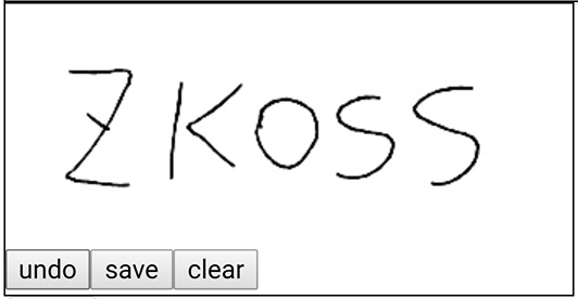
A Signature component represents a signature pad which can let user to take a signature on zk. It supports the desktop and touch-panel device. The Signature widget provides save, undo and clear API, you can save undo and clear the SignaturePad with this API. And Signature also provide a build-in tool bar to control the API.
Example
<signature id="s" height="100px" width="400px" style="border: 1px solid black;"'/>
Undo Save Clear
[Since 8.6.0]
There are some of APIs to control the Signature widget. Undo is removing the last step which was drawn on the signature pad. Save is saving the signature data to the server side as a base64 data type, user can get the image data by getImage() or getSignatureBase64(). Clear is to clear signature pad, and the signature pad would reset to empty.
Toolbar
The attribute of the tool bar is a boolean value, it controls the visibility of the tool bar, if the value is true, the user can use and see the tool bar, if not, they won't. And the user can customize css by using less, to reset the toolbar's position, size and some other features.
penSize penColor backgroundColor
 [Since 8.6.0]
 There are some attributes to control the basic properties of the signature pad. The penSize is the pen size of the signature pad, the penColor is the pen color of the signature pad, and the backgroundColor is the backgroundColor of the signature pad.
Supported Events
| Event: ScrollEvent
Denotes the content of a scrollable component has been scrolled by the user. | |
| Event: ScrollEvent
Denotes that the user is scrolling a scrollable component. Notice that the component's content (at the server) won't be changed until onScroll is received. Thus, you have to invoke the getPos method in the ScrollEvent class to retrieve the temporary position. |
- Inherited Supported Events: XulElement
Version History
| Version | Date | Content |
|---|---|---|
| 5.0.4 | August 2010 | Slider.setPageIncrement(int) is supported. |
| 5.0.4 | August 2010 | Slider support for clicking to increment or decrement |
| 7.0.1 | January 2014 | Slider support minimal position and decimal mode |
