Rangeslider"
| Line 14: | Line 14: | ||
= Example = | = Example = | ||
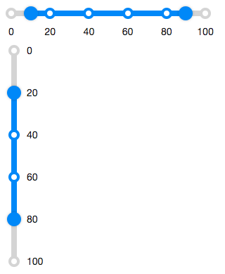
| − | [[Image:ZKComRef_Rangeslider.png]] | + | [[Image:ZKComRef_Rangeslider.png|320px]] |
<source lang="xml" > | <source lang="xml" > | ||
| − | <zk | + | <zk> |
<rangeslider startValue="10" endValue="90"/> | <rangeslider startValue="10" endValue="90"/> | ||
| + | <separator /> | ||
<rangeslider orient="vertical" startValue="20" endValue="80" markScale="20" /> | <rangeslider orient="vertical" startValue="20" endValue="80" markScale="20" /> | ||
</zk> | </zk> | ||
Revision as of 02:39, 20 November 2019
Rangeslider
- Demonstration:
- Java API: Rangeslider
- JavaScript API: Rangeslider
- Available for ZK:
-

since 9.0.0
Employment/Purpose
A rangeslider component represents a slider with a range value. It can be used to let the user select a start value and an end value. A rangeslider accepts a range of value starting from 0 to a certain maximum value. The default maximum value of rangeslider scale is 100. You can change the maximum allowed value by setting the max property. Notice that the value of max property is always larger than the value of min property.
Example
<zk>
  <rangeslider startValue="10" endValue="90"/>
  <separator />
  <rangeslider orient="vertical" startValue="20" endValue="80" markScale="20" />
</zk>
Properties
Disabled
If the rangeslider is disabled, then users can not drag the slider buttons.
Orient
Sets the orient either "horizontal" or "vertical" to display rangslider.
Marks
Sets the marks information for displaying value marks. (Default: "20") If there is only a number value, for example, 20. The value marks would be displayed every 20 start from the minimum value. (if min is 0, then display "0 20 40 ...") Another options for the marks can be specified as follows:
<rangeslider marks="10:10%, 20:20%, 50:50%, 80:80%" />
It means that each value mark could be displayed in different text.
Max
Rangeslider supports maximal position, which can be changed by the max property as follows. (Default: 100)
Min
Rangeslider supports minimal position, which can be changed by the min property as follows. (Default: 0)
StartValue, EndValue
Represent the range value of Rangeslider. (Default: 0)
Step
By default, the rangeslider will scroll to the position continuously when a user drags it. If you prefer to scroll a discrete fixed amount on each step, you can set the amount of value of the step property.
TooltipVisible
The tooltip displays the value of slider buttons in rangeslider. If the tooltipvisible is true, the tooltips of the slider buttons would be always visible. (Default: false)
Supported Events
| Event: RangeValueChangeEvent
Denotes the range value of a component has been changed by the user. |
- Inherited Supported Events: XulElement
Supported Children
*None
Use Cases
| Version | Description | Example Location |
|---|---|---|
Version History
| Version | Date | Content |
|---|---|---|
| 9.0.0 | November, 2019 | Rangeslider was introduced. |
