Coachmark"
(Created page with "{{ZKComponentReferencePageHeader}} = Coachmark = *Java API: <javadoc>org.zkoss.zkmax.zul.Coachmark</javadoc> *JavaScript API: <javadoc directory="jsdoc">zkmax.nav.Coachmark</ja...") |
|||
| Line 12: | Line 12: | ||
The coachmarks are suitable for guiding user operations, they should be as relevant as possible to the context. | The coachmarks are suitable for guiding user operations, they should be as relevant as possible to the context. | ||
Once open a coachmark, the background mask will show and the target component will be highlighted. | Once open a coachmark, the background mask will show and the target component will be highlighted. | ||
| + | |||
| + | = Example = | ||
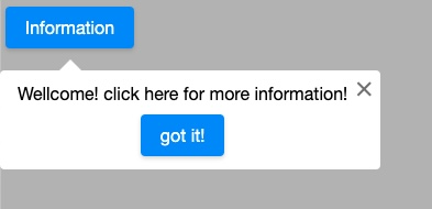
| + | [[File:Coachmark-2.png|center]] | ||
| + | <source lang="xml" > | ||
| + | <zk> | ||
| + | <button id="button" label="more information"></button> | ||
| + | <coachmark target="button" position="end_center"> | ||
| + | <label>Wellcome! click here for more information!</label> | ||
| + | <separator/> | ||
| + | <button width="100%" label="got it!"></button> | ||
| + | </coachmark> | ||
| + | </zk> | ||
| + | </source> | ||
| + | |||
= Supported Browsers = | = Supported Browsers = | ||
Revision as of 05:00, 20 November 2019
Coachmark
- Available for ZK:
-

[ since 9.0.0 ]
Employment/Purpose
Coachmark is used to attract users' attention to the target component and display a dialog. The coachmarks are suitable for guiding user operations, they should be as relevant as possible to the context. Once open a coachmark, the background mask will show and the target component will be highlighted.
Example
<zk>
	<button id="button" label="more information"></button>
	<coachmark target="button" position="end_center">
		<label>Wellcome! click here for more information!</label>
		<separator/>
		<button width="100%" label="got it!"></button>
	</coachmark>
</zk>
Supported Browsers
Only support browsers that support CSS keyframes. (IE10+, Edge, Chrome, Firefox, Safari)
Properties
Target
The target component of this coachmark.
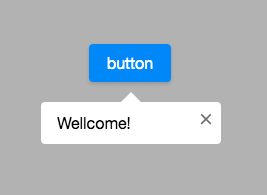
Example
<zk>
	<button id="button" label="button"></button>
	<coachmark target="button">
		<label>Wellcome!</label>
	</coachmark>
</zk>
Position
The position of this coachmark(default: after_center). Here are the available positions:
| start/before | center | end/after | |
|---|---|---|---|
| top | before_start | before_center | before_end |
| bottom | after_start | after_center | after_end |
| left | start_before | start_center | start_after |
| right | end_before | end_center | end_after |
Next
The next coachmark which will be opened while onTargetClick event or next() method is called.
Note: if you call next(Coachmark coachmark), the next coachmark already set will be ignored.
Methods
public void next() : Close this coachmark and Open the next which is set.
public void next(Coachmark coachmark) : Close this coachmark and Open the one you passed.(ignore the next coachmark already set)
Supported Events
| Event: OpenEvent
Denotes that the user has opened or closed a component. Note: unlike onClose, this event is only a notification. The client sends this event after opening or closing the component. | |
| Event: MouseEvent
Represents an event caused by a user's click on a highlighted target component. |
- Inherited Supported Events: XulElement
Supported Children
*ALL
Version History
| Version | Date | Content |
|---|---|---|
| 9.0.0 | Nov, 2019 | ZK-4382: Provide a Coachmark component |

