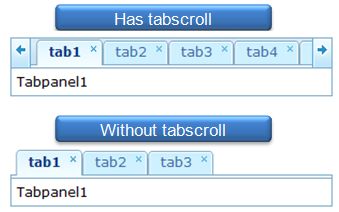
Default (Horizontal)"
From Documentation
m |
m |
||
| Line 45: | Line 45: | ||
=Tabs= | =Tabs= | ||
| + | =Structure= | ||
| + | [[Image:Tabbox-hor1.jpg]] | ||
| + | |||
| + | [[Image:Tabs-hor1.jpg]] | ||
| + | =Events= | ||
| + | <br /> | ||
| + | {{Template:Style Guide Event | ||
| + | |.z-tabs | ||
| + | | | ||
| + | | | ||
| + | | | ||
| + | | | ||
| + | | | ||
| + | |V | ||
| + | | | ||
| + | | | ||
| + | | | ||
| + | | | ||
| + | | | ||
| + | |display=none | ||
| + | }} | ||
| + | |||
| + | |||
| + | {{Template:Style Guide Event | ||
| + | |.z-tabs-right-scroll, | ||
| + | |||
| + | .z-tabs-left-scroll | ||
| + | |:hover | ||
| + | | | ||
| + | | | ||
| + | | | ||
| + | | | ||
| + | |V | ||
| + | |V | ||
| + | | | ||
| + | | | ||
| + | | | ||
| + | | | ||
| + | }} | ||
| + | =CSS Specification= | ||
| + | <br /> | ||
| + | {{Template:ZK Style Guide CSS}} | ||
| + | {{ZKStyleGuidePageFooter}} | ||
Revision as of 04:53, 9 September 2010
This is the Default (Horizontal) mold for Tabbox.
Source
The CSS source for from GitHub
Structure
Events
| CSS\Action | Normal (Open) | Hover | Click, Select, and Drag. | Focus | Focus and Hover | Disable |
| Naming: | .z-tabbox | |||||
| Supported: | V |
Note: An exclamation mark(!) means that the action effect is done by CSS background , not CSS background-position
CSS Specification
| Class Name | Description | Default Values |
| .z-tabbox | Overflow | overflow: hidden; visibility: hidden; |
Tabs
Structure
Events
| CSS\Action | Normal (Open) | Hover | Click, Select, and Drag. | Focus | Focus and Hover | Disable |
| Naming: | .z-tabs | |||||
| Supported: | V |
| CSS\Action | Normal (Open) | Hover | Click, Select, and Drag. | Focus | Focus and Hover | Disable |
| Naming: | .z-tabs-right-scroll,
.z-tabs-left-scroll |
:hover | ||||
| Supported: | V | V |
Note: An exclamation mark(!) means that the action effect is done by CSS background , not CSS background-position
CSS Specification
| Class Name | Description | Default Values |
| Copyright © Potix Corporation. This article is licensed under GNU Free Documentation License. |


