Video"
m (→Version History: add Track as children) |
|||
| Line 124: | Line 124: | ||
= StateChangeEvent = | = StateChangeEvent = | ||
| − | When you call <tt>play(), stop() | + | When you call <tt>play(), stop(), pause()</tt> StateChangeEvent will be triggered. You can check the current state by calling event.getState(). Video has three states, and you can access them by using <tt>Video.PLAY, Video.STOP and Video.PAUSE</tt>. |
For example: | For example: | ||
| Line 143: | Line 143: | ||
Video component also provides <tt>isPlaying(), isPaused() and isStopped()</tt> methods to check the video state. | Video component also provides <tt>isPlaying(), isPaused() and isStopped()</tt> methods to check the video state. | ||
| + | |||
| + | {{versionSince|9.6.0}} | ||
| + | From ZK 9.6.0, a state - Video.END is added. When the video is played to the end, the StateChangeEvent will be triggered. | ||
= Supported Events = | = Supported Events = | ||
Revision as of 00:15, 24 May 2021
Video
- Available for ZK:
-

since 8.6.0
Employment/Purpose
A Video component is used to play the video in the browser. Like audio, you can either use the src property to specify an URL of the video resource, or use the setContent method to specify a dynamically generated video. Users can control the video by play, stop and pause.
Example
<video src="zk.mp4" controls="true" autoplay="true" loop="true" />
Supports HTML5
The Video component is based on HTML 5's <video> tag, and supports the following properties: src, autoplay, controls, loop, playbackRate, dimBackground, preload, clipToFit, poster, playsinline and crossorigin.
Supported Formats
Autoplay policy is different between browser
Please refer to autoplay-policy-changes and auto-play-policy-changes-for-macos
Multiple Sources
Most browsers do not support all the video formats, so you can specify multiple source files in different formats for different browsers. If the first format is not supported by the browser, it will fallback to the 2nd format. For example:
<video src="zk.mp4, zk.webm, zk.ogg" />
enableFullScreen
For security reasons, fullScreen API can only be initiated by an user gesture. Therefore the Video component only provides a client-side method enableFullScreen() to enable the full screen mode.
<video id="player" src="zk.mp4" controls="true"/>
<button xmlns:w="client" w:onClick="zk.$('$player').enableFullScreen()" />
dimBackground
The Video component provides a theater mode, If dimBackground="true", the whole page will be covered by translucent black by default except the Video.
When the theater mode is enabled, user can click anywhere on the page outside the Video to disable theater mode and return to the normal view.
<video src="zk.mp4" dimBackground="true" />
By default, css of dimBackground has two properties as shown in the following css code.
You can also customize the background in your preference by simply overriding .z-video-dim-background in css.
<style>
.z-video-dim-background {
    background: black;
    opacity: 0.8;
}
</style>
playbackRate
The Video component provides setPlaybackRate(double) to control the video playing speed. The valid value depends on the displayed browser.
Default: 1.0
<video src="zk.mp4" playbackRate="0.5" />
currentTime
The Video component provides setCurrentTime(double) to jump to the specified time-point (in seconds) of the playback video.
<video src="zk.mp4" currentTime="60" />
playing
The Video component provides setPlaying(boolean) to play or pause the video.
playing="true" is same as invoking play(); playing="false" is same as invoking pause().
<video src="zk.mp4" playing="false" />
volume
The Video component provides setVolume(double) to change the volume. The value should range between 0.0 and 1.0.
Default: 1.0
<video src="zk.mp4" volume="0.5" />
muted
The Video component provides setMuted(boolean) to mute the video.
Default: false
<video src="zk.mp4" muted="true" />
clipToFit
The Video component provides setClipToFit(boolean) to clip the video when the source size doesn't fit the size specified in the Video tag.
For example:
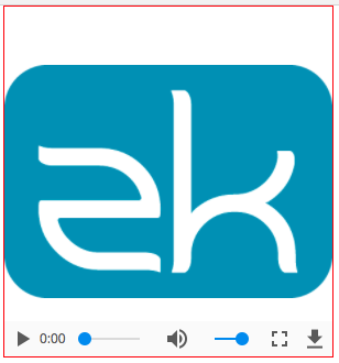
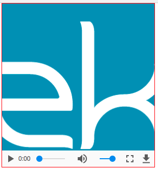
The source image used in the sample below is 450 * 320. When you set width="300px", height="320px", by default, blank space will be inserted above and below the video to preserve the aspect ratio (left image); when you set clipToFit="true", it will cut off the sides and fill up the space (right image).
  <video width="300px" height="320px" src="zk.mp4" style="border: 1px solid red;" />
  <video width="300px" height="320px" src="zk.mp4" style="border: 1px solid red;" clipToFit="true" />
StateChangeEvent
When you call play(), stop(), pause() StateChangeEvent will be triggered. You can check the current state by calling event.getState(). Video has three states, and you can access them by using Video.PLAY, Video.STOP and Video.PAUSE.
For example:
If you want to do something after the video starts to play, you can write codes as shown below (MVVM style).
<video onStateChange="@command('stateChange', event=event)" /> @Command
public void stateChange(@BindingParam("event") StateChangeEvent event) {
if (event.getState() == Video.PLAY) {
// do something...
}
}Video component also provides isPlaying(), isPaused() and isStopped() methods to check the video state.
Since 9.6.0 From ZK 9.6.0, a state - Video.END is added. When the video is played to the end, the StateChangeEvent will be triggered.
Supported Events
| Event: StateChangeEvent
Notifies when invoking play(), stop() or pause(). |
- Inherited Supported Events: XulElement
Supported Children
* Track
Version History
| Version | Date | Content |
|---|---|---|
| 8.6.0 | May 2018 | ZK-3845: Provide a video component |
| 9.5.0 | September 2020 | ZK-4649: Video supports to add tracks |


