Separator"
From Documentation
Jumperchen (talk | contribs) m |
m ((via JWB)) |
||
| (5 intermediate revisions by 3 users not shown) | |||
| Line 5: | Line 5: | ||
*Java API: <javadoc>org.zkoss.zul.Separator</javadoc> | *Java API: <javadoc>org.zkoss.zul.Separator</javadoc> | ||
*JavaScript API: <javadoc directory="jsdoc">zul.wgt.Separator</javadoc> | *JavaScript API: <javadoc directory="jsdoc">zul.wgt.Separator</javadoc> | ||
| + | *Style Guide: [[ZK_Style_Guide/XUL_Component_Specification/Separator | Separator]] | ||
= Employment/Purpose = | = Employment/Purpose = | ||
| − | + | A separator is used to insert a space between two components. There are several ways to customize the separator. | |
| − | |||
| − | |||
| + | * By use of the orient attribute, you are able to specify whether the separator is vertical or horizontal. By default it is a horizontal separator, which inserts a line break. On the other hand, a vertical separator inserts white space. | ||
| + | * By use of the bar attribute, you can control whether to show a horizontal or vertical line between components. | ||
| + | * By use of the spacing attribute, you can control the size of spacing. | ||
= Example = | = Example = | ||
| Line 30: | Line 32: | ||
</source> | </source> | ||
| − | =Supported | + | =Supported Events= |
| − | {| | + | {| class='wikitable' | width="100%" |
! <center>Name</center> | ! <center>Name</center> | ||
! <center>Event Type</center> | ! <center>Event Type</center> | ||
| Line 39: | Line 41: | ||
| None | | None | ||
|} | |} | ||
| + | *Inherited Supported Events: [[ZK_Component_Reference/Base_Components/XulElement#Supported_Events | XulElement]] | ||
=Supported Children= | =Supported Children= | ||
| − | *NONE | + | *NONE |
| − | =Use | + | =Use Cases= |
| − | {| | + | {| class='wikitable' | width="100%" |
! Version !! Description !! Example Location | ! Version !! Description !! Example Location | ||
|- | |- | ||
| − | | | + | | |
| | | | ||
| | | | ||
| Line 55: | Line 58: | ||
=Version History= | =Version History= | ||
| − | + | {{LastUpdated}} | |
| − | {| | + | {| class='wikitable' | width="100%" |
! Version !! Date !! Content | ! Version !! Date !! Content | ||
|- | |- | ||
| − | | | + | | |
| − | | | + | | |
| − | | | + | | |
|} | |} | ||
{{ZKComponentReferencePageFooter}} | {{ZKComponentReferencePageFooter}} | ||
Latest revision as of 11:06, 7 January 2022
Separator
Employment/Purpose
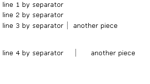
A separator is used to insert a space between two components. There are several ways to customize the separator.
- By use of the orient attribute, you are able to specify whether the separator is vertical or horizontal. By default it is a horizontal separator, which inserts a line break. On the other hand, a vertical separator inserts white space.
- By use of the bar attribute, you can control whether to show a horizontal or vertical line between components.
- By use of the spacing attribute, you can control the size of spacing.
Example
 line 1 by separator
 <separator />
 line 2 by separator
 <separator />
 line 3 by separator
 <space bar="true" />
 another piece
 <separator spacing="20px" />
 line 4 by separator
 <space bar="true" spacing="20px" />
 another piece
Supported Events
| None | None |
- Inherited Supported Events: XulElement
Supported Children
*NONE
Use Cases
| Version | Description | Example Location |
|---|---|---|
Version History
| Version | Date | Content |
|---|---|---|
