Tabpanel"
From Documentation
Jumperchen (talk | contribs) m (→Example) |
m ((via JWB)) |
||
| (3 intermediate revisions by 2 users not shown) | |||
| Line 3: | Line 3: | ||
= Tabpanel = | = Tabpanel = | ||
| − | *Demonstration: [http://www.zkoss.org/zkdemo/ | + | *Demonstration: [http://www.zkoss.org/zkdemo/tabbox Tabbox] |
*Java API: <javadoc>org.zkoss.zul.Tabpanel</javadoc> | *Java API: <javadoc>org.zkoss.zul.Tabpanel</javadoc> | ||
*JavaScript API: <javadoc directory="jsdoc">zul.tab.Tabpanel</javadoc> | *JavaScript API: <javadoc directory="jsdoc">zul.tab.Tabpanel</javadoc> | ||
| + | *Style Guide: [[ZK_Style_Guide/XUL_Component_Specification/Tabbox | Tabbox]] | ||
= Employment/Purpose = | = Employment/Purpose = | ||
| − | A < | + | A <code>tabpanel </code>is the body of a single tab panel. You would place the content for a group of components within a tab panel. The first <code>tabpanel </code>corresponds to the first <code>tab, </code>the second <code>tabpanel </code>corresponds to the second <code>tab </code>and so on. |
= Example = | = Example = | ||
| Line 41: | Line 42: | ||
</source> | </source> | ||
| − | =Supported | + | =Supported Events= |
| − | {| | + | {| class='wikitable' | width="100%" |
! <center>Name</center> | ! <center>Name</center> | ||
! <center>Event Type</center> | ! <center>Event Type</center> | ||
| − | |||
|- | |- | ||
| − | | | + | | None |
| − | | | + | | None |
| − | |||
| − | |||
| − | |||
| − | |||
| − | |||
| − | |||
| − | |||
| − | |||
| − | |||
| − | |||
| − | |||
| − | |||
| − | |||
| − | |||
| − | |||
| − | |||
| − | |||
| − | |||
| − | |||
| − | |||
| − | |||
|} | |} | ||
| + | *Inherited Supported Events: [[ZK_Component_Reference/Base_Components/XulElement#Supported_Events | XulElement]] | ||
=Supported Children= | =Supported Children= | ||
| Line 77: | Line 57: | ||
*ALL | *ALL | ||
| − | =Use | + | =Use Cases= |
| − | {| | + | {| class='wikitable' | width="100%" |
! Version !! Description !! Example Location | ! Version !! Description !! Example Location | ||
|- | |- | ||
| Line 92: | Line 72: | ||
See also: | See also: | ||
| − | [[ZK_Component_Reference/Containers/Tabbox# | + | [[ZK_Component_Reference/Containers/Tabbox#Use_Cases | Tabbox]] |
=Version History= | =Version History= | ||
| − | + | {{LastUpdated}} | |
| − | {| | + | {| class='wikitable' | width="100%" |
! Version !! Date !! Content | ! Version !! Date !! Content | ||
|- | |- | ||
Latest revision as of 10:38, 12 January 2022
Tabpanel
Employment/Purpose
A tabpanel is the body of a single tab panel. You would place the content for a group of components within a tab panel. The first tabpanel corresponds to the first tab, the second tabpanel corresponds to the second tab and so on.
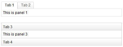
Example
<zk>
	<tabbox width="400px">
		<tabs>
			<tab label="Tab 1" />
			<tab label="Tab 2" />
		</tabs>
		<tabpanels>
			<tabpanel>This is panel 1</tabpanel>
			<tabpanel>This is panel 2</tabpanel>
		</tabpanels>
	</tabbox>
	<space />
	<tabbox width="400px" mold="accordion">
		<tabs>
			<tab label="Tab 3" />
			<tab label="Tab 4" />
		</tabs>
		<tabpanels>
			<tabpanel>This is panel 3</tabpanel>
			<tabpanel>This is panel 4</tabpanel>
		</tabpanels>
	</tabbox>
</zk>
Supported Events
| None | None |
- Inherited Supported Events: XulElement
Supported Children
*ALL
Use Cases
| Version | Description | Example Location |
|---|---|---|
| 3.6 | How to put a scrollbar inside a tabpanel | http://www.zkoss.org/forum/listComment/9889 |
| 3.6 | How to make a tabpanel loaded on demand | http://www.zkoss.org/forum/listComment/6236 |
See also: Tabbox
Version History
| Version | Date | Content |
|---|---|---|
