Default (Vertical)"
From Documentation
m |
m (→Source) |
||
| Line 7: | Line 7: | ||
=Source= | =Source= | ||
{{CSSSource | {{CSSSource | ||
| − | | url= | + | | url=zul/src/archive/web/js/zul/box/css/box.css.dsp |
| − | | control= | + | | control=Splitter |
|}} | |}} | ||
Revision as of 04:49, 13 September 2010
This is the Default (Vertical) mold for Splitter.
Source
The CSS source for Splitter from GitHub
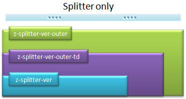
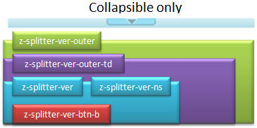
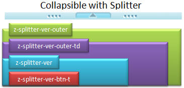
Structure
Events
| CSS\Action | Normal (Open) | Hover | Click, Select, and Drag. | Focus | Focus and Hover | Disable |
| Naming: | .z-splitter-ver | -btn-t:hover,
-btn-b:hover, -btn-visi (IE Only) |
||||
| Supported: | V | ! |
Note: An exclamation mark(!) means that the action effect is done by CSS background , not CSS background-position
CSS Specification
| Class Name | Description | Default Values |
| .z-splitter-ver | Background image of splittable | background-image:url(${c:encodeURL('~./zul/img/splt/splt-v.png')}); background-position: top center; font-size:0; max-height: 8px; height: 8px; |
| .z-splitter-ver-outer .z-splitter-ver-outer-td | Background image of non-splittable | background-image:url(${c:encodeURL('~./zul/img/splt/splt-v-ns.png')}); background-repeat: repeat-x; max-height: 8px; height: 8px; background-position: bottom left; |
| .z-splitter-ver-ns | Background position of non-splittable | background-image: none; background-position: none; |
| .z-splitter-ver-btn-t | Button icon of top side | width: 50px; min-height: 6px; height: 6px; background-image: url(${c:encodeURL('~./zul/img/splt/colps-t.png')}); |
| .z-splitter-ver-btn-b | Button icon of bottom side | width: 50px; min-height: 6px; height: 6px; background-image: url(${c:encodeURL('~./zul/img/splt/colps-b.png')}); |


