Default (Row)"
From Documentation
Jumperchen (talk | contribs) (Created page with '{{ZKStyleGuidePageHeader}} __TOC__ This is the '''Default''' mold for '''Cell'''. =Source= {{CSSSource | url=/zul/src/archive/web/js/zul/grid/css/grid.css.dsp | control=Cell …') |
m (→Structure) |
||
| (2 intermediate revisions by one other user not shown) | |||
| Line 13: | Line 13: | ||
=Structure= | =Structure= | ||
| − | [[Image:Cell1. | + | [[Image:Cell1.PNG ]] |
| − | [[Image:Cell2. | + | |
| + | [[Image:Cell2.PNG ]] | ||
=Events= | =Events= | ||
| Line 29: | Line 30: | ||
| | | | ||
| | | | ||
| − | | | + | | |
}} | }} | ||
Latest revision as of 06:49, 16 September 2010
This is the Default mold for Cell.
Source
The CSS source for Cell from GitHub
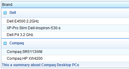
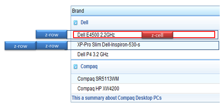
Structure
Events
| CSS\Action | Normal (Open) | Hover | Click, Select, and Drag. | Focus | Focus and Hover | Disable |
| Naming: | .z-cell | |||||
| Supported: | V |
Note: An exclamation mark(!) means that the action effect is done by CSS background , not CSS background-position
CSS Specification
| Class Name | Description | Default Values |
| .z-cell | Padding | padding: 2px; overflow: hidden; |
| tr.z-row .z-cell | Background color and border | background: white; border-top: none; border-left: 1px solid white; border-right: 1px solid #CCC; border-bottom: 1px solid #DDD; |
| tr.z-grid-odd .z-cell | Background color of the odd row | background: #F0FAFF; |

