Default"
From Documentation
m |
m (→Structure) |
||
| (One intermediate revision by one other user not shown) | |||
| Line 7: | Line 7: | ||
=Source= | =Source= | ||
{{CSSSource | {{CSSSource | ||
| − | | url= | + | | url=zul/src/archive/web/js/zul/grid/css/grid.css.dsp |
| − | | control= | + | | control=Grid |
|}} | |}} | ||
| Line 14: | Line 14: | ||
[[Image:Grid1.jpg ]] | [[Image:Grid1.jpg ]] | ||
| − | [[Image: | + | [[Image:Rowone.jpg ]] |
| − | |||
=Events= | =Events= | ||
Latest revision as of 07:12, 20 September 2010
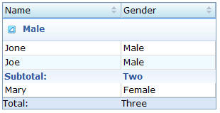
This is the Default mold for Row.
Source
The CSS source for Grid from GitHub
Structure
Events
| CSS\Action | Normal (Open) | Hover | Click, Select, and Drag. | Focus | Focus and Hover | Disable |
| Naming: | .z-rows,
.z-row |
|||||
| Supported: | V |
Note: An exclamation mark(!) means that the action effect is done by CSS background , not CSS background-position
CSS Specification
| Class Name | Description | Default Values |
| div.z-row-cnt | Font size | border: 0; margin: 0; padding: 0; font-family: ${fontFamilyC}; font-size: ${fontSizeM}; font-weight: normal; |
| div.z-row-cnt | Color | color: black; |
| td.z-row-inner | Padding | padding: 2px; overflow: hidden; |
| tr.z-row td.z-row-inner | Background color and border | background: white; border-top: none; border-left: 1px solid white; border-right: 1px solid #CCC; border-bottom: 1px solid #DDD; |
| tr.z-grid-odd td.z-row-inner, tr.z-grid-odd | Background color of the odd row | background: #F0FAFF; |

