Scrolling on Tablet"
m (correct highlight (via JWB)) |
|||
| (26 intermediate revisions by 5 users not shown) | |||
| Line 1: | Line 1: | ||
| − | |||
{{Template:Smalltalk_Author| | {{Template:Smalltalk_Author| | ||
|author=Monty Pan, Engineer, Potix Corporation | |author=Monty Pan, Engineer, Potix Corporation | ||
| − | |date=September, | + | |date=September, 04, 2012 |
|version=ZK 6.5 | |version=ZK 6.5 | ||
}} | }} | ||
__TOC__ | __TOC__ | ||
| − | == | + | == Introduction == |
| − | |||
| − | ZK 6.5 | + | Visually, the most notable difference between desktop and touch devices is that there are no scroll bars present on touch devices. End-users are also not able to scroll using peripherals such as a mouse or a keyboard, scrolling is done by a finger swipe action. |
| + | |||
| + | ZK 6.5 focuses on this feature and have done many improvements to make it work smoothly and seamlessly on your tablet. This article will introduce to you the theorem of tablet scrolling, how ZK component supports it and an example at the end to express some tips of migrating from desktop to tablet. | ||
== Principle == | == Principle == | ||
| + | |||
[[File:Scroll_Diagram.png]] | [[File:Scroll_Diagram.png]] | ||
| − | + | The principle of the scroll bar is simple; if the height of the container is smaller than its content, scroll bar will be visible for scrolling which means that the height value of container and content will decide the behavior of the scroll bar. | |
| − | On desktop, scroll bar | + | On desktop, scroll bar is handled by the browser. On tablet, scroll bar is handled by ZK, ZK will compute the height of components, render custom scroll bar, and transform swipe action to scrolling behaviour. |
== ZK Component Support == | == ZK Component Support == | ||
| − | + | If you simply look at whether a page is "scrollable" or not, ZK components act indifferently on desktop and on tablet. If a component is scrollable on a desktop, it is scrollable on a tablet too. Likewise, if a component does not support '''scrolling''' on a desktop, it would not be scrollable on a tablet either even with the hacking of CSS may not do the trick. '''Developers must be aware of this issue when migrating a project from desktop to tablet'''. | |
| + | |||
| + | In ZK, some components enables scrolling by default, some disables scrolling by default. This section will show you how you can change their default values to meet different needs. | ||
| − | + | Same for desktop and tablet, these components are scrollable by default: | |
* Grid | * Grid | ||
* Listbox | * Listbox | ||
* Tree | * Tree | ||
| − | + | To disable scrolling, you must set <code>data-scrollable</code> attribute like this: | |
<source lang="xml" line="true"> | <source lang="xml" line="true"> | ||
<listbox xmlns:ca="client/attribute" ca:data-scrollable="false" /> | <listbox xmlns:ca="client/attribute" ca:data-scrollable="false" /> | ||
</source> | </source> | ||
| − | + | Following components are not scrollable by default for both desktop and tablet. To enable scrolling, you must set the attributes as below: | |
* (Borderlayout) Center, East, West, North, South | * (Borderlayout) Center, East, West, North, South | ||
| − | ** <code> | + | ** <code>autoScroll="true"</code> |
| − | * Groupbox, Window | + | * Groupbox, Window |
** <code>contentStyle="overflow:auto"</code> | ** <code>contentStyle="overflow:auto"</code> | ||
* PanelChildren, Tabpanel | * PanelChildren, Tabpanel | ||
** <code>style="overflow:auto"</code> | ** <code>style="overflow:auto"</code> | ||
| − | Please read [[ZK_Component_Reference|Component Reference]] for more | + | Please read [[ZK_Component_Reference|Component Reference]] for more detailed information. |
| − | ZK 6.5 also | + | ZK 6.5 also introduces a container component <code>ScrollView</code>. It can attach any component and provides scroll ability. For more detailed information, please read the [[ZK_Component_Reference/Tablet_Devices/Components/Scrollview|ScrollView document]]. |
=== Other Issues === | === Other Issues === | ||
| − | + | ||
| + | In cases where both parent and child components are scrollable, the swipe action will be handled by the child only and blocking the parent from scrolling. | ||
| + | Like the example below, "footer" is invisible to end-users so they wouldn't be able to scroll it. | ||
<source lang="xml"> | <source lang="xml"> | ||
<borderlayout height="100px"> | <borderlayout height="100px"> | ||
<center autoscroll="true"> | <center autoscroll="true"> | ||
| − | <div | + | <div vflex="min"> |
<listbox height="100px"> | <listbox height="100px"> | ||
<listitem forEach="1,2,3,4,5"> | <listitem forEach="1,2,3,4,5"> | ||
| Line 62: | Line 67: | ||
[[File:Scroll_Issue1.png]] | [[File:Scroll_Issue1.png]] | ||
| − | + | Please note that non-scrollable components are sometimes scrollable because browser provides scrolling behavior too (before iOS 5, must use two fingers to scroll). In the example below, although <code><div></code> is unscrollable, end-users can still scroll and see "footer" because browser supports this functionality. | |
<source lang="xml"> | <source lang="xml"> | ||
<zk> | <zk> | ||
| Line 72: | Line 77: | ||
== Example == | == Example == | ||
| − | Now, we will analyse an example and rewrite it | + | Now, we will analyse an example and rewrite it to let you understand ZK component scrolling behavior in more detail and how to transform existing code to work with tablet devices efficiently. |
| − | |||
First, read this code: | First, read this code: | ||
<source lang="xml"> | <source lang="xml"> | ||
| Line 99: | Line 103: | ||
</window> | </window> | ||
</source> | </source> | ||
| − | It | + | It seems normal, browser will render scroll bar and scrolling works fine. But it can't work on tablet. Why? |
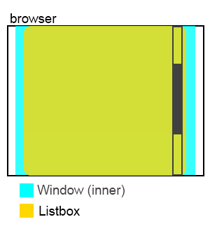
| − | + | The <code>listbox</code> in the above example does not render its own scroll bar because we did not limit the height of the listbox, so it extends its size to as many items as needed which in this case is 50 items. This results in the content and the container being the same size and as the browser only renders scroll bar for the whole page, this page becomes un-scrollable because listbox blocks users from swiping the whole page. | |
[[File:Scroll_Example1.png]] | [[File:Scroll_Example1.png]] | ||
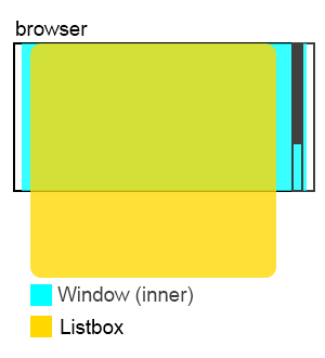
| − | If you set <code>Listbox</code> with <code>width="50%"</code> | + | To clarify the situation, If you set <code>Listbox</code> with <code>width="50%"</code>, <code>Listbox</code> still is not scrollable, but the right hand empty area where it is not covered by the <code>Listbox</code> becomes scrollable and when you swipe that area, the '''whole page''' scrolls. |
| − | Of course, <code>Listbox</code> | + | Of course, assigning a fixed height to <code>Listbox</code> can solve this problem, but, how to modify this code so that it would work properly on tablet with flexible layout? |
=== Solution === | === Solution === | ||
| − | + | Firstly, we must set a defined height limitation for parent components so for both <code>window</code> and <code>Tabbox</code> we set "<code>height="100%"</code>. Then, we set <code>Listbox vflex="1"</code> and leave ZK to compute '''Listbox''''s height. | |
<source lang="xml" highlight="1,2,7,8"> | <source lang="xml" highlight="1,2,7,8"> | ||
<window id="root" height="100%"> | <window id="root" height="100%"> | ||
| Line 134: | Line 138: | ||
</source> | </source> | ||
| − | The other visual equivalent way is let <code> | + | [[File:Scroll_Example2.png]] |
| + | |||
| + | The other visual equivalent way is to let <code>Window</code> whose id is "inner" to handle the scrolling. To do this, remove <code>vflex</code> of <code>Listbox</code> to give it full size and disable scrolling so that <code>Window</code> can receive the scrolling event: | ||
| + | |||
<source lang="xml" highlight="7,8"> | <source lang="xml" highlight="7,8"> | ||
<window id="root" height="100%"> | <window id="root" height="100%"> | ||
| Line 157: | Line 164: | ||
</window> | </window> | ||
</source> | </source> | ||
| + | |||
| + | [[File:Scroll_Example3.png]] | ||
== Conclusion == | == Conclusion == | ||
| − | + | All in all, scrolling mechanism is almost the same between desktop and tablet. In the past, writing the layout incorrectly will not occur serious operating errors on desktop, but these misuses will crash on tablet. Should a developer follow the tips on this article when writing an application, he/she will decrease the trouble and cost of migrating from desktop to tablet substantially. | |
== Reference == | == Reference == | ||
| − | http://books.zkoss.org/wiki/ZK_Developer's_Reference/UI_Patterns/Hflex_and_Vflex | + | <ul> |
| − | http://books.zkoss.org/wiki/ZK_Component_Reference/Tablet_Devices | + | <li>[http://books.zkoss.org/wiki/ZK_Developer's_Reference/UI_Patterns/Hflex_and_Vflex ZK Developer's Reference - UI Patterns/Hflex and Vflex]</li> |
| + | <li>[http://books.zkoss.org/wiki/ZK_Component_Reference/Tablet_Devices ZK Component Reference - Tablet Devices]</li> | ||
| + | </ul> | ||
| − | + | {{Template:CommentedSmalltalk_Footer| | |
| + | |name=Potix Corporation | ||
| + | }} | ||
Latest revision as of 04:20, 20 January 2022
Monty Pan, Engineer, Potix Corporation
September, 04, 2012
ZK 6.5
Introduction
Visually, the most notable difference between desktop and touch devices is that there are no scroll bars present on touch devices. End-users are also not able to scroll using peripherals such as a mouse or a keyboard, scrolling is done by a finger swipe action.
ZK 6.5 focuses on this feature and have done many improvements to make it work smoothly and seamlessly on your tablet. This article will introduce to you the theorem of tablet scrolling, how ZK component supports it and an example at the end to express some tips of migrating from desktop to tablet.
Principle
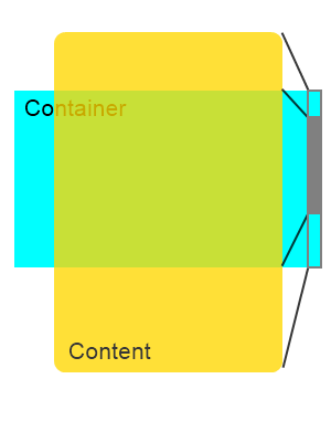
The principle of the scroll bar is simple; if the height of the container is smaller than its content, scroll bar will be visible for scrolling which means that the height value of container and content will decide the behavior of the scroll bar.
On desktop, scroll bar is handled by the browser. On tablet, scroll bar is handled by ZK, ZK will compute the height of components, render custom scroll bar, and transform swipe action to scrolling behaviour.
ZK Component Support
If you simply look at whether a page is "scrollable" or not, ZK components act indifferently on desktop and on tablet. If a component is scrollable on a desktop, it is scrollable on a tablet too. Likewise, if a component does not support scrolling on a desktop, it would not be scrollable on a tablet either even with the hacking of CSS may not do the trick. Developers must be aware of this issue when migrating a project from desktop to tablet.
In ZK, some components enables scrolling by default, some disables scrolling by default. This section will show you how you can change their default values to meet different needs.
Same for desktop and tablet, these components are scrollable by default:
- Grid
- Listbox
- Tree
To disable scrolling, you must set data-scrollable attribute like this:
1 <listbox xmlns:ca="client/attribute" ca:data-scrollable="false" />
Following components are not scrollable by default for both desktop and tablet. To enable scrolling, you must set the attributes as below:
- (Borderlayout) Center, East, West, North, South
autoScroll="true"
- Groupbox, Window
contentStyle="overflow:auto"
- PanelChildren, Tabpanel
style="overflow:auto"
Please read Component Reference for more detailed information.
ZK 6.5 also introduces a container component ScrollView. It can attach any component and provides scroll ability. For more detailed information, please read the ScrollView document.
Other Issues
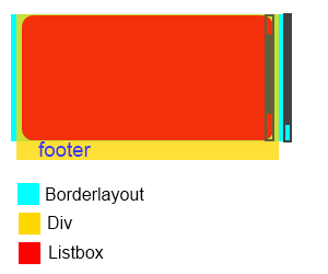
In cases where both parent and child components are scrollable, the swipe action will be handled by the child only and blocking the parent from scrolling. Like the example below, "footer" is invisible to end-users so they wouldn't be able to scroll it.
<borderlayout height="100px">
	<center autoscroll="true">
		<div vflex="min">
			<listbox height="100px">
				<listitem forEach="1,2,3,4,5">
					<listcell label="${each}"></listcell>
				</listitem>
			</listbox>
			<label>footer</label>
		</div>
	</center>
</borderlayout>
Please note that non-scrollable components are sometimes scrollable because browser provides scrolling behavior too (before iOS 5, must use two fingers to scroll). In the example below, although <div> is unscrollable, end-users can still scroll and see "footer" because browser supports this functionality.
<zk>
	<div style="background-color:green" width="100%" height="2000px" />
	<label>footer</label>
</zk>
Example
Now, we will analyse an example and rewrite it to let you understand ZK component scrolling behavior in more detail and how to transform existing code to work with tablet devices efficiently.
First, read this code:
<window id="root">
	<tabbox width="100%">
		<tabs>
			<tab label="Demo"/>
		</tabs>
		<tabpanels><tabpanel>
			<window id="inner">
				<listbox id="lbx" />
				<zscript><![CDATA[
				//generate data for listbox
				String[] data = new String[50];
				for (int i = 0; i < data.length; i++) {
					data[i] = "item " + i;
				}
				org.zkoss.zul.ListModel strset = new org.zkoss.zul.SimpleListModel(data);
				lbx.setModel(strset);
				]]></zscript>
			</window>
		</tabpanel></tabpanels>
	</tabbox>
</window>
It seems normal, browser will render scroll bar and scrolling works fine. But it can't work on tablet. Why?
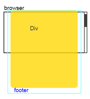
The listbox in the above example does not render its own scroll bar because we did not limit the height of the listbox, so it extends its size to as many items as needed which in this case is 50 items. This results in the content and the container being the same size and as the browser only renders scroll bar for the whole page, this page becomes un-scrollable because listbox blocks users from swiping the whole page.
To clarify the situation, If you set Listbox with width="50%", Listbox still is not scrollable, but the right hand empty area where it is not covered by the Listbox becomes scrollable and when you swipe that area, the whole page scrolls.
Of course, assigning a fixed height to Listbox can solve this problem, but, how to modify this code so that it would work properly on tablet with flexible layout?
Solution
Firstly, we must set a defined height limitation for parent components so for both window and Tabbox we set "height="100%". Then, we set Listbox vflex="1" and leave ZK to compute Listbox's height.
<window id="root" height="100%">
	<tabbox width="100%" height="100%">
		<tabs>
			<tab label="Demo"/>
		</tabs>
		<tabpanels><tabpanel>
			<window id="inner" height="100%">
				<listbox id="lbx" vflex="1" />
				<zscript><![CDATA[
				String[] data = new String[50];
				for (int i = 0; i < data.length; i++) {
					data[i] = "item " + i;
				}
				org.zkoss.zul.ListModel strset = new org.zkoss.zul.SimpleListModel(data);
				lbx.setModel(strset);
				]]></zscript>
			</window>
		</tabpanel></tabpanels>
	</tabbox>
</window>
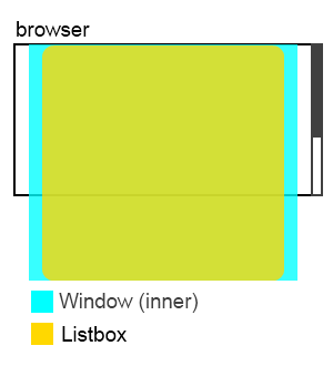
The other visual equivalent way is to let Window whose id is "inner" to handle the scrolling. To do this, remove vflex of Listbox to give it full size and disable scrolling so that Window can receive the scrolling event:
<window id="root" height="100%">
	<tabbox width="100%" height="100%">
		<tabs>
			<tab label="Demo"/>
		</tabs>
		<tabpanels><tabpanel>
			<window id="inner" height="100%" contentStyle="overflow:auto">
				<listbox id="lbx" xmlns:ca="client/attribute" ca:data-scrollable="false" />
				<zscript><![CDATA[
				String[] data = new String[50];
				for (int i = 0; i < data.length; i++) {
					data[i] = "item " + i;
				}
				org.zkoss.zul.ListModel strset = new org.zkoss.zul.SimpleListModel(data);
				lbx.setModel(strset);
				]]></zscript>
			</window>
		</tabpanel></tabpanels>
	</tabbox>
</window>
Conclusion
All in all, scrolling mechanism is almost the same between desktop and tablet. In the past, writing the layout incorrectly will not occur serious operating errors on desktop, but these misuses will crash on tablet. Should a developer follow the tips on this article when writing an application, he/she will decrease the trouble and cost of migrating from desktop to tablet substantially.
Reference
Comments
| Copyright © Potix Corporation. This article is licensed under GNU Free Documentation License. |
