Rowlayout"
m ((via JWB)) |
|||
| (3 intermediate revisions by 2 users not shown) | |||
| Line 9: | Line 9: | ||
= Employment/Purpose = | = Employment/Purpose = | ||
| − | A < | + | A <code>rowlayout</code> lays out a container which can have multiple columns, it offers a 12-column grid out of the box. You can simply chooses the number of columns to occupy for each major content area, and may also skip columns for extra space without inserting space-inducing elements. |
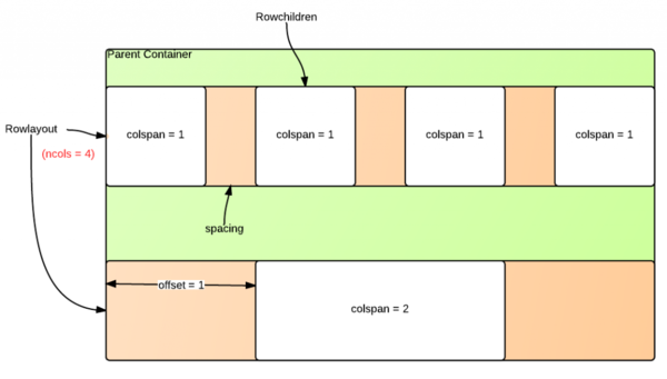
The following diagram illustrates the rowlayout/rowchildren components and their various configurable parameters. | The following diagram illustrates the rowlayout/rowchildren components and their various configurable parameters. | ||
| − | [[Image:ZKComRef_Rowlayout.PNG]] | + | [[Image:ZKComRef_Rowlayout.PNG|600px]] |
= Example = | = Example = | ||
| Line 21: | Line 21: | ||
Next, use rowchildren component to place components into an integral number of these columns. You can also optionally specify how many columns to skip ahead. | Next, use rowchildren component to place components into an integral number of these columns. You can also optionally specify how many columns to skip ahead. | ||
| − | + | == Equally Divided== | |
<source lang="xml" > | <source lang="xml" > | ||
| − | <rowlayout ncols="12" | + | <rowlayout ncols="12"> |
| − | + | <forEach begin="1" end="3"> | |
| − | + | <rowchildren colspan="4" style="background-color: skyblue"> | |
| − | </rowlayout> | + | 1/3 |
| + | </rowchildren> | ||
| + | </forEach> | ||
| + | </rowlayout> | ||
</source> | </source> | ||
| + | |||
| + | == Position Offset == | ||
| + | <source lang='xml'> | ||
| + | <rowlayout ncols="12"> | ||
| + | <rowchildren colspan="4" style="background-color: skyblue" offset="2"> | ||
| + | offset 2 columns | ||
| + | </rowchildren> | ||
| + | </rowlayout> | ||
| + | </source> | ||
| + | |||
| + | == Column Spacing== | ||
| + | <source lang='xml'> | ||
| + | <rowlayout ncols="12" spacing="100%"> | ||
| + | <forEach begin="1" end="3"> | ||
| + | <rowchildren colspan="4" style="background-color: skyblue"> | ||
| + | spacing = 100% | ||
| + | </rowchildren> | ||
| + | </forEach> | ||
| + | </rowlayout> | ||
| + | </source> | ||
| + | |||
| + | The above examples look like: | ||
| + | [[File:rowlayout-examples.png | center]] | ||
=Supported Events= | =Supported Events= | ||
| − | {| | + | {| class='wikitable' | width="100%" |
! <center>Name</center> | ! <center>Name</center> | ||
! <center>Event Type</center> | ! <center>Event Type</center> | ||
| Line 45: | Line 71: | ||
=Use Cases= | =Use Cases= | ||
| − | {| | + | {| class='wikitable' | width="100%" |
! Version !! Description !! Example Location | ! Version !! Description !! Example Location | ||
|- | |- | ||
| Line 56: | Line 82: | ||
{{LastUpdated}} | {{LastUpdated}} | ||
| − | {| | + | {| class='wikitable' | width="100%" |
! Version !! Date !! Content | ! Version !! Date !! Content | ||
|- | |- | ||
Latest revision as of 14:08, 12 January 2022
Rowlayout
Employment/Purpose
A rowlayout lays out a container which can have multiple columns, it offers a 12-column grid out of the box. You can simply chooses the number of columns to occupy for each major content area, and may also skip columns for extra space without inserting space-inducing elements.
The following diagram illustrates the rowlayout/rowchildren components and their various configurable parameters.
Example
Using rowlayout component is simple. First, use rowlayout to divide the horizontal space of its parent container into a number of columns. You can also optionally specify the column/spacing ratio. The default number of columns is 12, and the default column/spacing ratio is 1/3, which means column is 3 times wider than the spacing between columns. Spacing could be given as a ratio, a percentage or a floating-point number.
Next, use rowchildren component to place components into an integral number of these columns. You can also optionally specify how many columns to skip ahead.
Equally Divided
    <rowlayout ncols="12">
        <forEach begin="1" end="3">
            <rowchildren colspan="4" style="background-color: skyblue">
                1/3
            </rowchildren>
        </forEach>
    </rowlayout>
Position Offset
    <rowlayout ncols="12">
        <rowchildren colspan="4" style="background-color: skyblue" offset="2">
            offset 2 columns
        </rowchildren>
    </rowlayout>
Column Spacing
    <rowlayout ncols="12" spacing="100%">
        <forEach begin="1" end="3">
            <rowchildren colspan="4" style="background-color: skyblue">
                spacing = 100%
            </rowchildren>
        </forEach>
    </rowlayout>
The above examples look like:
Supported Events
| None | None |
- Inherited Supported Events: XulElement
Supported Children
* Rowchildren
Use Cases
| Version | Description | Example Location |
|---|---|---|
Version History
| Version | Date | Content |
|---|---|---|
| ] |

