Slider"
Wenninghsu (talk | contribs) |
(→Step) |
||
| (8 intermediate revisions by 2 users not shown) | |||
| Line 9: | Line 9: | ||
= Employment/Purpose = | = Employment/Purpose = | ||
| − | A slider component represents a slider with a scale and a knob. It can be used to let user select a value by sliding the knob along the scale. A slider accepts a range of value starting from 0 to certain maximum value. The default maximum value of slider scale is 100. You could change the maximum allowed value by the < | + | A slider component represents a slider with a scale and a knob. It can be used to let user select a value by sliding the knob along the scale. A slider accepts a range of value starting from 0 to certain maximum value. The default maximum value of slider scale is 100. You could change the maximum allowed value by the <code>maxpos</code> property. However the default minimum is 0 and cannot be changed. |
= Example = | = Example = | ||
| Line 20: | Line 20: | ||
= Minimal Position = | = Minimal Position = | ||
| − | + | {{versionSince| 7.0.1}} | |
Slider supports minimal position, which can be changed by the minpos property as follows. | Slider supports minimal position, which can be changed by the minpos property as follows. | ||
| Line 28: | Line 28: | ||
<slider minpos="30"/> | <slider minpos="30"/> | ||
</source> | </source> | ||
| − | Slider also provides < | + | Slider also provides <code>setRange(int, int)</code> and <code>setRange(double, double)</code> methods to help user change the range from minimal position to maximum position. |
= Decimal Mode = | = Decimal Mode = | ||
| − | + | {{versionSince| 7.0.1}} | |
Set the mode property to "decimal" will enable decimal slider. So the slider can represent decimal number. | Set the mode property to "decimal" will enable decimal slider. So the slider can represent decimal number. | ||
| Line 49: | Line 49: | ||
= Step = | = Step = | ||
| − | + | {{versionSince| 7.0.1}} | |
| − | By default, the slider will scroll to the position continuously when an user drags it. If you prefer to scroll a discrete fixed amount on each step, you can set the amount of value of the < | + | By default, the slider will scroll to the position continuously when an user drags it. If you prefer to scroll a discrete fixed amount on each step, you can set the amount of value of the <code>step</code> property. Step property is useful in decimal mode, slider's position value could be rounded to a fixed number by specifying step property. For example, if we want to retrieve the value from decimal slider in the range of 10.0 to 12.0. As the below picture shows, the default decimal show the value contains only one digit in fractional part. |
[[File:dec_slider_no_step.png]] | [[File:dec_slider_no_step.png]] | ||
| Line 63: | Line 63: | ||
= Knob Mold = | = Knob Mold = | ||
| − | + | {{ZK EE}} | |
| − | + | {{versionSince| 8.6.0}} | |
Set the mold property to "knob" will enable knob slider. So the slider can act as a normal knob. The knob can controlled by wheel, drag, click and enter a value to the input element. | Set the mold property to "knob" will enable knob slider. So the slider can act as a normal knob. The knob can controlled by wheel, drag, click and enter a value to the input element. | ||
| Line 74: | Line 74: | ||
</source> | </source> | ||
| − | = AngelArc, StrokeWidth and ScaleInput= | + | == AngelArc, StrokeWidth and ScaleInput == |
| − | |||
| − | |||
AngelArc, strokeWidth and scaleInput are properties only for knob mold. Set the angelArc property with a double for the angle of the knob slider. Set the strokeWidth property with a double for the stroke width of the knob. ScaleInput is the scale ratio of the input size. | AngelArc, strokeWidth and scaleInput are properties only for knob mold. Set the angelArc property with a double for the angle of the knob slider. Set the strokeWidth property with a double for the stroke width of the knob. ScaleInput is the scale ratio of the input size. | ||
| Line 87: | Line 85: | ||
=Supported Events= | =Supported Events= | ||
| − | {| | + | {| class='wikitable' | width="100%" |
! <center>Name</center> | ! <center>Name</center> | ||
! <center>Event Type</center> | ! <center>Event Type</center> | ||
| Line 97: | Line 95: | ||
| <center>onScrolling</center> | | <center>onScrolling</center> | ||
| '''Event:''' <javadoc>org.zkoss.zk.ui.event.ScrollEvent</javadoc> | | '''Event:''' <javadoc>org.zkoss.zk.ui.event.ScrollEvent</javadoc> | ||
| − | Denotes that the user is scrolling a scrollable component. Notice that the component's content (at the server) won't be changed until onScroll is received. Thus, you have to invoke the < | + | Denotes that the user is scrolling a scrollable component. Notice that the component's content (at the server) won't be changed until onScroll is received. Thus, you have to invoke the <code>getPos</code> method in the ScrollEvent class to retrieve the temporary position. |
|} | |} | ||
*Inherited Supported Events: [[ZK_Component_Reference/Base_Components/XulElement#Supported_Events | XulElement]] | *Inherited Supported Events: [[ZK_Component_Reference/Base_Components/XulElement#Supported_Events | XulElement]] | ||
| Line 103: | Line 101: | ||
=Supported Molds= | =Supported Molds= | ||
Available molds of a component are defined in lang.xml embedded in zul.jar. | Available molds of a component are defined in lang.xml embedded in zul.jar. | ||
| − | {| | + | {| class='wikitable' | width="100%" |
! <center>Name</center> | ! <center>Name</center> | ||
! <center>Snapshot</center> | ! <center>Snapshot</center> | ||
| Line 116: | Line 114: | ||
|[[Image:slider_mold_scale.png ]] | |[[Image:slider_mold_scale.png ]] | ||
|- | |- | ||
| − | | <center>knob</center> | + | | <center>{{versionSince| 8.6.0}}</center> |
| + | <center>knob</center> | ||
|[[Image:knob270.png ]] | |[[Image:knob270.png ]] | ||
|} | |} | ||
| − | + | {{versionSince| 7.0.0}} the scale mold is deprecated because designs are changed. | |
| − | |||
| − | the scale mold is deprecated because designs are changed. | ||
=Supported Children= | =Supported Children= | ||
| Line 130: | Line 127: | ||
=Use Cases= | =Use Cases= | ||
| − | {| | + | {| class='wikitable' | width="100%" |
! Version !! Description !! Example Location | ! Version !! Description !! Example Location | ||
|- | |- | ||
| Line 140: | Line 137: | ||
=Version History= | =Version History= | ||
{{LastUpdated}} | {{LastUpdated}} | ||
| − | {| | + | {| class='wikitable' | width="100%" |
! Version !! Date !! Content | ! Version !! Date !! Content | ||
|- | |- | ||
Latest revision as of 07:02, 31 January 2024
Slider
Employment/Purpose
A slider component represents a slider with a scale and a knob. It can be used to let user select a value by sliding the knob along the scale. A slider accepts a range of value starting from 0 to certain maximum value. The default maximum value of slider scale is 100. You could change the maximum allowed value by the maxpos property. However the default minimum is 0 and cannot be changed.
Example
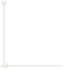
  <slider id="slider" orient="vertical"/>
  <slider curpos="1" maxpos="20"  />
Minimal Position
Since 7.0.1 Slider supports minimal position, which can be changed by the minpos property as follows.
<slider minpos="30"/>
Slider also provides setRange(int, int) and setRange(double, double) methods to help user change the range from minimal position to maximum position.
Decimal Mode
Since 7.0.1 Set the mode property to "decimal" will enable decimal slider. So the slider can represent decimal number.
<slider mode="decimal" step="0.1"/>
Page Increment
By default, the slider will move to the position of the try on which an user clicks. If you prefer to move in a fixed amount (like the scrollbar does), you could specify the amount of value to move by use of Slider.setPageIncrement(int).
<slider pageIncrement="10"/>
Step
Since 7.0.1
By default, the slider will scroll to the position continuously when an user drags it. If you prefer to scroll a discrete fixed amount on each step, you can set the amount of value of the step property. Step property is useful in decimal mode, slider's position value could be rounded to a fixed number by specifying step property. For example, if we want to retrieve the value from decimal slider in the range of 10.0 to 12.0. As the below picture shows, the default decimal show the value contains only one digit in fractional part.
If we want to retrieve the value which contains two digits in fractional part, we can set the step value to 0.01. Then the value will increase as 10.01, 10.02, 10.02 on each step when scrolling the slider. If step is 0.05, the value will increase as 10.05, 10.10, 10.15 on each step, as below.
<slider mode="decimal" minpos="10.0" maxpos="12.0" step="0.05"/>
Knob Mold
- Available for ZK:
-

Since 8.6.0 Set the mold property to "knob" will enable knob slider. So the slider can act as a normal knob. The knob can controlled by wheel, drag, click and enter a value to the input element.
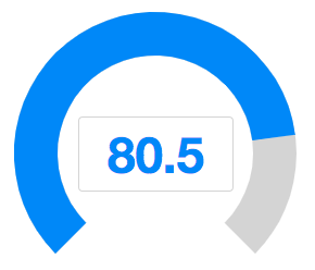
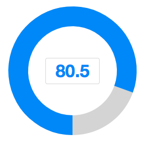
<slider mold="knob" minpos="0.0" maxpos="100.0" curpos="80.5" step="0.5" strokeWidth="40"/>
AngelArc, StrokeWidth and ScaleInput
AngelArc, strokeWidth and scaleInput are properties only for knob mold. Set the angelArc property with a double for the angle of the knob slider. Set the strokeWidth property with a double for the stroke width of the knob. ScaleInput is the scale ratio of the input size.
<slider mold="knob" strokeWidth="40" angelArc="270" scaleInput="1.3" minpos="0.0" maxpos="100.0" curpos="80.5" step="0.5"/>
Supported Events
| Event: ScrollEvent
Denotes the content of a scrollable component has been scrolled by the user. | |
| Event: ScrollEvent
Denotes that the user is scrolling a scrollable component. Notice that the component's content (at the server) won't be changed until onScroll is received. Thus, you have to invoke the |
- Inherited Supported Events: XulElement
Supported Molds
Available molds of a component are defined in lang.xml embedded in zul.jar.

|
Since 7.0.0 the scale mold is deprecated because designs are changed.
Supported Children
*None
Use Cases
| Version | Description | Example Location |
|---|---|---|
Version History
| Version | Date | Content |
|---|---|---|
| 5.0.4 | August 2010 | Slider.setPageIncrement(int) is supported. |
| 5.0.4 | August 2010 | Slider support for clicking to increment or decrement |
| 7.0.1 | January 2014 | Slider support minimal position and decimal mode |


