Toolbar"
KatherineLin (talk | contribs) |
|||
| (6 intermediate revisions by 2 users not shown) | |||
| Line 9: | Line 9: | ||
= Employment/Purpose = | = Employment/Purpose = | ||
| − | A < | + | A <code>toolbar</code> is used to place a series of buttons, such as <code>toolbarbutton </code>or <code>button. </code>The toolbar buttons could be used without toolbars, so a toolbar could be used without tool buttons. However, the tool buttons change their appearance if they are placed inside a toolbar. |
| − | The toolbar has two orientation: < | + | The toolbar has two orientation: <code>horizontal </code>and <code>vertical. </code>It controls how the buttons are placed. |
See also : [[ZK_Component_Reference/Essential_Components/Button | Button]], [[ZK_Component_Reference/Essential_Components/Toolbarbutton | Toolbarbutton]] | See also : [[ZK_Component_Reference/Essential_Components/Button | Button]], [[ZK_Component_Reference/Essential_Components/Toolbarbutton | Toolbarbutton]] | ||
| Line 36: | Line 36: | ||
= overflowPopup = | = overflowPopup = | ||
| − | + | {{versionSince| 8.6.0}} | |
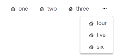
| − | When overflowPopup="true", a toolbar will have a < | + | When <code>overflowPopup="true"</code>, a toolbar will have a <code>...</code> symbol that shows a popup that contains those buttons not fitting in the toolbar. |
Default: false. | Default: false. | ||
| Line 54: | Line 54: | ||
</source> | </source> | ||
| − | = | + | = overflowPopupIconSclass = |
| − | + | {{versionSince| 9.6.0}} | |
| − | When overflowPopup="true", you can customize a toolbar < | + | When overflowPopup="true", you can customize a toolbar <code>...</code> symbol just specify the <code>overflowPopupIconSclass</code> attribute. For a complete list of icons, please refer to [http://fontawesome.io/cheatsheet/ FontAwesome Cheatsheet]. |
| − | Default: < | + | Default: <code>...</code> symbol |
[[File:Toolbar-overflowPopupIconSclass.png]] | [[File:Toolbar-overflowPopupIconSclass.png]] | ||
| Line 75: | Line 75: | ||
=Supported Events= | =Supported Events= | ||
| − | {| | + | {| class='wikitable' | width="100%" |
! <center>Name</center> | ! <center>Name</center> | ||
! <center>Event Type</center> | ! <center>Event Type</center> | ||
| Line 86: | Line 86: | ||
=Supported Molds= | =Supported Molds= | ||
Available molds of a component are defined in lang.xml embedded in zul.jar. It is suggested to set mold to panel while toolbar is in the footer of a panel. | Available molds of a component are defined in lang.xml embedded in zul.jar. It is suggested to set mold to panel while toolbar is in the footer of a panel. | ||
| − | {| | + | {| class='wikitable' | width="100%" |
! <center>Name</center> | ! <center>Name</center> | ||
! <center>Snapshot</center> | ! <center>Snapshot</center> | ||
| Line 101: | Line 101: | ||
*ALL | *ALL | ||
| − | |||
| − | |||
| − | |||
| − | |||
| − | |||
| − | |||
| − | |||
| − | |||
| − | |||
| − | |||
| − | |||
| − | |||
| − | |||
| − | |||
| − | |||
| − | |||
| − | |||
| − | |||
| − | |||
{{ZKComponentReferencePageFooter}} | {{ZKComponentReferencePageFooter}} | ||
Latest revision as of 08:37, 11 April 2024
Toolbar
Employment/Purpose
A toolbar is used to place a series of buttons, such as toolbarbutton or button. The toolbar buttons could be used without toolbars, so a toolbar could be used without tool buttons. However, the tool buttons change their appearance if they are placed inside a toolbar.
The toolbar has two orientation: horizontal and vertical. It controls how the buttons are placed.
See also : Button, Toolbarbutton
Example
<window title="Toolbar window" border="normal" width="300px">
    <toolbar>
        <toolbarbutton label="Left" />
        <space />
        <toolbarbutton label="Right" image="/img/network.gif"
            dir="reverse" />
    </toolbar>
    <toolbar orient="vertical">
        <button label="Left" image="/img/network.gif" width="125px" />
        <toolbarbutton label="Right" image="/img/network.gif"
            dir="reverse" />
    </toolbar>
</window>
overflowPopup
Since 8.6.0
When overflowPopup="true", a toolbar will have a ... symbol that shows a popup that contains those buttons not fitting in the toolbar.
Default: false.
    <toolbar overflowPopup="true" width="350px" style="border: 1px black solid;">
        <toolbarbutton label="one" iconSclass="z-icon-home"/>
        <toolbarbutton label="two" iconSclass="z-icon-home"/>
        <toolbarbutton label="three" iconSclass="z-icon-home"/>
        <toolbarbutton label="four" iconSclass="z-icon-home"/>
        <toolbarbutton label="five" iconSclass="z-icon-home"/>
        <toolbarbutton label="six" iconSclass="z-icon-home"/>
    </toolbar>
overflowPopupIconSclass
Since 9.6.0
When overflowPopup="true", you can customize a toolbar ... symbol just specify the overflowPopupIconSclass attribute. For a complete list of icons, please refer to FontAwesome Cheatsheet.
Default: ... symbol
    <toolbar overflowPopup="true" overflowPopupIconSclass="z-icon-plus-square" width="350px" style="border: 1px black solid;">
        <toolbarbutton label="one" iconSclass="z-icon-home"/>
        <toolbarbutton label="two" iconSclass="z-icon-home"/>
        <toolbarbutton label="three" iconSclass="z-icon-home"/>
        <toolbarbutton label="four" iconSclass="z-icon-home"/>
        <toolbarbutton label="five" iconSclass="z-icon-home"/>
        <toolbarbutton label="six" iconSclass="z-icon-home"/>
    </toolbar>
Supported Events
| None | None |
- Inherited Supported Events: XulElement
Supported Molds
Available molds of a component are defined in lang.xml embedded in zul.jar. It is suggested to set mold to panel while toolbar is in the footer of a panel.
Supported Children
*ALL

