Nav"
From Documentation
m ((via JWB)) |
m (correct highlight (via JWB)) |
||
| (One intermediate revision by the same user not shown) | |||
| Line 11: | Line 11: | ||
= Employment/Purpose = | = Employment/Purpose = | ||
| − | A container is used to display < | + | A container is used to display <code>navitem</code>, it should be placed inside a <code>navbar</code>. |
= Example = | = Example = | ||
| Line 32: | Line 32: | ||
== Badge Text == | == Badge Text == | ||
| − | This property set the badge text for the < | + | This property set the badge text for the <code>Nav</code>,it is used to present more details of <code>Nav</code>. For example, a <code>Nav</code> with label "Get Started" contains three <code>Navitem</code> components. If we want to let user know how much items in the <code>Nav</code> without opening it, we can show the children numbers of current <code>Nav</code> by <javadoc class="false" method="setBadgeText(java.lang.String)">org.zkoss.zkmax.zul.Nav</javadoc> API. The code snippets as shown below: |
{| class='wikitable' | width="100%" | {| class='wikitable' | width="100%" | ||
|- | |- | ||
| [[Image:ZKComRef_Nav_badgeText.png]] | | [[Image:ZKComRef_Nav_badgeText.png]] | ||
| | | | ||
| − | <source lang="xml" | + | <source lang="xml" highlight="1"> |
<nav label="Get Started" iconSclass="z-icon-th-list" badgeText="3"> | <nav label="Get Started" iconSclass="z-icon-th-list" badgeText="3"> | ||
<navitem label="Step One" /> | <navitem label="Step One" /> | ||
| Line 52: | Line 52: | ||
! <center>Event Type</center> | ! <center>Event Type</center> | ||
|- | |- | ||
| − | | <center>< | + | | <center><code>onOpen</code></center> |
| '''Event:''' <javadoc>org.zkoss.zk.ui.event.OpenEvent</javadoc> | | '''Event:''' <javadoc>org.zkoss.zk.ui.event.OpenEvent</javadoc> | ||
Denotes user has opened or closed a nav component. | Denotes user has opened or closed a nav component. | ||
Latest revision as of 09:22, 18 January 2022
Employment/Purpose
A container is used to display navitem, it should be placed inside a navbar.
Example
<navbar orient="vertical" width="200px">
	<navitem label="Home" iconSclass="z-icon-home" />
	<nav label="Get Started" iconSclass="z-icon-th-list" badgeText="3">
		<navitem label="Step One" />
		<navitem label="Step Two" />
		<navitem label="Step Three" />
	</nav>
	<navitem label="About" iconSclass="z-icon-flag" />
	<navitem label="Contact" iconSclass="z-icon-envelope"/>
</navbar>
Properties
Badge Text
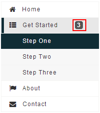
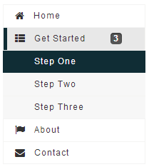
This property set the badge text for the Nav,it is used to present more details of Nav. For example, a Nav with label "Get Started" contains three Navitem components. If we want to let user know how much items in the Nav without opening it, we can show the children numbers of current Nav by setBadgeText(String) API. The code snippets as shown below:

|
<nav label="Get Started" iconSclass="z-icon-th-list" badgeText="3">
	<navitem label="Step One" />
	<navitem label="Step Two" />
	<navitem label="Step Three" />
</nav>
|
Supported Events
onOpen |
Event: OpenEvent
Denotes user has opened or closed a nav component. |
- Inherited Supported Events: LabelImageElement
Supported Children
* Nav, Navitem, Navseparator
Use Cases
| Version | Description | Example Location |
|---|---|---|
Version History
| Version | Date | Content |
|---|---|---|
| 7.0.0 | August, 2013 | Nav was introduced. |
