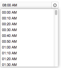
Timepicker"
m ((via JWB)) |
|||
| (4 intermediate revisions by the same user not shown) | |||
| Line 2: | Line 2: | ||
= Timepicker = | = Timepicker = | ||
| − | + | {{versionSince| 8.0.0}} | |
| + | {{ZK EE}} | ||
*Java API: <javadoc>org.zkoss.zkmax.zul.Timepicker</javadoc> | *Java API: <javadoc>org.zkoss.zkmax.zul.Timepicker</javadoc> | ||
*JavaScript API: <javadoc directory="jsdoc">zkmax.inp.Timepicker</javadoc> | *JavaScript API: <javadoc directory="jsdoc">zkmax.inp.Timepicker</javadoc> | ||
| Line 17: | Line 18: | ||
<source lang="xml" > | <source lang="xml" > | ||
| − | + | <timepicker/> | |
| − | |||
| − | |||
</source> | </source> | ||
| + | |||
| + | {{IntegrateMomentjs}} | ||
=Properties= | =Properties= | ||
| Line 37: | Line 38: | ||
</zk></source> | </zk></source> | ||
| − | In addition to specifying the format explicitly, you could specify the styling | + | {{VersionSince| 5.0.7}} In addition to specifying the format explicitly, you could specify the styling. There are two different types of styling: short, and medium (representing the styling of java.text.DateFormat). For example, you could specify the styling rather than the real format as follows. |
<source lang="xml"> | <source lang="xml"> | ||
| Line 45: | Line 46: | ||
Then the real format of the timepicker will be decided at run time depending the configuration. For more information, please refer to [[ZK Developer's Reference/Internationalization/Date and Time Formatting|ZK Developer's Reference: Date and Time Formatting]]. | Then the real format of the timepicker will be decided at run time depending the configuration. For more information, please refer to [[ZK Developer's Reference/Internationalization/Date and Time Formatting|ZK Developer's Reference: Date and Time Formatting]]. | ||
| − | |||
| − | |||
| − | |||
| − | |||
| − | |||
== Minimum Time == | == Minimum Time == | ||
Latest revision as of 09:33, 28 December 2023
Timepicker
Since 8.0.0
- Available for ZK:
-

- Java API: Timepicker
- JavaScript API: Timepicker
- Style Guide: Timepicker
Employment/Purpose
A selection box for holding a time (a java.util.Date Object) , but only Hour, Minute, and Second are used.
Example
<timepicker/>
Integrate Moment.js
Since 8.5.1 The JavaScript widgets including Datebox,Timebox,Timepicker rely on moment.js and moment-timezone.js to handle time zone information more accurately.
To check the included moment.js version, enter zk.mm.version in the browser developer console tab.
Properties
Format
Use a to signify it is am or pm. The input string follows the formatting of the SimpleDateFormat.
Below is an example of using a within the format.
<zk>
	<window title="Test">
		<timepicker format="a hh:mm:ss"/>
	</window>
</zk>
Since 5.0.7 In addition to specifying the format explicitly, you could specify the styling. There are two different types of styling: short, and medium (representing the styling of java.text.DateFormat). For example, you could specify the styling rather than the real format as follows.
<timepicker format="short"/>
<timepicker format="medium"/>
Then the real format of the timepicker will be decided at run time depending the configuration. For more information, please refer to ZK Developer's Reference: Date and Time Formatting.
Minimum Time
By default, the options of timepicker start at 0:00 AM, you could specify another minimum time by using a java.util.Date Object.
<zscript>
	import java.util.Date;
	Date min = new Date();
	min.setTime(0);
</zscript>
<timepicker format="HH:mm a" min="${min}" />
Maximum Time
By default, the options of timepicker end before 12:00 AM, you could specify another maximum time by using a java.util.Date Object.
<zscript>
	import java.util.Date;
	Date max = new Date();
	max.setTime(0);
</zscript>
<timepicker format="HH:mm a" max="${max}" />
Interval
By default, the interval of the options in timepicker is one hour, you could specify the interval by using an integer (unit: 1 second).
<timepicker format="HH:mm a" interval="600" />
Inherited Functions
Please refer to FormatInputElement for inherited functions.
Supported Events
| None | None |
- Inherited Supported Events: FormatInputElement
Supported Children
*NONE
Use Cases
| Version | Description | Example Location |
|---|---|---|
Version History
| Version | Date | Content |
|---|---|---|
