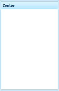
Default (Center)"
From Documentation
m |
Jumperchen (talk | contribs) |
||
| (One intermediate revision by the same user not shown) | |||
| Line 6: | Line 6: | ||
=Source= | =Source= | ||
| − | |||
{{CSSSource | {{CSSSource | ||
| − | | url= | + | | url=zul/src/archive/web/js/zul/layout/css/borderlayout.css.dsp |
| − | | control= | + | | control=Center |
|}} | |}} | ||
| Line 54: | Line 53: | ||
background:transparent repeat-x 0 0; | background:transparent repeat-x 0 0; | ||
| − | background-image: url(${c:encodeURL('~. | + | background-image: url(${c:encodeURL('~./zul/img/layout/borderlayout-hm.png')}); |
white-space: nowrap; | white-space: nowrap; | ||
Latest revision as of 06:21, 13 September 2010
This is the Default (Center) mold for Borderlayout.
Source
The CSS source for Center from GitHub
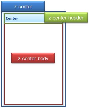
Structure
Events
| CSS\Action | Normal (Open) | Hover | Click, Select, and Drag. | Focus | Focus and Hover | Disable |
| Naming: | .z-center | |||||
| Supported: | V |
CSS Specification
| Class Name | Description | Default Values |
| .z-center | Border and background | border: 1px solid #9ECAD8;
position: absolute; overflow: hidden; background-color: white; |
| .z-center-header | Background of header | color: #0F3B82;
font: normal 11px tahoma, arial, verdana, sans-serif; font-weight:bold; padding: 5px 3px 4px 5px; border-bottom: 1px solid #9ecad8; background:transparent repeat-x 0 0; background-image: url(${c:encodeURL('~./zul/img/layout/borderlayout-hm.png')}); white-space: nowrap; overflow: hidden; line-height: 15px; zoom: 1; |
| .z-center-noborder | No border | border:0; |

