Default"
From Documentation
m |
m (→Structure) |
||
| (One intermediate revision by one other user not shown) | |||
| Line 6: | Line 6: | ||
=Source= | =Source= | ||
| + | |||
{{CSSSource | {{CSSSource | ||
| − | | url= | + | | url=/zul/src/archive/web/js/zul/box/css/box.css.dsp |
| − | | control= | + | | control=Hbox |
|}} | |}} | ||
=Structure= | =Structure= | ||
| − | [[Image: | + | [[Image:Hboxone.png]] |
| − | [[Image: | + | [[Image:Hboxtwo.png]] |
=Events= | =Events= | ||
Latest revision as of 06:47, 20 September 2010
This is the Default mold for Hbox.
Source
The CSS source for Hbox from GitHub
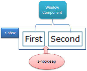
Structure
Events
| CSS\Action | Normal (Open) | Hover | Click, Select, and Drag. | Focus | Focus and Hover | Disable |
| Naming: | .z-hbox | |||||
| Supported: | V |
Note: An exclamation mark(!) means that the action effect is done by CSS background , not CSS background-position
CSS Specification
| Class Name | Description | Default Values |
| td.z-hbox-sep | Width of separator | width: 0.3em; padding: 0; margin: 0; |
