Rating"
| (One intermediate revision by the same user not shown) | |||
| Line 3: | Line 3: | ||
= Rating = | = Rating = | ||
| − | *Java API: <javadoc>org.zkoss | + | *Java API: <javadoc>org.zkoss.zul.Rating</javadoc> |
| − | *JavaScript API: <javadoc directory="jsdoc"> | + | *JavaScript API: <javadoc directory="jsdoc">zul.wgt.Rating</javadoc> |
{{versionSince| 8.6.0}} | {{versionSince| 8.6.0}} | ||
| Line 37: | Line 37: | ||
</source> | </source> | ||
| − | =Properties | + | =Properties= |
==IconSclass== | ==IconSclass== | ||
| − | Specify the | + | Specify the CSS class name of the rating icon. |
==Orient== | ==Orient== | ||
| Line 47: | Line 47: | ||
==Rating== | ==Rating== | ||
| − | This is the rating value, | + | This is the rating value, which has an initial value if specified to an integer larger than 0. |
==Cancelable== | ==Cancelable== | ||
| − | If true, by clicking the | + | If true, by clicking the previously rated icon again, the rating will be canceled and set to 0. |
==Max== | ==Max== | ||
| − | Represents the maximum number of | + | Represents the maximum number of ratings. Also, icons will be rendered as the max size. |
==Disabled== | ==Disabled== | ||
Latest revision as of 09:27, 19 September 2022
Rating
Since 8.6.0
Employment/Purpose
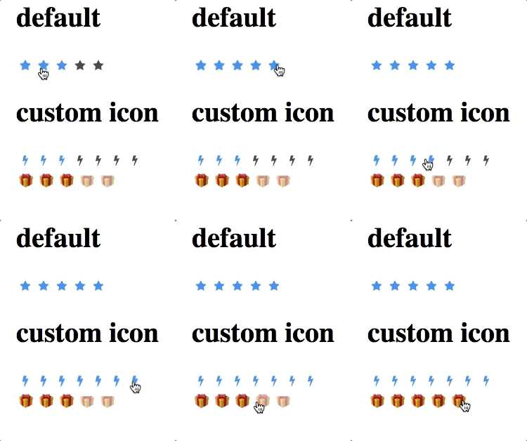
The rating component is a component that allows user selecting an rate that is smaller than the maximum number.
Examples
Default
<rating rating="3"/>
Custom Icon
<rating iconSclass="z-icon-bolt"/>
CSS
    <style>
        .myGiftIcon:before {
            content: '🎁';
        }
        .gift .z-rating-icon{
            opacity: 0.5;
        }
        .gift .z-rating-selected, .gift .z-rating-hover{
            opacity: 1;
        }
    </style>
    <rating iconSclass="myGiftIcon" sclass="gift" rating="3"/>
Properties
IconSclass
Specify the CSS class name of the rating icon.
Orient
The orientation is default to horizontal, could be changed to vertical if vertical is specified.
Rating
This is the rating value, which has an initial value if specified to an integer larger than 0.
Cancelable
If true, by clicking the previously rated icon again, the rating will be canceled and set to 0.
Max
Represents the maximum number of ratings. Also, icons will be rendered as the max size.
Disabled
If disabled is true, it's not allowed to be rated. (Is allowed to have an initial rating.)
Readonly
If true, the rating is only readable, not changeable. (Is allowed to have an initial rating.)
Supported Events
onChange |
Event: Event
Denotes user has rated. |
- Inherited Supported Events: XulElement
Supported Children
* none
Version History
| Version | Date | Content |
|---|---|---|
