Columns"
From Documentation
| (5 intermediate revisions by the same user not shown) | |||
| Line 20: | Line 20: | ||
[[Image:ZKComRef_Grid_Example.png]] | [[Image:ZKComRef_Grid_Example.png]] | ||
| − | < | + | <syntaxhighlight lang="xml" > |
<grid> | <grid> | ||
<columns sizable="true"> | <columns sizable="true"> | ||
| Line 47: | Line 47: | ||
</rows> | </rows> | ||
</grid> | </grid> | ||
| − | </ | + | </syntaxhighlight> |
=Properties= | =Properties= | ||
==Menupopup== | ==Menupopup== | ||
| − | By default, the | + | By default, the <code>none</code> is assumed, you can specify the <code>auto</code> to show a default menu on each column. Or you can provide your own menupopup for each column. |
===Auto=== | ===Auto=== | ||
[[Image:ZKComRef_Grid_Columns_Menu.png]] | [[Image:ZKComRef_Grid_Columns_Menu.png]] | ||
| Line 86: | Line 86: | ||
== Sizable == | == Sizable == | ||
| − | Specifies whether | + | Specifies whether a user is allowed to resize a column's width by dragging the vertical bar between two adjacent columns. |
| + | |||
| + | [[File:Sizable.png|center]] | ||
| − | + | === Double-Click to Auto-Fit === | |
| + | In additions to dragging, an end user can double-click on the vertical bar between two adjacent columns, such that the grid will automatically resize the column to fit its contents. In other words, all sizable column provides the auto-fitting feature. | ||
=Supported Events= | =Supported Events= | ||
Latest revision as of 03:17, 21 February 2023
Columns
- Demonstration: Grid (Simple Grid)
- Java API: Columns
- JavaScript API: Columns
- Style Guide: Columns
Employment/Purpose
Defines the columns of a grid.
Each child of a columns element should be a org.zkoss.zul.Column element.
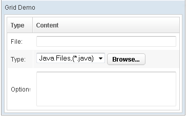
Example
    <grid>
        <columns sizable="true">
            <column label="Type" hflex="min"/>
            <column label="Content"/>
        </columns>
        <rows>
            <row>
                <label value="File:"/>
                <textbox width="99%"/>
            </row>
            <row>
                <label value="Type:"/>
                <hbox>
                    <listbox rows="1" mold="select">
                        <listitem label="Java Files,(*.java)"/>
                        <listitem label="All Files,(*.*)"/>
                    </listbox>
                    <button label="Browse..."/>
                </hbox>
            </row>
            <row>
                <label value="Options:"/>
                <textbox rows="3" width="99%"/>
            </row>
        </rows>
    </grid>
Properties
Menupopup
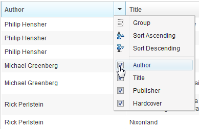
By default, the none is assumed, you can specify the auto to show a default menu on each column. Or you can provide your own menupopup for each column.
Auto
	<grid>
		<columns menupopup="auto">
			<column label="Author" sort="auto"/>
			<column label="Title" sort="auto"/>
			<column label="Publisher" sort="auto"/>
			<column label="Hardcover" sort="auto"/>
		</columns>
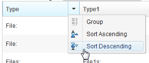
Customized Menupopup
<window title="Column's Menu Demo" border="normal" width="500px">
<menupopup id="editPopup">
<menuitem label="Group" image="~./zul/img/grid/menu-group.png"/>
<menuitem label="Sort Ascending" image="~./zul/img/grid/menu-arrowup.png"/>
<menuitem label="Sort Descending" image="~./zul/img/grid/menu-arrowdown.png"/>
</menupopup>
<grid>
<columns sizable="true" menupopup="editPopup">
<column id="col" label="Type" sortAscending="${asc}" sortDescending="${dsc}"/>
<column id="col1" label="Type1" sortAscending="${asc}" sortDescending="${dsc}"/>
<column id="col2" label="Content"/>
</columns>
</grid>
</window>
As you can see, the example above specify a customized menupopup to the columns as its column menu.
Sizable
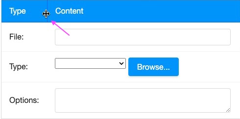
Specifies whether a user is allowed to resize a column's width by dragging the vertical bar between two adjacent columns.
Double-Click to Auto-Fit
In additions to dragging, an end user can double-click on the vertical bar between two adjacent columns, such that the grid will automatically resize the column to fit its contents. In other words, all sizable column provides the auto-fitting feature.
Supported Events
| None | None |
- Inherited Supported Events: HeadersElement
Supported Children
* Column
Use Cases
Version History
| Version | Date | Content |
|---|---|---|


