Tabbox"
| (2 intermediate revisions by the same user not shown) | |||
| Line 146: | Line 146: | ||
=Supported Orients= | =Supported Orients= | ||
| + | |||
{| class='wikitable' | width="100%" | {| class='wikitable' | width="100%" | ||
! <center>Name</center> | ! <center>Name</center> | ||
| Line 163: | Line 164: | ||
| | | | ||
[[Image:tabbox_orient_vertical-right.png ]] | [[Image:tabbox_orient_vertical-right.png ]] | ||
| − | |||
|- | |- | ||
| <center>bottom</center> | | <center>bottom</center> | ||
| | | | ||
[[Image:tabbox_orient_bottom.png ]] | [[Image:tabbox_orient_bottom.png ]] | ||
| − | |||
|} | |} | ||
| − | < | + | <syntaxhighlight lang='xml'> |
<tabbox orient="bottom"> | <tabbox orient="bottom"> | ||
</tabbox> | </tabbox> | ||
| − | < | + | </syntaxhighlight> |
| Line 182: | Line 181: | ||
*[[ZK_Component_Reference/Containers/Tabbox/Tabs | Tabs]], [[ZK_Component_Reference/Containers/Tabbox/Tabpanels | Tabpanels]], [[ZK Component Reference/Essential Components/Toolbar|Toolbar]] | *[[ZK_Component_Reference/Containers/Tabbox/Tabs | Tabs]], [[ZK_Component_Reference/Containers/Tabbox/Tabpanels | Tabpanels]], [[ZK Component Reference/Essential Components/Toolbar|Toolbar]] | ||
| − | |||
| − | |||
| − | |||
| − | |||
| − | |||
| − | |||
| − | |||
| − | |||
| − | |||
| − | |||
| − | |||
| − | |||
| − | |||
| − | |||
| − | |||
| − | |||
| − | |||
| − | |||
| − | |||
| − | |||
{{ZKComponentReferencePageFooter}} | {{ZKComponentReferencePageFooter}} | ||
Latest revision as of 08:25, 20 June 2024
Tabbox
Employment/Purpose
A tabbox is a container used to display a set of tabbed groups of components. A row of tabs is displayed at the top (or left or other location) of tabbox which may be used to switch between each group. It allows developers to separate a large number of components into several groups (each group is contained in a tabpanel). Only one group is visible at the time, such that the user interface won't be too complicate to read. Once the tab of an invisible group is clicked, it becomes visible and the previous visible group becomes invisible.
The visible group is called selected, which can be retrieved by use of Tabbox.getSelectedPanel() or Tabbox.getSelectedIndex().
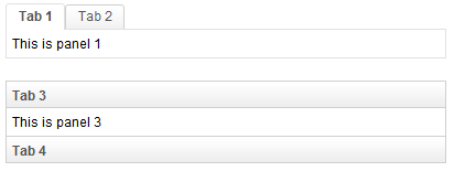
Example
<zk>
	<tabbox width="400px">
		<tabs>
			<tab label="Tab 1" />
			<tab label="Tab 2" />
		</tabs>
		<tabpanels>
			<tabpanel>This is panel 1</tabpanel>
			<tabpanel>This is panel 2</tabpanel>
		</tabpanels>
	</tabbox>
	<space />
	<tabbox width="400px" mold="accordion">
		<tabs>
			<tab label="Tab 3" />
			<tab label="Tab 4" />
		</tabs>
		<tabpanels>
			<tabpanel>This is panel 3</tabpanel>
			<tabpanel>This is panel 4</tabpanel>
		</tabpanels>
	</tabbox>
</zk>
Properties and Features
Toolbar in Tabbox
The Tabbox supports the inclusion of other controls within its tab bar, thus allowing more freedom and layout options when creating layouts which include a toolbar. The screenshot below demonstrates an example Tabbox which includes extra controls in the tab bar acting like a menu system.
Note: Toolbar in Tabbox only works in a horizontal(top/bottom) orient Tabbox.
<tabbox width="250px">
	<tabs>
		<tab label="Tab 1" closable="true" />
		<tab label="Tab 2" closable="true" />
		<tab label="Tab 3" closable="true" />
		<tab label="Tab 4" closable="true" />
		<tab label="Tab 5" closable="true" />
	</tabs>
	<toolbar>
		<toolbarbutton image="/img/live.gif" onClick='alert("Live")' />
		<toolbarbutton image="/img/defender.gif"
			onClick='alert("Defender")' />
		<toolbarbutton image="/img/battery.gif"
			onClick='alert("Battery")' />
	</toolbar>
	<tabpanels>
		<tabpanel>This is panel 1</tabpanel>
		<tabpanel>This is panel 2 The second panel</tabpanel>
		<tabpanel>This is panel 3</tabpanel>
		<tabpanel>This is panel 4</tabpanel>
		<tabpanel>This is panel 5</tabpanel>
	</tabpanels>
</tabbox>
MaximalHeight
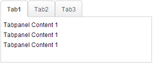
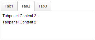
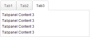
Since 7.0.0 In order to solve the problem where each tabpanel have different heights, we offer this feature called MaximalHeight. With this feature, every Tabpanel will be applied the maximum height among all the tabpanels i.e. if one tabpanel's height is at 300px while the rest is at 240px, all of the tabpanels will be applied with a height of 300px. This feature only works in the initial phase. The screenshot below demonstrates an example Tabbox which includes 3 tabpanels and all of them use the maximum height.
Note: The Client ROD feature will be disabled if it is set to true.
<tabbox maximalHeight="true" width="300px">
	<tabs id="tabs0">
		<tab label="Tab1" />
		<tab label="Tab2" />
		<tab label="Tab3" />
	</tabs>
	<tabpanels id="pnls0">
		<tabpanel>
			<div>Tabpanel Content 1</div>
			<div>Tabpanel Content 1</div>
			<div>Tabpanel Content 1</div>
		</tabpanel>
		<tabpanel>
			<div>Tabpanel Content 2</div>
			<div>Tabpanel Content 2</div>
		</tabpanel>
		<tabpanel>
			<div>Tabpanel Content 3</div>
			<div>Tabpanel Content 3</div>
			<div>Tabpanel Content 3</div>
			<div>Tabpanel Content 3</div>
		</tabpanel>
	</tabpanels>
</tabbox>
Supported Events
| Event: SelectEvent
|
- Inherited Supported Events: XulElement
Supported Molds
Available molds of a component are defined in lang.xml embedded in zul.jar.

| |

| |
 Deprecated Since 7.0.0 Deprecated Since 7.0.0
|
Supported Orients
<tabbox orient="bottom">
</tabbox>
- Since 7.0.0 Rename orient "horizontal" to "top", "vertical" to "left" and add extra two orients named "bottom" and "right"
Supported Children
* Tabs, Tabpanels, Toolbar


