Enhancing Design Collaboration: The ZK Figma Kit for Seamless Web App Development"
m (→Introduction) |
m |
||
| (7 intermediate revisions by the same user not shown) | |||
| Line 1: | Line 1: | ||
{{Template:Smalltalk_Author | {{Template:Smalltalk_Author | ||
| − | |author= | + | |author= Jean Yen, Customer Care |
| − | |date= | + | |date= Nov. 25, 2024 |
|version=1.0-Beta}} | |version=1.0-Beta}} | ||
| Line 12: | Line 12: | ||
[[File:ZK-figma-overview.png||center|ZK Framework UI Kit]] | [[File:ZK-figma-overview.png||center|ZK Framework UI Kit]] | ||
| + | |||
[[File:ZK-figma-overview2.png||center|ZK Framework UI Kit]] | [[File:ZK-figma-overview2.png||center|ZK Framework UI Kit]] | ||
| Line 32: | Line 33: | ||
=== Migrate from an older Theme === | === Migrate from an older Theme === | ||
| − | If you are using an older ZK version with a deprecated theme (e.g., Breeze, Silvertail, or | + | If you are using an older ZK version with a deprecated theme (e.g., Breeze, Silvertail, Sapphire, or Atlantic) and wish to maintain a similar look and feel when upgrading to ZK 10, you can use the ZK UI kit to experiment with your theme's color schemes. This allows you to preview and adjust the colors. Please note that only color schemes will be applied; structural changes, such as gradients, will not be included. |
== Dynamic Status Representation with Variable Controls == | == Dynamic Status Representation with Variable Controls == | ||
| − | The kit supports variable-controlled component states—such as hover, checked, and collapsed/expanded—allowing designers to represent different UI states accurately and flexibly. | + | The kit supports variable-controlled component states—such as hover, checked, and collapsed/expanded—allowing designers to represent different UI states accurately and flexibly. [https://youtu.be/2FU0b6pVjOI View the demo here]. |
| − | |||
| − | [ | ||
== Advanced Customization Options == | == Advanced Customization Options == | ||
| − | For advanced customization, designers can detach components to make detailed modifications, ensuring designs meet specific project requirements and preferences. | + | For advanced customization, designers can detach components to make detailed modifications, ensuring designs meet specific project requirements and preferences. [https://youtu.be/8uF4J6c3ENE View the demo here]. |
= Typical Workflow: Designers and Developers Working Together = | = Typical Workflow: Designers and Developers Working Together = | ||
| Line 49: | Line 48: | ||
== Download == | == Download == | ||
| − | Download the ZK Framework UI Kit (Figma) here | + | Download the [https://zkoss.org/zkdownload/startEvalFileDownload?id=396847541 ZK Framework UI Kit (Figma) here >>] |
= Summary = | = Summary = | ||
Latest revision as of 16:45, 22 November 2024
Jean Yen, Customer Care
Nov. 25, 2024
1.0-Beta
Introduction
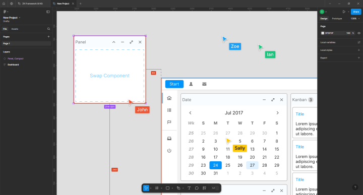
In the world of web application development, collaboration between designers and developers has become more essential than ever. While ZK developers traditionally focused on directly building UIs, today, many companies employ dedicated design teams to lay out the visual aspects of their applications.
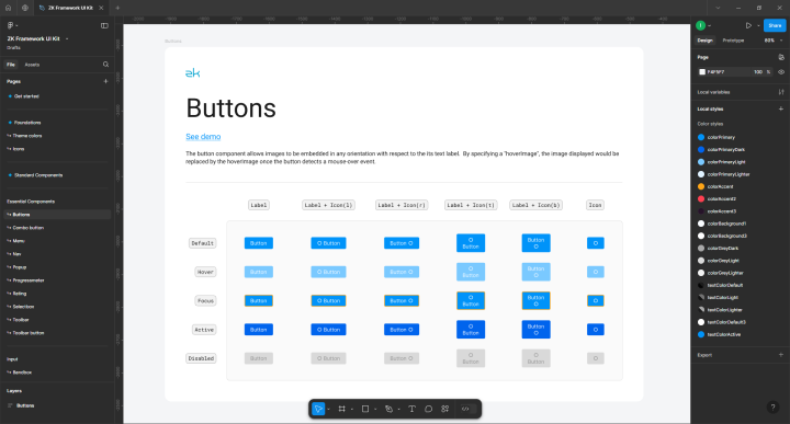
To support this, we’re excited to introduce the ZK Framework UI Kit — a design-ready Figma file packed with all our core UI components, making it easy for design teams to create detailed, functional layouts. With this kit, designers can craft comprehensive UI plans in Figma that developers can seamlessly bring to life, ensuring a smooth and efficient transition from design to deployment.
Key Features
Ready-to-Use Figma File for ZK Components
The ZK Framework UI Kit is a comprehensive, ready-to-use resource that includes all core ZK components, giving designers everything they need to create layouts that developers can easily follow.
Support for Both Standard and Compact Themes
The kit comes with ZK’s two most popular themes: Iceblue (iceblue) and Iceblue Compact (iceblue_c). Designers can experiment with both the standard and compact components to determine the best fit for their project’s needs.
Custom Theme
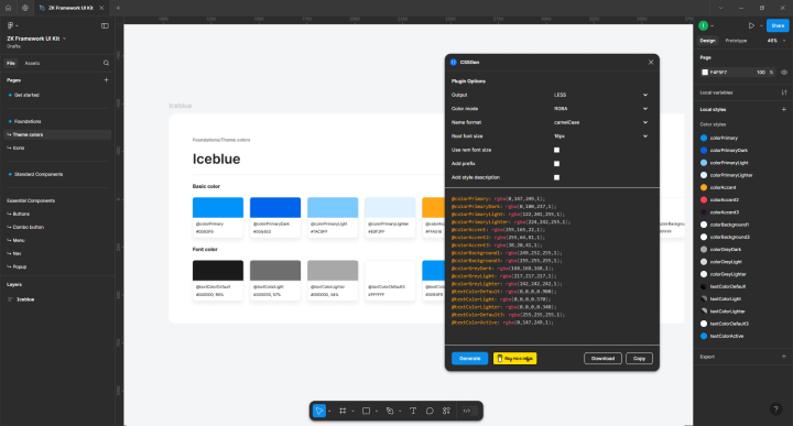
In this kit, colors are set up as local styles, making it easy to experiment with different colors and apply a custom theme to match corporate or project branding. These styles map directly to the CSS/LESS files used in the application, simplifying the developer’s work once the designer defines the custom colors.
For theme customization, ZK developers use the zkThemeTemplate tool. By overriding existing LESS variables with new styles, developers can efficiently apply the custom theme.
Once local styles are updated in the ZK Framework UI Kit, developers can extract customized styles by using plugins, for example, CSSGen. Developers can then copy and paste these styles into zkThemeTemplate, ensuring a smooth implementation of the new theme.
Migrate from an older Theme
If you are using an older ZK version with a deprecated theme (e.g., Breeze, Silvertail, Sapphire, or Atlantic) and wish to maintain a similar look and feel when upgrading to ZK 10, you can use the ZK UI kit to experiment with your theme's color schemes. This allows you to preview and adjust the colors. Please note that only color schemes will be applied; structural changes, such as gradients, will not be included.
Dynamic Status Representation with Variable Controls
The kit supports variable-controlled component states—such as hover, checked, and collapsed/expanded—allowing designers to represent different UI states accurately and flexibly. View the demo here.
Advanced Customization Options
For advanced customization, designers can detach components to make detailed modifications, ensuring designs meet specific project requirements and preferences. View the demo here.
Typical Workflow: Designers and Developers Working Together
- The designer creates the web app layout using the ZK Framework UI Kit. Start by experimenting and choosing between the Standard and the Compact Components. Once the theme is decided, use all components from the same group (do not mix Standard and Compact components).
- Layout your pages. Customize details such as colors, spacing, and margins.
- Internal approval of the design, if required.
- The developer follows the Figma file to build the web application. Local styles can be exported and applied to the LESS file (refer to Custom Theme above).
Download
Download the ZK Framework UI Kit (Figma) here >>
Summary
The ZK UI Kit is designed to simplify collaboration between designers and developers, enabling the creation of robust and visually appealing applications. This is our first version of the kit, and we’re committed to continuously improving it based on your feedback. We invite you to try it out, see how it enhances your productivity, and let us know any ideas or suggestions you may have at info@zkoss.org.
Comments
| Copyright © Potix Corporation. This article is licensed under GNU Free Documentation License. |


