Panel"
Jumperchen (talk | contribs) |
Jumperchen (talk | contribs) |
||
| Line 102: | Line 102: | ||
|} | |} | ||
| − | *Inherited Supported Events: [[ZK_Component_Reference/Base_Components/ | + | *Inherited Supported Events: [[ZK_Component_Reference/Base_Components/XulElement#Supported_Events | XulElement]] |
=Supported Children= | =Supported Children= | ||
Revision as of 10:16, 11 November 2010
Panel
Employment/Purpose
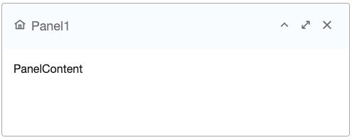
Panel is a container that has specific functionality and structural components that make it the perfect building block for application-oriented user interfaces. The Panel contains bottom, top, and foot toolbars, along with separate header, footer and body sections. It also provides built-in collapsible, closable, maximizable, and minimizable behavior, along with a variety of pre-built tool buttons that can be wired up to provide other customized behavior. Panels can be easily embedded into any kind of ZUL component that is allowed to have children or layout component. Panels also provide specific features like float and move. Unlike Window, Panels can only be floated and moved inside its parent node, which is not using zk.setVParent() function at client side. In other words, if Panel's parent node is an relative position, the floated panel is only inside its parent, not the whole page. The second difference of Window is that Panel is not an independent ID space (by implementing IdSpace), so the ID of each child can be used throughout the panel.
Draggable
When used with Portallayout, the draggable property (HtmlBasedComponent.setDraggable(String)) can be used to control whether the panel is draggable under the portal layout.
Note: this feature is available since 5.0.3.
Example
<panel height="100px" width="200px" style="margin-bottom:10px"
     title="Panel1" border="normal" maximizable="true"
     collapsible="true">
     <panelchildren>PanelContent1</panelchildren>
</panel>
<panel height="100px" width="200px" framable="true" title="Panel2"
     border="normal" maximizable="true" style="margin-bottom:10px">
     <panelchildren>PanelContent2</panelchildren>
</panel>
Supported Events
| Event: MoveEvent
Denotes the position of the window is moved by a user. | |
| Event: OpenEvent
Denotes user has opened or closed a component. Note: Unlike onClose, this event is only a notification. The client sends this event after opening or closing the component. It is useful to implement load-on-demand by listening to the onOpen event, and creating components when the first time the component is opened. | |
| Event: MaximizeEvent
Denotes user has maximize a component. | |
| Event: MinimizeEvent
Denotes user has minimize a component. | |
| Event: OpenEvent
Denotes the close button is pressed by a user, and the component shall detach itself.
| |
| Event: SizeEvent
Denotes the panel's size is updated by a user. | |
| Event: ZIndexEvent
Denotes the panel's zindex is updated by a user. |
- Inherited Supported Events: XulElement
Supported Children
* Panel_Children
Use Cases
| Version | Description | Example Location |
|---|---|---|
| 5.0 | Portallayout, panels and events | http://www.zkoss.org/forum/listComment/10765 |
Version History
| Version | Date | Content |
|---|---|---|
| 5.0.3 | July, 2010 | The draggable property can be used to control the drag-ability in a portal layout. |
