Window"
(→Modal) |
(→Highlighted: removed) |
||
| Line 99: | Line 99: | ||
[[File:Modalwindow.png]] | [[File:Modalwindow.png]] | ||
| − | |||
| − | |||
| − | |||
| − | |||
| − | |||
| − | |||
| − | |||
| − | |||
| − | |||
| − | |||
| − | |||
| − | |||
| − | |||
| − | |||
== Modal Windows and Event Listeners == | == Modal Windows and Event Listeners == | ||
Revision as of 02:54, 15 November 2010
Window
Employement/Purpose
A window is, like HTML DIV tag, used to group components. Unlike other components, a window has the following characteristics.
- A window is an owner of an ID space. Any component contained in a window, including itself, could be found by use of the getFellow method, if it is assigned with an identifier.
- A window could be overlapped, popup, and embedded.
- A window could be a modal dialog.
Example
<hbox>
    <window title="Embedded Style" border="normal" width="200px"> Hello,
        Embedded! </window>
    <window title="Overlapped Style" zclass="z-window-overlapped" border="normal"
        width="200px"> Hello, Overlapped! </window>
    <window title="Popup Style" zclass="z-window-popup" border="normal"
        width="200px"> Hello, Popup! </window>

    <window title="Modal Style" zclass="z-window-modal" border="normal"
        width="200px"> Hello, Modal! </window>
    <window title="Highlight Style" zclass="z-window-highlighted" border="normal"
        width="200px"> Hello, Highlighted! </window>
</hbox>
Window Modes
A window could be in one of five different modes: overlapped, popup, modal, highlighted and embedded. By default, it is in the embedded mode. You could change the mode by use of Window.setMode(String).
<window title="Hi, I'm Overlapped" border="normal" mode="overlapped">
...
</window>
Alternatively, you could invoke one of Window.doOverlapped(), Window.doPopup(), Window.doModal(), Window.doHighlighted(), and Window.doEmbedded(), as shown below.
<zk>
    <window id="win" title="Hi!" border="normal" width="200px">
        <caption>
            <toolbarbutton label="Close" onClick="win.setVisible(false)"/>
        </caption>
        <checkbox label="Hello, Wolrd!"/>
    </window>

    <button label="Overlap" onClick="win.doOverlapped();"/>
    <button label="Popup" onClick="win.doPopup();"/>
    <button label="Modal" onClick="win.doModal();"/>
    <button label="Embed" onClick="win.doEmbedded();"/>
    <button label="Highlighted" onClick="win.doHighlighted();"/>
</zk>
Embedded
An embedded window is placed inline with other components. In this mode, you cannot change its position, since the position is decided by the browser. It is the default mode since it is the most common appearance.
Overlapped
An overlapped window is overlapped with other components, such that users could drag it around and developer could set its position by Window.setLeft(String) and Window.setTop(String).
<window title="My Overlapped" width="300px" mode="overlapped">
</window>
Popup
A popup window is similar to overlapped windows, except it is automatically closed when user clicks on any component other than the popup window itself or any of its descendants. As its name suggested, it is designed to implement the popup windows. A typical application is to display information that won't obscure the current operation and are easy to close. A popup window is usually position around the focal point (such as a button). It can be done by use of Window.setPosition(String) with parent.
For example, we could display a popup window right after a button as depicted below.
<zk>
    <toolbarbutton label="More info" onClick="info.doPopup()"/><span>
    <window id="info" visible="false" width="120px" border="normal" position="parent">
    Here is more information
    </window>
    </span>
</zk>
where we specify position="parent", and make it as a child of Span. The span component acts as an anchor point and the window is posited based on it.
In additions to popup windows, you could use Popup for displaying a popup. The popup component has more control how to position it (by use of Popup.open(Component, String)).
Modal and Highlighted
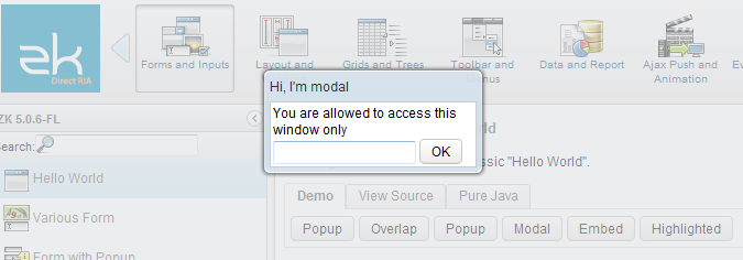
By default, a modal window is the same as a highlighted window. It provides a so-called modal effect that only components in the modal window are accessible. Users cannot access anything outside of the modal window, including clicking or tabbing.
Modal Windows and Event Listeners
Unlike other modes, you can only put a window into the modal mode in an event listener. In other words, you can invoke doModal() or setMode("modal") in an event listener.
<zk>
    <window id="wnd" title="My Modal" visible="false" width="300px">
        <button label="close" onClick="wnd.visible = false"/>
    </window>
    <button label="do it" onClick="wnd.doModal()"/>
</zk>
On the other hand, the following is wrong if it executes in the Component Creation Phase
//t1.zul
<window title="My Modal" width="300px" closable="true">
    <zscript>
        self.doModal();
    </zscript>
</window>
It will cause the following result if you browse it directly.
If you need to create a modal window in page loading, you can post the onModal event as follows.
//t2.zul
<window title="My Modal" width="300px" closable="true">
    <zscript>
    Events.postEvent("onModal", self, null);
    </zscript>
</window>
Or use this instead.
//t3.zul
<window title="My Modal" width="300px" closable="true" mode="modal">
</window>
Note: the following codes execute correctly even if t1.zul sets the window's mode to modal directly (as shown above). Why? It executes in an event listener (for onClick).
<button label="do it">
    <attribute name="onClick">
    Executions.createComponents("t1.zul", null, null);
        //it loads t1.zul in this event listener for onClick
    </attribute>
</button>
Supported Events
| Event: Event
Denotes the position of the window is moved by a user. | |
| Event: OpenEvent
Denotes user has opened or closed a component. Note: Unlike onClose, this event is only a notification. The client sends this event after opening or closing the component. It is useful to implement load-on-demand by listening to the onOpen event, and creating components when the first time the component is opened. | |
| Event: Event
Denotes the close button is pressed by a user, and the component shall detach itself. | |
| Event: MaximizeEvent
Denotes user has maximize a component. | |
| Event: MinimizeEvent
Denotes user has minimize a component. | |
| Event: SizeEvent
Denotes the panel's size is updated by a user. | |
| Event: ZIndexEvent
Denotes the panel's zindex is updated by a user. |
- Inherited Supported Events: XulElement
Supported Children
*ALL
Use Cases
| Version | Description | Example Location |
|---|---|---|
| 5.0+ | How to create a modal Window and communicate with it | http://www.zkoss.org/forum/listComment/9785 |
| 3.6+ | Best practises on creating a pop-up window to display PDF reports | http://www.zkoss.org/forum/listComment/9305 |
Version History
| Version | Date | Content |
|---|---|---|


