Panelchildren"
From Documentation
Jumperchen (talk | contribs) |
m ((via JWB)) |
||
| Line 30: | Line 30: | ||
=Supported Events= | =Supported Events= | ||
| − | {| | + | {| class='wikitable' | width="100%" |
! <center>Name</center> | ! <center>Name</center> | ||
! <center>Event Type</center> | ! <center>Event Type</center> | ||
| Line 48: | Line 48: | ||
=Version History= | =Version History= | ||
{{LastUpdated}} | {{LastUpdated}} | ||
| − | {| | + | {| class='wikitable' | width="100%" |
! Version !! Date !! Content | ! Version !! Date !! Content | ||
|- | |- | ||
Latest revision as of 11:04, 7 January 2022
Panel Children
- Demonstration: Panel
- Java API: Panelchildren
- JavaScript API: Panelchildren
- Style Guide: Panel
Employment/Purpose
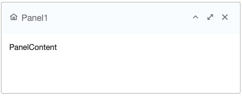
Panelchildren is used for Panel component to manage each child who will be shown in the body of Panel. Note that the size of Panelchildren is automatically calculated by Panel so both setWidth(String) and setHeight(String) are read-only.
Example
<panel height="100px" width="200px" style="margin-bottom:10px"
     title="Panel1" border="normal" maximizable="true"
     collapsible="true">
     <panelchildren>PanelContent1</panelchildren>
</panel>
<panel height="100px" width="200px" framable="true" title="Panel2"
     border="normal" maximizable="true" style="margin-bottom:10px">
     <panelchildren>PanelContent2</panelchildren>
</panel>
Supported Events
| None | None |
- Inherited Supported Events: XulElement
Supported Children
*ALL
Use Cases
Version History
| Version | Date | Content |
|---|---|---|
