New Features of ZK 5.0.3"
| Line 157: | Line 157: | ||
*[http://www.zkoss.org/download/zk.dsp Download ZK 5 here] | *[http://www.zkoss.org/download/zk.dsp Download ZK 5 here] | ||
*[http://www.zkoss.org/release/rn-5.0.3.dsp Take a look at ZK 5's release notes here] | *[http://www.zkoss.org/release/rn-5.0.3.dsp Take a look at ZK 5's release notes here] | ||
| − | *View the [ | + | *View the [[Small_Talks/2009/December/ZK_5:_Upgrade_Notes |ZK 5: Upgrade Notes]] and a real case: [[Small Talks/2010/April/Upgrading to ZK 5|Upgrading to ZK 5]] |
[[Category:ZK]] | [[Category:ZK]] | ||
Latest revision as of 03:11, 21 December 2010
Timothy Clare, Technology Evangelist, Potix Corporation
June 29th, 2010
ZK 5.0.3
ZK 5.0.3 is a maintenance release focusing on fixing some issues and introducing requested features. Requested features included Calendar day rendering along with hflex and vflex improvements.
Calendar Day Renderer
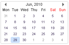
It is now possible to customize the appearance of days on ZK's Calendar. This is achieved by overriding the default renderer at the client.
An example: Customizing Calendar's disabled days
Not in the image, days belonging to the previous and next month are not black, they are a light shade of grey as indicated by the function disabled in the zul.db.Renderer.
For more information please consult the Renderer jsdoc.
Controlling whether a portallayout panel is draggable
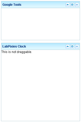
ZK 5.0.3 now affords us the ability to specify whether a portallayout panel can be drag-able or not. The code below demonstrates this functionality.
<portallayout>
   <portalchildren style="padding: 5px" width="30%">
      <panel height="150px" title="Google Tools" border="normal"
           collapsible="true" closable="true" maximizable="true"
           style="margin-bottom:10px">
         <panelchildren>

         </panelchildren>
      </panel>
      <panel height="300px" title="LabPixies Clock" border="normal"
           collapsible="true" closable="true" maximizable="true"
           style="margin-bottom:10px"
           draggable="false">
          <panelchildren>
             This is not draggable.
          </panelchildren>
      </panel>
   </portalchildren>
</portallayout>
Tabbox can auto grow
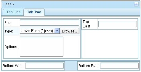
Assume we have two tabpanels, with one larger than the other. If the smaller is displayed first upon showing the new tabpanel the tabbox will now resize itself to accommodate the size of its contents. Below is the code and output.
<window id="tabView" title="Case 2" closable="true" hflex="min" width="500px">
	<borderlayout hflex="min" vflex="min">
		<north hflex="min" vflex="min">

			<tabbox hflex="min" vflex="min">
				<tabs>
					<tab label="Tab One"/>
					<tab label="Tab Two"/>
				</tabs>

				<tabpanels hflex="min" vflex="min">
				<!--
					<custom-attributes org.zkoss.zul.client.rod="false"/>
				 -->
					<tabpanel hflex="min" vflex="min">
						<grid hflex="min" vflex="min">
							<rows>
								<row>
									<label value="Top East"/>
									<textbox />
								</row>
							</rows>
						</grid>

					</tabpanel>
					<tabpanel hflex="min" vflex="min">
						<borderlayout hflex="min" vflex="min">
							<west hflex="min" vflex="min">
								<grid hflex="min" vflex="min">
								<rows>
								<row>
									<label value="File:"/>
									<textbox width="98%"/>
								</row>
								<row>
									<label value="Type:"/>
									<hbox>
										<listbox rows="1" mold="select">
											<listitem label="Java Files,(*.java)"/>
											<listitem label="All Files,(*.*)"/>
										</listbox>
										<button label="Browse..."/>
									</hbox>
								</row>
								<row>
									<label value="Options:"/>
									<textbox rows="3" hflex="min" vflex="min"/>
								</row>
								</rows>
								</grid>
							</west>
							<east hflex="min" vflex="min">
								<grid hflex="min" vflex="min">
								 	<rows>
										<row>
											<label value="Top East"/>
											<textbox />
										</row>
									</rows>
								</grid>

							</east>
						</borderlayout>

					</tabpanel>
				</tabpanels>
			</tabbox>
		</north>
		<center hflex="min" vflex="min">
		<borderlayout hflex="min" vflex="min">
			<west hflex="min" vflex="min">
				<grid hflex="min" vflex="min">
					<rows>
						<row>
							<label value="Bottom West"/>
							<textbox />
						</row>
					</rows>
				</grid>
			</west>
			<east hflex="min" vflex="min">
				<grid hflex="min" vflex="min">
					<rows>
						<row>
							<label value="Bottom East"/>
							<textbox />
						</row>
					</rows>
				</grid>
			</east>
		</borderlayout>
		</center>
	</borderlayout>
</window>
Download & other resources
- Download ZK 5 here
- Take a look at ZK 5's release notes here
- View the ZK 5: Upgrade Notes and a real case: Upgrading to ZK 5
Comments
| Copyright © Potix Corporation. This article is licensed under GNU Free Documentation License. |


