Tabbox"
m (→Features) |
m (→Properties) |
||
| Line 44: | Line 44: | ||
</source> | </source> | ||
| − | |||
=Properties and Features= | =Properties and Features= | ||
==Toolbar in Tabbox== | ==Toolbar in Tabbox== | ||
Revision as of 04:17, 18 January 2011
Tabbox
Employment/Purpose
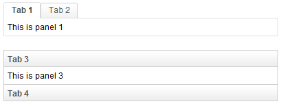
A tabbox is a container used to display a set of tabbed groups of components. A row of tabs is displayed at the top (or left or other location) of tabbox which may be used to switch between each group. It allows developers to separate a large number of components into several groups (each group is contained in a tabpanel). Only one group is visible at the time, such that the user interface won't be too complicate to read. Once the tab of an invisible group is clicked, it becomes visible and the previous visible group becomes invisible.
The visible group is called selected, which can be retrieved by use of Tabbox.getSelectedPanel() or Tabbox.getSelectedIndex().
Example
<zk>
	<tabbox width="400px">
		<tabs>
			<tab label="Tab 1" />
			<tab label="Tab 2" />
		</tabs>
		<tabpanels>
			<tabpanel>This is panel 1</tabpanel>
			<tabpanel>This is panel 2</tabpanel>
		</tabpanels>
	</tabbox>
	<space />
	<tabbox width="400px" mold="accordion">
		<tabs>
			<tab label="Tab 3" />
			<tab label="Tab 4" />
		</tabs>
		<tabpanels>
			<tabpanel>This is panel 3</tabpanel>
			<tabpanel>This is panel 4</tabpanel>
		</tabpanels>
	</tabbox>
</zk>
Properties and Features
Toolbar in Tabbox
The Tabbox supports the inclusion of other controls within its tab bar, thus allowing more freedom and layout options when creating layouts which include a toolbar. The screenshot below demonstrates an example Tabbox which includes extra controls in the tab bar acting like a menu system.
<tabbox width="250px">
	<tabs>
		<tab label="Tab 1" closable="true" />
		<tab label="Tab 2" closable="true" />
		<tab label="Tab 3" closable="true" />
		<tab label="Tab 4" closable="true" />
		<tab label="Tab 5" closable="true" />
	</tabs>
	<toolbar>
		<toolbarbutton image="/img/live.gif" onClick='alert("Live")' />
		<toolbarbutton image="/img/defender.gif"
			onClick='alert("Defender")' />
		<toolbarbutton image="/img/battery.gif"
			onClick='alert("Battery")' />
	</toolbar>
	<tabpanels>
		<tabpanel>This is panel 1</tabpanel>
		<tabpanel>This is panel 2 The second panel</tabpanel>
		<tabpanel>This is panel 3</tabpanel>
		<tabpanel>This is panel 4</tabpanel>
		<tabpanel>This is panel 5</tabpanel>
	</tabpanels>
</tabbox>
Supported Events
| Event: SelectEvent
|
- Inherited Supported Events: XulElement
Supported Molds
Available molds of a component are defined in lang.xml embedded in zul.jar.

| |

| |

|
Supported Children
* Tabs, Tabpanels, Toolbar
Use Cases
| Version | Description | Example Location |
|---|---|---|
| 5.0 | Tabbox can be used to display information on seperate panels and show only one panel a time. | http://www.zkoss.org/zkdemo/userguide/#l10 |
Version History
| Version | Date | Content |
|---|---|---|

