Hbox"
m (→Hbox) |
|||
| Line 12: | Line 12: | ||
The hbox component is used to create a horizontally oriented box. Each component placed in the hbox will be placed horizontally in a row. | The hbox component is used to create a horizontally oriented box. Each component placed in the hbox will be placed horizontally in a row. | ||
| − | Notice that hbox and vbox are designed to | + | Notice that hbox and vbox are designed to provide more sophisticated layout, such as splitter, alignment and packing. If you need only the layout feature, it is suggest to use [[ZK Component Reference/Layouts/Hlayout | Hlayout]] and [[ZK Component Reference/Layouts/Vlayout | Vlayout]] instead, since the performance is much better (due to the use of HTML DIV instead of TABLE). |
= Example = | = Example = | ||
Revision as of 10:13, 29 July 2011
Hbox
Employment/Purpose
The hbox component is used to create a horizontally oriented box. Each component placed in the hbox will be placed horizontally in a row.
Notice that hbox and vbox are designed to provide more sophisticated layout, such as splitter, alignment and packing. If you need only the layout feature, it is suggest to use Hlayout and Vlayout instead, since the performance is much better (due to the use of HTML DIV instead of TABLE).
Example
<zk>
	<vbox>
		<button label="Button 1" />
		<button label="Button 2" />
	</vbox>
	<hbox>
		<button label="Button 3" />
		<button label="Button 4" />
	</hbox>
</zk>
Properties
- Inherited Properties: Box
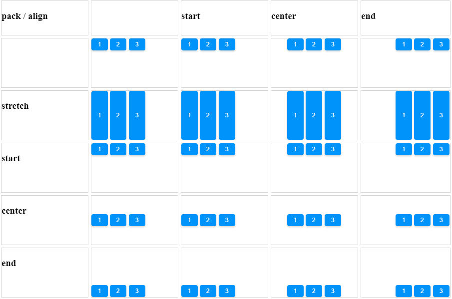
Align and Pack
<zk xmlns:n="http://www.zkoss.org/2005/zk/native">
	<zscript><![CDATA[
		Map map = new LinkedHashMap();
		String[] packs = new String[]{"", "start", "center", "end"};
		String[] aligns = new String[]{"", "stretch", "start", "center", "end"};

		for (int i = 0; i < packs.length; i++) {
			String pack = packs[i];
			List list = new ArrayList();
			for (int j = 0; j < aligns.length; j++) {
				list.add(aligns[j]);
			}
			map.put(pack, list);
		}

	]]></zscript>
	<tablelayout columns="6">
		<tablechildren >
			<panel border="normal" height="100px" width="100px"
				forEach='"align / pack", "", "stretch", "start", "center", "end"'>
				<panelchildren>
					<n:h3>${each}</n:h3>
				</panelchildren>
			</panel>
		</tablechildren>
		<tablechildren forEach="${map}">
			<variables key="${each.key}"/>
			<panel border="normal" height="100px" width="200px">
				<panelchildren>
					<n:h3>${key}</n:h3>
				</panelchildren>
			</panel>
			<panel border="normal" height="100px" width="200px" forEach="${each.value}" >
				<panelchildren>
					<hbox pack="${key}" align="${each}" height="90%" width="100%">
						<button label="1" />
						<button label="2" />
						<button label="3" />
					</hbox>
				</panelchildren>
			</panel>
		</tablechildren>
	</tablelayout>
</zk>
[Since 5.0.0]
Cell Component
In ZK5, we have introduced a new component named Cell which can be embedded into a Grid or Box (Hbox and Vbox) to fully control the layout and the style. You can now use the rowspan or the colspan property to layout your Grid, for example a content cell can now cross over multiple rows. The code below demonstrates how to do this:
<hbox>
    <cell sclass="years">
        ...
    </cell>
</hbox>
[Since 5.0.0]
Supported Events
| None | None |
- Inherited Supported Events: Box
Supported Children
*ALL
Use Cases
| Version | Description | Example Location |
|---|---|---|
Version History
| Version | Date | Content |
|---|---|---|

