Auxheader"
Jimmyshiau (talk | contribs) |
|||
| Line 117: | Line 117: | ||
[[File:Auxheader_rowspan_limitation02.jpg]] | [[File:Auxheader_rowspan_limitation02.jpg]] | ||
| − | The other limitation is that the width of the Auxheader component depend the Column component. Thus, if you'd like to specify the width in the Column component. However, it means it will take some space even if there are no label in all Column components. The workaround is simple: make the empty Columns component invisible. For example, | + | The other limitation is that the width of the Auxheader component depend on the Column component. Thus, if you'd like to specify the width in the Column component. However, it means it will take some space even if there are no label in all Column components. The workaround is simple: make the empty Columns component invisible. For example, |
<source lang="xml" high="11"> | <source lang="xml" high="11"> | ||
Revision as of 01:36, 1 August 2011
Auxheader
- Demonstration: Grid (Merged Header)
- Java API: Auxheader
- JavaScript API: Auxheader
- Style Guide: Auxhead
Employment/Purpose
The auxiliary headers support the colspan and rowspan properties which allows itself to be spanned across several columns/rows. Auxiliary headers should be accompanied with columns/listhead/treecols when used with grid/listbox/tree.
Example
An auxiliary header.
<grid>
	<auxhead>
		<auxheader label="H1'07" colspan="6" />
		<auxheader label="H2'07" colspan="6" />
	</auxhead>
	<auxhead>
		<auxheader label="Q1" colspan="3" />
		<auxheader label="Q2" colspan="3" />
		<auxheader label="Q3" colspan="3" />
		<auxheader label="Q4" colspan="3" />
	</auxhead>
	<columns>
		<column label="Jan" />
		<column label="Feb" />
		<column label="Mar" />
		<column label="Apr" />
		<column label="May" />
		<column label="Jun" />
		<column label="Jul" />
		<column label="Aug" />
		<column label="Sep" />
		<column label="Oct" />
		<column label="Nov" />
		<column label="Dec" />
	</columns>
	<rows>
		<row>
			<label value="1,000" />
			<label value="1,100" />
			<label value="1,200" />
			<label value="1,300" />
			<label value="1,400" />
			<label value="1,500" />
			<label value="1,600" />
			<label value="1,700" />
			<label value="1,800" />
			<label value="1,900" />
			<label value="2,000" />
			<label value="2,100" />
		</row>
	</rows>
</grid>
The Limitation of rowspan
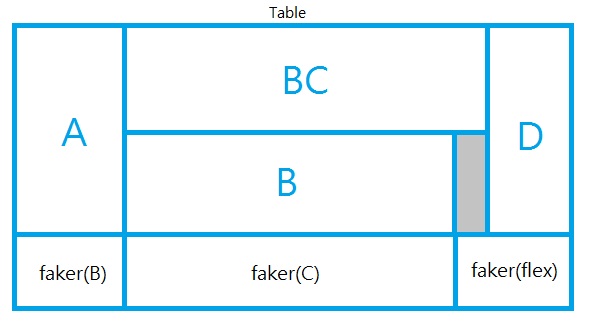
For better performance, every instance of Column will create an invisible HTML TH element called faker. However, with some complex combination of rowspan and colspan, Grid might not be able to generate the correct number of faker to represent each column.
For example, it is wrong if the number of the column components are not the same as the number of columns in each row as shown below:
<grid width="200px">
	<auxhead>
		<auxheader label="A" rowspan="2" />
		<auxheader label="BC" colspan="2" />
		<auxheader label="D" rowspan="2" />
	</auxhead>
	<columns><!-- this is wrong since the number of column components is smaller -->
		<column label="B"/>
		<column label="C"/>
	</columns>
	<rows>
		<row>
			<label forEach="E,F,G,H" value="${each}"/><!-- four columns -->
		</row>
	</rows>
</grid>
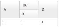
As shown above, the column with label C will be invisible, because the fakers are not created correctly. Here is the result but wrong DOM structure:
There is a simple workaround: specify all columns. If you don't want to show all columns, you could use Auxheader instead of Column, and then add an empty Columns. For example, the code in the previous example can be fixed as follows:
<grid width="200px">
	<auxhead>
		<auxheader label="A" rowspan="2" />
		<auxheader label="BC" colspan="2" />
		<auxheader label="D" rowspan="2" />
	</auxhead>
	<auxhead>
		<auxheader label="B"/>
		<auxheader label="C"/>
	</auxhead>
	<columns/> <!-- use an empty columns to make fakers created correctly -->
	<rows>
		<row>
			<label forEach="E,F,G,H" value="${each}"/>
		</row>
	</rows>
</grid>
The other limitation is that the width of the Auxheader component depend on the Column component. Thus, if you'd like to specify the width in the Column component. However, it means it will take some space even if there are no label in all Column components. The workaround is simple: make the empty Columns component invisible. For example,
<grid width="350px">
	<auxhead>
		<auxheader label="A" rowspan="2" />
		<auxheader label="BC" colspan="2" />
		<auxheader label="D" rowspan="2" />
	</auxhead>
	<auxhead>
		<auxheader label="B"/>
		<auxheader label="C"/>
	</auxhead>
	<columns visible="false"><!-- make it invisible -->
		<column width="100px"/><!-- specify width here -->
		<column width="150px"/>
		<column width="50px"/>
		<column width="50px"/>
	</columns>
	<rows>
		<row>
			<label forEach="E,F,G,H" value="${each}"/>
		</row>
	</rows>
</grid>
Supported Events
| None | None |
- Inherited Supported Events: XulElement
Supported Children
*ALL
Use Cases
| Version | Description | Example Location |
|---|---|---|
Version History
| Version | Date | Content |
|---|---|---|


