Cardlayout"
From Documentation
| Line 9: | Line 9: | ||
= Employment/Purpose = | = Employment/Purpose = | ||
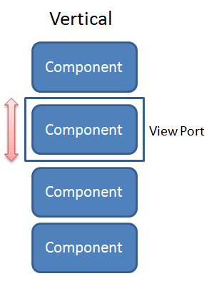
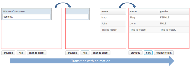
| − | <tt>Cardlayout</tt> is a layout that | + | <tt>Cardlayout</tt> is a layout that allows end-users to change component like changing cards. The <tt>selectedIndex</tt> will decide which component will be shown in the view port. When the value of <tt>selectedIndex</tt> changes or when <tt>next()</tt> or <tt>previous()</tt> is called, transition of components through animation will occur whereas the <tt>orient</tt> attribute decides the direction of the animation whether it is horizontal or vertical. |
[[Image:ZKComRef_Cardlayout_Horizontal.png]] | [[Image:ZKComRef_Cardlayout_Horizontal.png]] | ||
Revision as of 09:04, 16 August 2012
Cardlayout
- Demonstration: N/A
- Java API: Cardlayout
- JavaScript API: Cardlayout
- Style Guide: N/A
- Available for ZK:
-

Employment/Purpose
Cardlayout is a layout that allows end-users to change component like changing cards. The selectedIndex will decide which component will be shown in the view port. When the value of selectedIndex changes or when next() or previous() is called, transition of components through animation will occur whereas the orient attribute decides the direction of the animation whether it is horizontal or vertical.
Example
	<cardlayout id="card" width="300px" height="200px" style="border:1px solid red" selectedIndex="1">
		<div vflex="1" hflex="1" style="background-color:yellow;padding:20px">flex component</div>
		<window title="Window Component" border="normal" width="250px">content...</window>
		<listbox>
			<listhead sizable="true">
				<listheader label="name" sort="auto" />
				<listheader label="gender" sort="auto" />
			</listhead>
			<listitem>
				<listcell label="Mary" />
				<listcell label="FEMALE" />
			</listitem>
			<listitem>
				<listcell label="John" />
				<listcell label="MALE" />
			</listitem>
			<listfoot>
				<listfooter>
					<label value="This is footer1" />
				</listfooter>
				<listfooter>
					<label value="This is footer2" />
				</listfooter>
			</listfoot>
		</listbox>
	</cardlayout>
	<hlayout>
		<button onClick="card.previous()">previous</button>
		<button onClick="card.next()">next</button>
		<button onClick='card.setOrient("horizontal".equals(card.getOrient()) ? "vertical" : "horizontal")'>change orient</button>
	</hlayout>
Size Issue
If Cardlayout set hflex="min", it's width will decide by initial selected component size. On the other hand, if the child component of Cardlayout set hflex="1", it's width will equal to Cardlayout's width.
Supported Events
| None | None |
- Inherited Supported Events: XulElement
Supported Children
*ALL
Use Cases
| Version | Description | Example Location |
|---|---|---|
Version History
| Version | Date | Content |
|---|---|---|
| 6.5.0 | August, 2012 | Cardlayout was introduced. |


