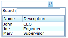
Default"
From Documentation
m (→Structure) |
m |
||
| Line 1: | Line 1: | ||
{{ZKStyleGuidePageHeader}} | {{ZKStyleGuidePageHeader}} | ||
| + | |||
| + | __TOC__ | ||
This is the '''[MOLD NAME]''' mold for '''[ITEM NAME]''' | This is the '''[MOLD NAME]''' mold for '''[ITEM NAME]''' | ||
Revision as of 03:53, 8 September 2010
This is the [MOLD NAME] mold for [ITEM NAME]
Source
The CSS source for {{{control}}} from GitHub
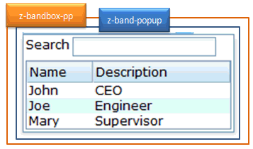
Structure
Events
| CSS\Action | Normal (Open) | Hover | Click, Select, and Drag. | Focus | Focus and Hover | Disable |
| Naming: | .z-band-popup | |||||
| Supported: | V |
Note: An exclamation mark(!) means that the action effect is done by CSS background , not CSS background-position
CSS Specification
| Class Name | Description | Default Values |
| .z-bandbox-pp | Font size | border: 0; padding: 0; margin: 0; white-space: nowrap; font-family: ${fontFamilyC};
font-size: ${fontSizeM}; font-weight: normal; repeat-x;display: block; position: absolute; z-index: 88000; |

