Splitlayout"
| Line 15: | Line 15: | ||
= Example = | = Example = | ||
| − | [[Image:ZKComRef_Splitlayout_Examples.PNG]] | + | [[Image:ZKComRef_Splitlayout_Examples.PNG | center]] |
<source lang="xml" > | <source lang="xml" > | ||
Revision as of 09:32, 5 September 2018
Splitlayout
- Demonstration: Spltlayout
- Java API: Splitlayout
- JavaScript API: Splitlayout
- Available for ZK:
-

Employment/Purpose
Splitlayout is a layout container, which is used to divide a component into two components.
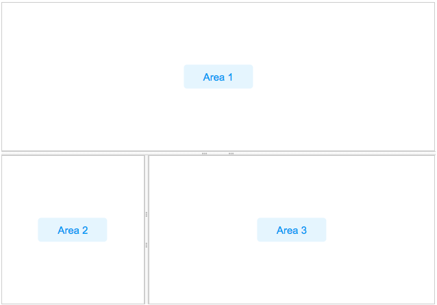
These two components inside Splitlayout, the splitlayouts, are placed either horizontally or vertically by setting the orientation, and users can easily resize these two viewports by dragging the splitter bar. Also, like other ZK layout components, it supports hflex and vflex, indicating that users can divide the area into three or more spaces by putting the splitlayouts into the outer Splitlayout.
Example
    <splitlayout  vflex="1" hflex="1">
        <div sclass="area" hflex="1" vflex="1">
            <label value="Area 1"/>
        </div>
        <splitlayout vflex="1" hflex="1" orient="horizontal" >
            <div sclass="area" vflex="1" hflex="1">
                <label value="Area 2"/>
            </div>
            <div sclass="area" vflex="1"  hflex="2">
                <label value="Area 3"/>
            </div>
        </splitlayout>
    </splitlayout>
Properties and Features
Orientation
The orientation indicates the how these two children container would display in splitlayout. Supported value: (default) “vertical” or “horizontal”.
Collapse
The collapse property (Splitlayout.setCollapse(String)) specifies which side of the splitter is collapsed when its grippy (button) is clicked. If this property is not specified, the splitter will not cause a collapse.
Supported value: (default) “none”, “before” or "after". "before" means that the splitter in splitlayout would collapse to the left/top, and "after means splitter in splitlayout would collapse to the right/button.
Open
This method would not be able to work if the "collapse" attribute is not specified.
onOpen Event
When a splitlayout is collapsed or opened by a user, the onOpen event (OpenEvent) is sent to the application.
Widths and Heights
specify widths or heights with a list of numbers(in pixel) separated by a comma to denote the width/height of two areas in splitlayout. Notice that you should use them while using flex in the children component.
Specify Children Size in Proportion
Specify hflex/vflex on 2 children like:
        <splitlayout  vflex="1" >
            <div sclass="area" vflex="2">
                ...
            </div>
            <div sclass="area" vflex="3">
               ...
            </div>
        </splitlayout>
MinWidths and MinHeights
User setMinWidths(String minWidths) and setMinHeights(String minHeights) to sets the minimum widths/heights in the same format of setWidths/setHeights. When user drag the splitter, the two areas will not be smaller than the minWidths/minHeights.
Supported Events
| Event: OpenEvent
When a splitter is collapsed or opened by a user, the onOpen event is sent to the application. |
- Inherited Supported Events: XulElement
Supported Children
*ALL
Version History
| Version | Date | Content |
|---|---|---|
| 8.5.0 | October, 2017 | new added component |
