GoldenLayout"
m |
|||
| Line 2: | Line 2: | ||
= GoldenLayout = | = GoldenLayout = | ||
| − | + | {{versionSince | 8.6.0}} | |
| + | {{ZK EE}} | ||
*Java API: <javadoc>org.zkoss.zkmax.zul.GoldenLayout</javadoc> | *Java API: <javadoc>org.zkoss.zkmax.zul.GoldenLayout</javadoc> | ||
*JavaScript API: <javadoc directory="jsdoc">zkmax.layout.GoldenLayout</javadoc> | *JavaScript API: <javadoc directory="jsdoc">zkmax.layout.GoldenLayout</javadoc> | ||
| − | |||
| − | |||
=Browser Support= | =Browser Support= | ||
Revision as of 01:34, 26 January 2021
GoldenLayout
Since 8.6.0
- Available for ZK:
-

- Java API: GoldenLayout
- JavaScript API: GoldenLayout
Browser Support
- Due to the limitation of the 3rd party library used in this component, GoldenLayout is not supported in mobile devices.
Employment/Purpose
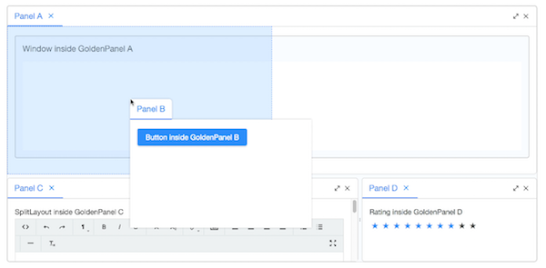
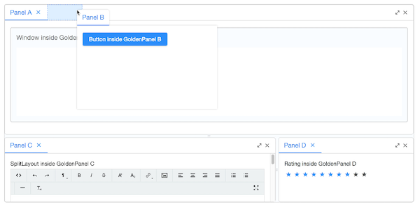
GoldenLayout is a layout container which layouts panels as docker type and is used to represent GoldenLayout. GoldenLayout is the parent component, and its children component can only be GoldenPanel.
A GoldenLayout could be nested to another GoldenLayout (actually, almost all kinds of components) to form a complicated layout.
Example
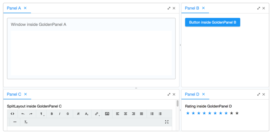
    <goldenlayout vflex="1" hflex="1">
        <attribute name="areas">
            A A B
            A A B
            C C D
        </attribute>
        <goldenpanel area="A" title="Panel A">
            <window vflex="1" title="Window inside GoldenPanel A" border="normal"/>
        </goldenpanel>
        <goldenpanel area="B" title="Panel B">
            <button label="Button inside GoldenPanel B"/>
        </goldenpanel>
        <goldenpanel area="C" title="Panel C">
            <vlayout>
                SplitLayout inside GoldenPanel C
                <splitlayout hflex="1" height="500px">
                    <tbeditor vflex="1"/>
                    <window border="normal" title="Window" vflex="1"/>
                </splitlayout>
            </vlayout>
        </goldenpanel>
        <goldenpanel area="D" title="Panel D">
            <vlayout>
                Rating inside GoldenPanel D
                <rating max="10" rating="8"/>
            </vlayout>
        </goldenpanel>
    </goldenlayout>
Properties and Features
The goldenLayout is layouted as docker type, and is usually construct with a tree structure, which is hard to layout in zul. ZK change the structure for initial rendering to a one layer design. All the GoldenPanels are in one layer inside GoldenLayout, and the panels layout pattern will be specified by the areas attribute of GoldenLayout and area attribute of GoldenPanel. The order added to the GoldenLayout only represents the stacking order if they are stacked together in the same area.
Areas
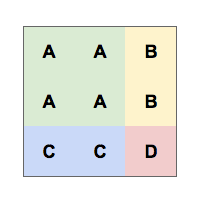
The areas attribute is a sugar for initializing the layout. In the example code above, we have the areas in line 2 specified as
A A B
A A B
C C D
The GoldenPanels which area attribute is specified as A, will be positioned at the A position of the areas attribute.
Note that, A A B will result as hflex A is 2 and hflex B is 1. Same with vflex. But if hflex or vflex attribute is specified on the GoldenPanel which area is A, it overrides the flex size calculated by the GoldenLayout's areas attribute.
Orient
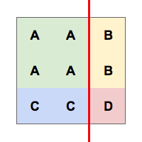
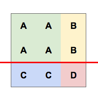
The orient indicates the initial splitting orientation if you layout it by the area attribute. Supported value: (default) “vertical” or “horizontal”.
From the example above, it's possible to divide in two ways.
 |
 |
 |
Adding GoldenPanels
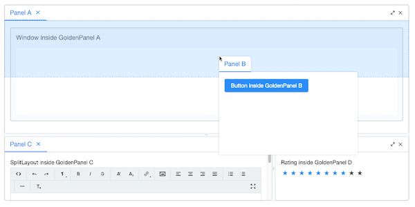
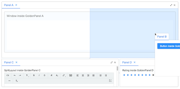
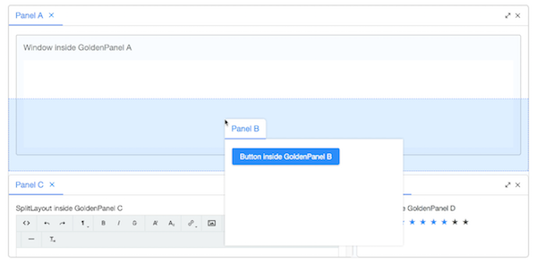
By user's drag drop, the GoldenPanels are usually dropped to a region like north, east, south, west and stack of a GoldenPanel. So we provide some GoldenPanel adding APIs to simulate these actions. Please refer to the addPanel APIs like GoldenLayout.addPanel(GoldenPanel, GoldenPanel, String) in GoldenLayout.
north
east
south
west
stack
Supported Events
| None | None |
- Inherited Supported Events: XulElement
Supported Children
* GoldenPanel
Version History
| Version | Date | Content |
|---|---|---|
