Linelayout"
m (→Orient) |
m (→FirstScale) |
||
| Line 67: | Line 67: | ||
The CSS inline style for the line. | The CSS inline style for the line. | ||
== FirstScale == | == FirstScale == | ||
| − | The scale of space occupied by the first area. The default value is 1, you can change the position of line by adjusting this property. | + | The scale of space occupied by the first area. The default value is 1, you can change the position of the line by adjusting this property. |
| − | For example, set firstScale 1 and lastScale 3 in a vertical linelayout | + | For example, set firstScale as 1 and lastScale as 3 in a vertical linelayout, the line will be rendered a quarter away from the left since the space ratio becomes 1:3.. |
| + | |||
== LastScale == | == LastScale == | ||
The scale of space occupied by the last area, the default value is 1. | The scale of space occupied by the last area, the default value is 1. | ||
Revision as of 08:43, 22 November 2019
Linelayout
- Java API: Linelayout
- JavaScript API: Linelayout
- Available for ZK:
-

[Since 9.0.0]
Employment/Purpose
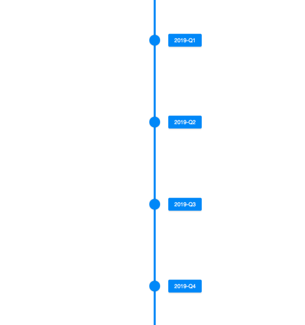
Linelayout is a component for displaying chronological information in a flexible and easy way; in addition to static data it also support ListModel. Linelayout only accept Lineitem as its child.
A Linelayout is composed of three parts: first area, line area and last area. The first and last areas are the containers for the content, and the line area contains the point.
Browser Support
- This component is based on CSS Flexbox and is compatible with browsers that support CSS Flexbox such as IE11+, Chrome and Firefox. Please check browser compatibility before using it.
Example
  <zscript>
    ListModel model = new ListModelList(new String[] {
        "2019-Q1",
        "2019-Q2",
        "2019-Q3",
        "2019-Q4"
    });
  </zscript>
  <linelayout model="${model}">
    <template name="model">
      <lineitem>
        <button label="${each}"></button>
      </lineitem>
    </template>
  </linelayout>
Properties
Orient
Whether the linelayout displays vertically or horizontally. The default value is "vertical".
  <linelayout orient="horizontal" lineStyle="background:rgba(0,0,0,0.5)" >
    <lineitem>
      <label>8 am</label>
      <button>good morning</button>
    </lineitem>
    <lineitem opposite="true" pointIconSclass="z-icon-plus-circle" pointStyle="background: #FF4051">
      <label>12 pm</label>
      <button>lunch time</button>
    </lineitem>
    <lineitem>
      <label>6 pm</label>
      <button>dinner time</button>
    </lineitem>
    <lineitem opposite="true">
      <label>10 pm</label>
      <button>good night</button>
    </lineitem>
  </linelayout>
LineStyle
The CSS inline style for the line.
FirstScale
The scale of space occupied by the first area. The default value is 1, you can change the position of the line by adjusting this property. For example, set firstScale as 1 and lastScale as 3 in a vertical linelayout, the line will be rendered a quarter away from the left since the space ratio becomes 1:3..
LastScale
The scale of space occupied by the last area, the default value is 1.
Please refer to FirstScale.
Supported Events
| None | None |
- Inherited Supported Events: XulElement
Supported Children
* Lineitem
Version History
| Version | Date | Content |
|---|---|---|
| 9.0.0 | Nov 2019 | ZK-4377: Provide a Linelayout component |

