Component Attributes"
(→mold) |
|||
| Line 44: | Line 44: | ||
Supported values: | Supported values: | ||
| − | * <tt>default</tt>: displays a " | + | * <tt>default</tt>: displays date/time in a grid style. The column headers are "days" and row headers are "time". |
* <tt>monthly</tt>: displays the days in a month. | * <tt>monthly</tt>: displays the days in a month. | ||
Revision as of 10:13, 2 February 2021
The Calendar Component
ZK Calendar is a single ZK component. Developers can put it within any ZK container component, such as <window/>, <tabbox/>, or <groupbox/>, etc.
For example:
<window title="Bare ZK Calendar" border="normal">
	<calendars />
</window>
If you don't specify an attribute on <calendars/>, Calendars will just run with the default values.
Component Attributes
Developers can customize the calendars component by its attributes in a zul.
days
Default: 7
Sets the days displayed in the default mold, that is, how many columns will be displayed.
readonly
Default: false
If it's true, an end-user cannot create, edit, or move an item on the Calendars.
firstDayOfWeek
Default: Sunday
Determine the first day of a week to be displayed on the calendar.
mold
Supported values:
- default: displays date/time in a grid style. The column headers are "days" and row headers are "time".
- monthly: displays the days in a month.
The Default Mold
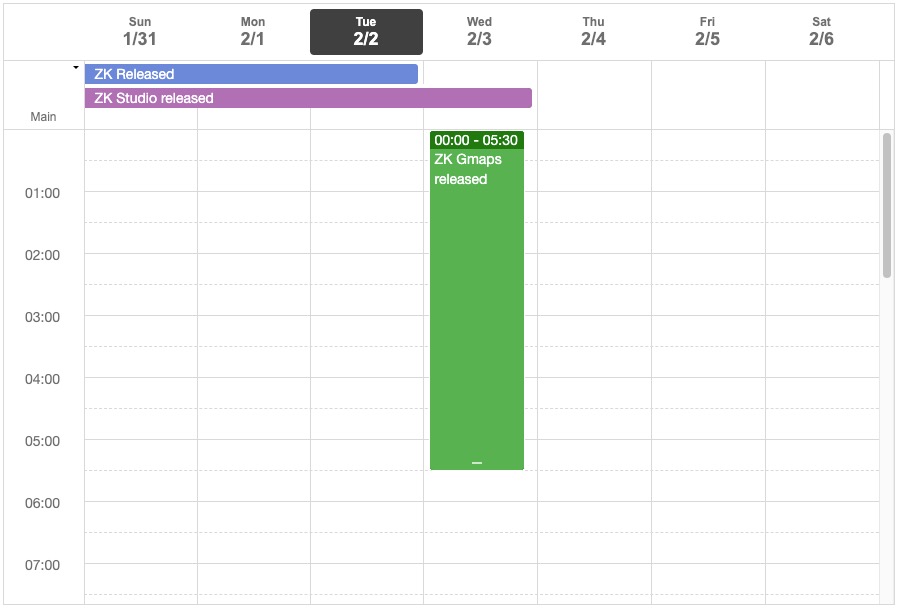
In the default mold, the content of the calendar is separated into two parts. The main component area is where date time events are displayed and the top of the Calendar component is used to display the daylong event.
The Month Mold
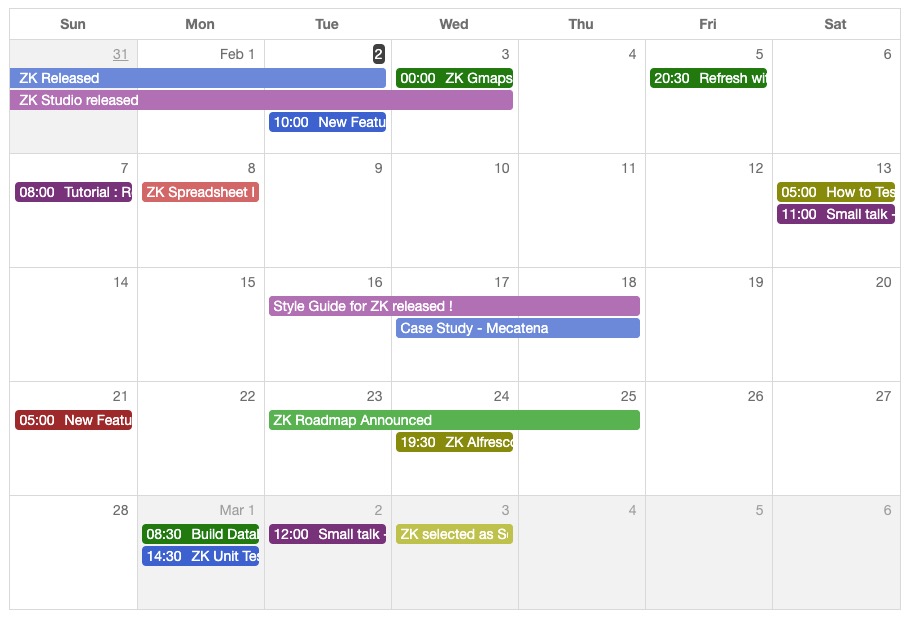
In the month mold, the content of each day has no background color, the text is colored and the item over one day has a background color with white text. When using the month mold, each row represents one week.
By just changing one attribute ZK affords us exceptional power. But how do we change this attribute? The next section explains how.
timeZone
Default: java.util.TimeZone.getDefault()
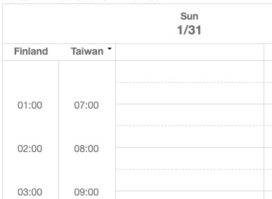
You can set one or more time zones.
<calendars timeZone="Finland=GMT+2, Taiwan=GMT+8"/>
width , height
Set the size of the component, for example:
<calendars width="400px" height="600px"/>
beginTime
Default: 0
Supported Value: an integer between 0 - 23
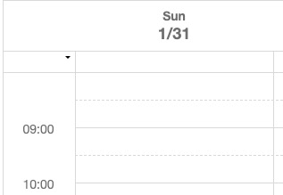
Sets the beginning hour of a day.
<calendars beginTime="8"/>
Add Application Logic
If you want to add, remove, or show items on a Calendars, please read Implementing Event Listeners.
The example project is at Github


