Panel"
m ((via JWB)) |
m ((via JWB)) |
||
| Line 50: | Line 50: | ||
</panel> | </panel> | ||
</source> | </source> | ||
| − | + | {{versionSince|5.0.0}} | |
== Draggable == | == Draggable == | ||
| Line 77: | Line 77: | ||
</portallayout> | </portallayout> | ||
</source> | </source> | ||
| − | + | {{versionSince|5.0.3}} | |
== Border == | == Border == | ||
Revision as of 08:53, 14 January 2022
Panel
Employment/Purpose
Panel is a container that has specific functionality and structural components that make it the perfect building block for application-oriented user interfaces. The Panel contains bottom, top, and foot toolbars, along with separate header, footer and body sections. It also provides built-in collapsible, closable, maximizable, and minimizable behavior, along with a variety of pre-built tool buttons that can be wired up to provide other customized behavior. Panels can be easily embedded into any kind of ZUL component that is allowed to have children or layout component. Panels also provide specific features like float and move. Unlike Window, Panels can only be floated and moved inside its parent node, which is not using zk.setVParent() function at client side. In other words, if Panel's parent node is an relative position, the floated panel is only inside its parent, not the whole page. The second difference of Window is that Panel is not an independent ID space (by implementing IdSpace), so the ID of each child can be used throughout the panel.
Example
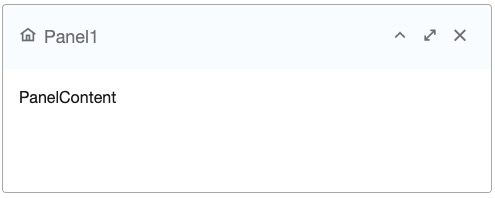
    <panel height="20%"  style="margin-bottom:10px"
           title="Panel1" border="normal" maximizable="true" closable="true"
           collapsible="true">
        <caption iconSclass="z-icon-home"/>
        <panelchildren>PanelContent</panelchildren>
    </panel>
Java Example
Panel panel = new Panel();
panel.setTitle("Here is Title");
panel.setBorder("normal");
panel.setFramable(true);

Panelchildren pc = new Panelchildren();
pc.setParent(panel);
pc.appendChild(new Label("Here is Content"));
Properties
Sizable
The panel can now be resized as long as the attribute sizable is set to true. The example ZUL below shows a panel which can be resized and the image displays a panel which is in the process of being resized.
<panel sizable="true" id="panel" framable="true" width="500px" height="400px"
    title="Panel"
    maximizable="true" minimizable="true" border="normal"
    collapsible="true" closable="true">
    <panelchildren>
        <textbox width="100%" height="100%" />
    </panelchildren>
</panel>
Since 5.0.0
Draggable
When used with Portallayout, the draggable property (HtmlBasedComponent.setDraggable(String)) can be used to control whether the panel is draggable under the portal layout.
<portallayout>
   <portalchildren style="padding: 5px" width="30%">
      <panel height="150px" title="Google Tools" border="normal"
           collapsible="true" closable="true" maximizable="true"
           style="margin-bottom:10px">
         <panelchildren>

         </panelchildren>
      </panel>
      <panel height="300px" title="LabPixies Clock" border="normal"
           collapsible="true" closable="true" maximizable="true"
           style="margin-bottom:10px"
           draggable="false">
          <panelchildren>
             This is not draggable.
          </panelchildren>
      </panel>
   </portalchildren>
</portallayout>
Since 5.0.3
Border
It specifies whether to display the border. Currently, it supports none, normal, rounded and rounded+. The default is none, i.e., no border.
Here is the effect with different borders:
Backward Compatibility: ZK 5.0.5 and prior shall use the combination of the border and framable property as follows.
Border in 5.0.6 The equivalent combination in 5.0.5 and prior Description border="none" border="none" framable is default to falseborder="normal" border="normal" framable is default to falseborder="rounded" framable="true" border is default to noneborder="rounded+" border="normal" framable="true"
- Notice that the use of the border and framable combiation still works in 5.0.6 (backward compatible).
Title
Besides this attribute, you could use Caption to define a more sophisticated caption (aka., title). If the panel has a caption whose label Caption.getLabel() is not empty, then this attribute is ignored. (Default: empty).
Closable
Specify the panel whether to show a close button on the title bar or not. If closable, a button is displayed and the onClose event (OpenEvent) is sent if a user clicks the button. (Default: false)
Miscellaneous
Scrollable Panel
To make the scrollbar appear when content exceeds panel height, specify style="overflow: auto" on Panelchildren.
<panel height="200px">
	<panelchildren style="overflow: auto">
		<div style="background: #999966" height="195px" />
		<div style="background: #669999">Div Content</div>
	</panelchildren>
</panel>
Toolbar positions
Panel supports three kinds of Toolbar positions: Top, Bottom and Foot. For example:
<panel id="panel" framable="true" width="500px" height="550px"
    title="Panel component" floatable="true" movable="true"
    maximizable="true" minimizable="true" border="normal"
    collapsible="true" closable="true">
        <toolbar>
          ... // Top Toolbar of the panel
        </toolbar>
        <panelchildren>
          ... // Each added child will show into the body content of the panel
        </panelchildren>
        <toolbar>
          ... // Bottom Toolbar of the panel
        </toolbar>
        <toolbar>
          ... // Foot Toolbar of the panel
        </toolbar>
</panel>
- Top Toolbar (Line 5): It is used to show the top toolbar close to the body content of the panel. (It is an option)
- Bottom Toolbar (Line 11): It is used to show the bottom toolbar close to the body content of the panel. (It is an option)
- Foot Toolbar (Line 14): It is used to show the operating button under the body content with a few padding. (It is an option)
Please refer Small_Talks/2008/July/Using_Panel_to_Lay_out_Your_Website for details.
Supported Events
onMove |
Event: MoveEvent
Denotes the position of the window is moved by a user. |
onOpen |
Event: OpenEvent
Denotes user has opened or closed a component.
Unlike client sends this event after opening or closing the component. It is useful to implement load-on-demand by listening to the first time the component is opened. |
onMaximize |
Event: MaximizeEvent
Denotes user has maximize a component. |
onMinimize |
Event: MinimizeEvent
Denotes user has minimize a component. |
onClose |
Event: OpenEvent
Denotes the close button is pressed by a user, and the component shall detach itself.
|
onSize |
Event: SizeEvent
Denotes the panel's size is updated by a user. |
onZIndex |
Event: ZIndexEvent
Denotes the panel's zindex is updated by a user. |
- Inherited Supported Events: XulElement
Supported Children
* Panelchildren
Use Cases
| Version | Description | Example Location |
|---|---|---|
| 5.0 | Portallayout, panels and events | http://www.zkoss.org/forum/listComment/10765 |
Version History
| Version | Date | Content |
|---|---|---|
| 5.0.3 | July, 2010 | The draggable property can be used to control the drag-ability in a portal layout. |
| 5.0.6 | January, 2010 | The framable property was deprecated. Please refer to #Border for details. |


