Default"
From Documentation
Jumperchen (talk | contribs) |
m (→Example) |
||
| Line 70: | Line 70: | ||
=Example= | =Example= | ||
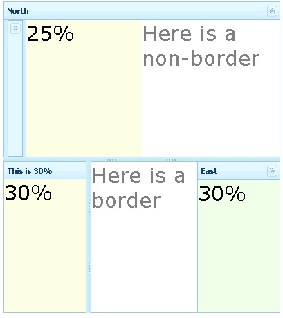
| − | [[Image:Borderlayout-demo. | + | [[Image:Borderlayout-demo.jpg]] |
<source lang="css"> | <source lang="css"> | ||
<style> | <style> | ||
Revision as of 06:19, 16 September 2010
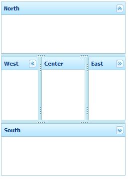
This is the Default mold for Borderlayout.
Source
The CSS source for Borderlayout from GitHub
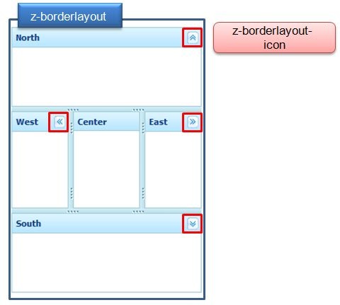
Structure
Events
| CSS\Action | Normal (Open) | Hover | Click, Select, and Drag. | Focus | Focus and Hover | Disable |
| Naming: | .z-borderlayout | |||||
| Supported: | V |
| CSS\Action | Normal (Open) | Hover | Click, Select, and Drag. | Focus | Focus and Hover | Disable |
| Naming: | .z-borderlayout-icon | |||||
| Supported: | V |
Note: An exclamation mark(!) means that the action effect is done by CSS background , not CSS background-position
CSS Specification
| Class Name | Description | Default Values |
| .z-borderlayout | Background and color | width:100%; height:100%; overflow:hidden; background-color:#CDE6F5; border:0 none; position: relative; |
| .z-borderlayout-icon | Background of tool icons | overflow: hidden;
width: 16px; height: 16px; float: right; margin-left: 2px; cursor: pointer; background: transparent no-repeat 0 0; background-image : url(${c:encodeURL('~./zul/img/layout/borderlayout-btn.png')}); |
Example
<style>
.z-border-layout {
	background-color: #D0F0FF;
}
.z-west-header, .z-center-header, .z-east-header, .z-north-header, .z-south-header {
	background-color:#E4F8FF;
	background-position: 0 13px;
}
.z-east-colpsd, .z-west-colpsd, .z-south-colpsd, .z-north-colpsd {
	background-color:#E4F8FF;
}
.z-border-layout-icon, .z-north-splt, .z-south-splt, .z-east-splt, .z-west-splt {
	opacity: .6;
	filter: alpha(opacity=60);
}
</style>


