South"
From Documentation
Zkwikiadmin (talk | contribs) m (Created page with 'init') |
Jumperchen (talk | contribs) m |
||
| Line 1: | Line 1: | ||
| − | + | {{ZKComponentReferencePageHeader}} | |
| + | |||
| + | = South = | ||
| + | *Demonstration: [http://www.zkoss.org/zkdemo/userguide/#l1 Borderlayout] | ||
| + | *Java API: <javadoc>org.zkoss.zul.South</javadoc> | ||
| + | *JavaScript API: <javadoc directory="jsdoc">zul.layout.South</javadoc> | ||
| + | |||
| + | = Employment/Purpose = | ||
| + | This component is a south region. | ||
| + | |||
| + | = Example = | ||
| + | |||
| + | [[Image:ZKComRef_South_Example.jpg]] | ||
| + | |||
| + | <source lang="xml" > | ||
| + | <borderlayout height="500px"> | ||
| + | <north size="50%" border="0"> | ||
| + | <borderlayout> | ||
| + | <west size="25%" border="none" flex="true"> | ||
| + | <div style="background:#B8D335"> | ||
| + | <label value="25 style=" color:white ; font-size:50px " /> | ||
| + | </div> | ||
| + | </west> | ||
| + | <center border="none" flex="true"> | ||
| + | <div style="background:#E6D92C"> | ||
| + | <label value="25 style=" color:white ; font-size:50px " /> | ||
| + | </div> | ||
| + | </center> | ||
| + | <east size="50%" border="none" flex="true"> | ||
| + | <label value="Here is a non-borde style=" color:gray ; | ||
| + | font-size:30px " /> | ||
| + | </east> | ||
| + | </borderlayout> | ||
| + | </north> | ||
| + | <center border="0"> | ||
| + | <borderlayout> | ||
| + | <west size="30%" flex="true" border="0"> | ||
| + | <div style="background:#E6D92C"> | ||
| + | <label value="30 style=" color:white ; font-size:50px " /> | ||
| + | </div> | ||
| + | </west> | ||
| + | <center> | ||
| + | <label value="Here is a borde style=" color:gray ; | ||
| + | font-size:30px " /> | ||
| + | </center> | ||
| + | <east size="30%" flex="true" border="0"> | ||
| + | <div style="background:#B8D335"> | ||
| + | <label value="30 style=" color:white ; font-size:50px " /> | ||
| + | </div> | ||
| + | </east> | ||
| + | </borderlayout> | ||
| + | </center> | ||
| + | </borderlayout> | ||
| + | </source> | ||
| + | |||
| + | =Supported events= | ||
| + | |||
| + | {| border="1" | width="100%" | ||
| + | ! <center>Name</center> | ||
| + | ! <center>Event Type</center> | ||
| + | |- | ||
| + | | <center>onOpen</center> | ||
| + | | '''Event:''' [[ZK_Component_Reference/Events/OpenEvent | OpenEvent]] | ||
| + | |||
| + | Denotes user has opened or closed a component. Note: unlike onClose, this event is only a notification. The client sends this event after opening or closing the component. | ||
| + | |} | ||
| + | |||
| + | =Supported Children= | ||
| + | |||
| + | *ALL | ||
| + | |||
| + | =Use cases= | ||
| + | |||
| + | [[ZK_Component_Reference/Layouts/Borderlayout|Borderlayout]] | ||
| + | =Version History= | ||
| + | |||
| + | {| border='1px' | width="100%" | ||
| + | ! Version !! Date !! Content | ||
| + | |- | ||
| + | | 5.0.1 | ||
| + | | 04/30/2010 | ||
| + | | Initialization | ||
| + | |} | ||
| + | |||
| + | {{ZKComponentReferencePageFooter}} | ||
Revision as of 08:30, 30 April 2010
South
- Demonstration: Borderlayout
- Java API: South
- JavaScript API: South
Employment/Purpose
This component is a south region.
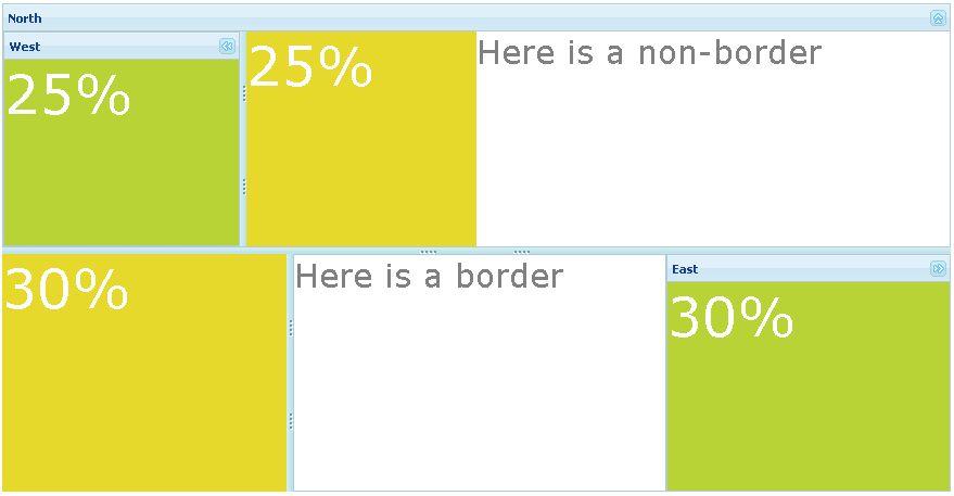
Example
<borderlayout height="500px">
	<north size="50%" border="0">
		<borderlayout>
			<west size="25%" border="none" flex="true">
				<div style="background:#B8D335">
					<label value="25 style=" color:white ; font-size:50px " />
				</div>
			</west>
			<center border="none" flex="true">
				<div style="background:#E6D92C">
					<label value="25 style=" color:white ; font-size:50px " />
				</div>
			</center>
			<east size="50%" border="none" flex="true">
				<label value="Here is a non-borde style=" color:gray ;
					font-size:30px " />
			</east>
		</borderlayout>
	</north>
	<center border="0">
		<borderlayout>
			<west size="30%" flex="true" border="0">
				<div style="background:#E6D92C">
					<label value="30 style=" color:white ; font-size:50px " />
				</div>
			</west>
			<center>
				<label value="Here is a borde style=" color:gray ;
					font-size:30px " />
			</center>
			<east size="30%" flex="true" border="0">
				<div style="background:#B8D335">
					<label value="30 style=" color:white ; font-size:50px " />
				</div>
			</east>
		</borderlayout>
	</center>
</borderlayout>
Supported events
| Event: OpenEvent
Denotes user has opened or closed a component. Note: unlike onClose, this event is only a notification. The client sends this event after opening or closing the component. |
Supported Children
- ALL
Use cases
Version History
| Version | Date | Content |
|---|---|---|
| 5.0.1 | 04/30/2010 | Initialization |
