Hbox"
From Documentation
Jumperchen (talk | contribs) |
|||
| Line 3: | Line 3: | ||
= Hbox = | = Hbox = | ||
| − | *Demonstration: | + | *Demonstration: [http://www.zkoss.org/zkdemo/layout/box Hbox] |
*Java API: <javadoc>org.zkoss.zul.Hbox</javadoc> | *Java API: <javadoc>org.zkoss.zul.Hbox</javadoc> | ||
*JavaScript API: <javadoc directory="jsdoc">zul.box.Box</javadoc> | *JavaScript API: <javadoc directory="jsdoc">zul.box.Box</javadoc> | ||
| + | *Style Guide: [http://books.zkoss.org/wiki/ZK_Style_Guide/XUL_Component_Specification/Hbox Hbox] | ||
= Employment/Purpose = | = Employment/Purpose = | ||
| Line 11: | Line 12: | ||
The hbox component is used to create a horizontally oriented box. Each component placed in the hbox will be placed horizontally in a row. | The hbox component is used to create a horizontally oriented box. Each component placed in the hbox will be placed horizontally in a row. | ||
| − | Notice that hbox and vbox are designed to provode more sophisticated layout, such as splitter, alignment and packing. If you need only the layout feature, it is suggest to use [[ZK Component Reference/Layouts/Hlayout]] and [[ZK Component Reference/Layouts/Vlayout]] instead, since the performance is much better (due to the use of HTML DIV instead of TABLE). | + | Notice that hbox and vbox are designed to provode more sophisticated layout, such as splitter, alignment and packing. If you need only the layout feature, it is suggest to use [[ZK Component Reference/Layouts/Hlayout | Hlayout]] and [[ZK Component Reference/Layouts/Vlayout | Vlayout]] instead, since the performance is much better (due to the use of HTML DIV instead of TABLE). |
= Example = | = Example = | ||
| Line 30: | Line 31: | ||
</source> | </source> | ||
| − | =Align and | + | =Align and Pack= |
[[Image:ZKComRef_Hbox_Simple_Examples_align_pack.PNG]] | [[Image:ZKComRef_Hbox_Simple_Examples_align_pack.PNG]] | ||
| Line 80: | Line 81: | ||
</source> | </source> | ||
| − | =Supported | + | =Supported Events= |
{| border="1" | width="100%" | {| border="1" | width="100%" | ||
| Line 89: | Line 90: | ||
| None | | None | ||
|} | |} | ||
| + | *Inherited Supported Events: [[ZK Component Reference/Containers/Box#Supported_Events | Box]] | ||
=Supported Children= | =Supported Children= | ||
| Line 94: | Line 96: | ||
*ALL | *ALL | ||
| − | =Use | + | =Use Cases= |
{| border='1px' | width="100%" | {| border='1px' | width="100%" | ||
Revision as of 09:45, 15 November 2010
Hbox
Employment/Purpose
The hbox component is used to create a horizontally oriented box. Each component placed in the hbox will be placed horizontally in a row.
Notice that hbox and vbox are designed to provode more sophisticated layout, such as splitter, alignment and packing. If you need only the layout feature, it is suggest to use Hlayout and Vlayout instead, since the performance is much better (due to the use of HTML DIV instead of TABLE).
Example
<zk>
	<vbox>
		<button label="Button 1" />
		<button label="Button 2" />
	</vbox>
	<hbox>
		<button label="Button 3" />
		<button label="Button 4" />
	</hbox>
</zk>
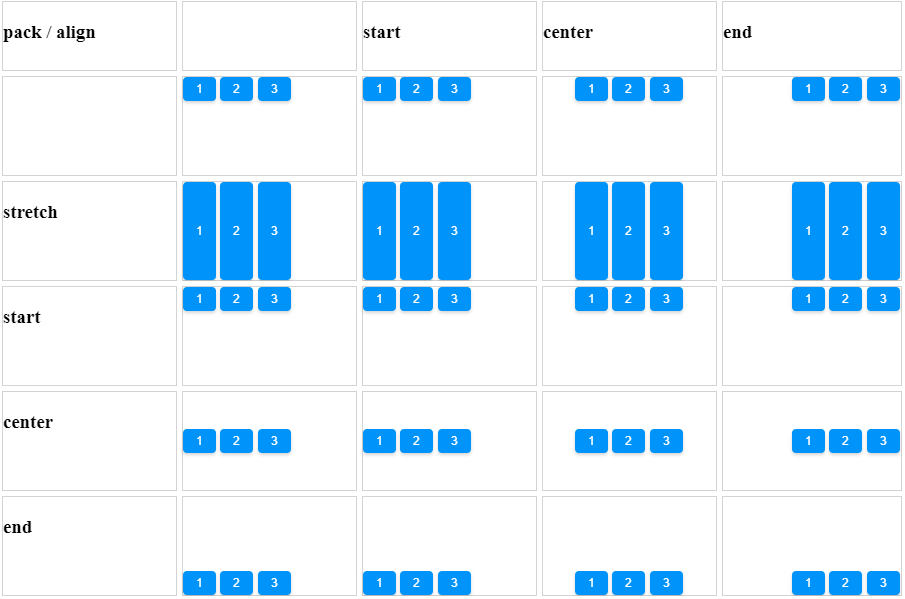
Align and Pack
<zk xmlns:n="http://www.zkoss.org/2005/zk/native">
	<zscript><![CDATA[
		Map map = new LinkedHashMap();
		String[] packs = new String[]{"", "start", "center", "end"};
		String[] aligns = new String[]{"", "stretch", "start", "center", "end"};

		for (int i = 0; i < packs.length; i++) {
			String pack = packs[i];
			List list = new ArrayList();
			for (int j = 0; j < aligns.length; j++) {
				list.add(aligns[j]);
			}
			map.put(pack, list);
		}

	]]></zscript>
	<tablelayout columns="6">
		<tablechildren >
			<panel border="normal" height="100px" width="100px"
				forEach='"align / pack", "", "stretch", "start", "center", "end"'>
				<panelchildren>
					<n:h3>${each}</n:h3>
				</panelchildren>
			</panel>
		</tablechildren>
		<tablechildren forEach="${map}">
			<variables key="${each.key}"/>
			<panel border="normal" height="100px" width="200px">
				<panelchildren>
					<n:h3>${key}</n:h3>
				</panelchildren>
			</panel>
			<panel border="normal" height="100px" width="200px" forEach="${each.value}" >
				<panelchildren>
					<hbox pack="${key}" align="${each}" height="90%" width="100%">
						<button label="1" />
						<button label="2" />
						<button label="3" />
					</hbox>
				</panelchildren>
			</panel>
		</tablechildren>
	</tablelayout>
</zk>
Supported Events
| None | None |
- Inherited Supported Events: Box
Supported Children
*ALL
Use Cases
| Version | Description | Example Location |
|---|---|---|
Version History
| Version | Date | Content |
|---|---|---|

