Menuitem"
From Documentation
Jumperchen (talk | contribs) |
Jumperchen (talk | contribs) |
||
| Line 3: | Line 3: | ||
= Menuitem = | = Menuitem = | ||
| − | *Demonstration: [http://www.zkoss.org/zkdemo/ | + | *Demonstration: [http://www.zkoss.org/zkdemo/menu Menu] and [http://docs.zkoss.org/wiki/ZK_5:_New_File_Upload#Live_Demo Fileupload] |
*Java API: <javadoc>org.zkoss.zul.Menuitem</javadoc> | *Java API: <javadoc>org.zkoss.zul.Menuitem</javadoc> | ||
*JavaScript API: <javadoc directory="jsdoc">zul.menu.Menuitem</javadoc> | *JavaScript API: <javadoc directory="jsdoc">zul.menu.Menuitem</javadoc> | ||
| + | *Style Guide: [http://books.zkoss.org/wiki/ZK_Style_Guide/XUL_Component_Specification/Menubar/Menuitem_in_Menubar Menuitem in Menubar], [http://books.zkoss.org/wiki/ZK_Style_Guide/XUL_Component_Specification/Menupopup/Menuitem_in_Menupopup Menuitem in Menupopup] | ||
= Employment/Purpose = | = Employment/Purpose = | ||
| Line 38: | Line 39: | ||
| − | =Supported | + | =Supported Events= |
{| border="1" | width="100%" | {| border="1" | width="100%" | ||
| Line 44: | Line 45: | ||
! <center>Event Type</center> | ! <center>Event Type</center> | ||
|- | |- | ||
| − | | <center><tt> | + | | <center><tt>onCheck</tt></center> |
| − | | <javadoc>org.zkoss.zk.ui.event. | + | | '''Event:''' <javadoc>org.zkoss.zk.ui.event.CheckEvent</javadoc> |
| − | + | Denotes user has checked the item. | |
| − | |||
| − | |||
|- | |- | ||
| <center>onUpload</center> | | <center>onUpload</center> | ||
| − | | <javadoc>org.zkoss.zk.ui.event.UploadEvent</javadoc> | + | | '''Event:''' <javadoc>org.zkoss.zk.ui.event.UploadEvent</javadoc> |
| − | |||
| − | |||
| − | |||
Denotes user has uploaded a file to the component. | Denotes user has uploaded a file to the component. | ||
| − | |||
|} | |} | ||
| + | *Inherited Supported Events: [[ZK_Component_Reference/Base_Components/LabelImageElement#Supported_Events | LabelImageElement]] | ||
=Supported Children= | =Supported Children= | ||
| Line 63: | Line 59: | ||
*NONE | *NONE | ||
| − | =Use | + | =Use Cases= |
{| border='1px' | width="100%" | {| border='1px' | width="100%" | ||
Revision as of 04:32, 16 November 2010
Menuitem
- Demonstration: Menu and Fileupload
- Java API: Menuitem
- JavaScript API: Menuitem
- Style Guide: Menuitem in Menubar, Menuitem in Menupopup
Employment/Purpose
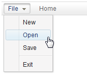
A single choice in a Menupopup element. It acts much like a button but it is rendered on a menu. Default getZclass(): z-menu-item .
Within ZK 5, the file upload has been redesigned so it can be integrated with any widget. For example, The toolbarbutton can now be used to upload a file. In addition to this, the display of the upload status has been enhanced and can be customized easily.
Example
<menubar>
 <menu label="File">
     <menupopup>
         <menuitem label="New" onClick="alert(self.label)"/>
         <menuitem label="Open" onClick="alert(self.label)"/>
         <menuitem label="Save" onClick="alert(self.label)"/>
         <menuseparator/>
         <menuitem label="Exit" onClick="alert(self.label)"/>
     </menupopup>
 </menu>
 <menuitem label="Home"/>
</menubar>
Fileupload Example
<menuitem upload="true" label="Customized Attach" onUpload='alert("File is uploaded!")'/>
Supported Events
| Event: CheckEvent
Denotes user has checked the item. | |
| Event: UploadEvent
Denotes user has uploaded a file to the component. |
- Inherited Supported Events: LabelImageElement
Supported Children
*NONE
Use Cases
| Version | Description | Example Location |
|---|---|---|
Version History
| Version | Date | Content |
|---|---|---|
