Bandbox"
From Documentation
Jumperchen (talk | contribs) |
|||
| Line 2: | Line 2: | ||
= Bandbox = | = Bandbox = | ||
| − | *Demonstration: [http://www.zkoss.org/zkdemo/ | + | *Demonstration: [http://www.zkoss.org/zkdemo/combobox/customizable_combobox Bandbox] |
*Java API: <javadoc>org.zkoss.zul.Bandbox</javadoc> | *Java API: <javadoc>org.zkoss.zul.Bandbox</javadoc> | ||
*JavaScript API: <javadoc directory="jsdoc">zul.inp.Bandbox</javadoc> | *JavaScript API: <javadoc directory="jsdoc">zul.inp.Bandbox</javadoc> | ||
| + | *Style Guide: [http://books.zkoss.org/wiki/ZK_Style_Guide/XUL_Component_Specification/Bandbox Bandbox] | ||
= Employment/Purpose = | = Employment/Purpose = | ||
| Line 10: | Line 11: | ||
Unlike comboboxes, the popup window of a bandbox could be anything. It is designed to give developers the maximal flexibility. A typical use is to represent the popup window as a search dialog. | Unlike comboboxes, the popup window of a bandbox could be anything. It is designed to give developers the maximal flexibility. A typical use is to represent the popup window as a search dialog. | ||
| + | |||
= Example = | = Example = | ||
| Line 46: | Line 48: | ||
</source> | </source> | ||
| − | =Supported | + | =Supported Events= |
{| border="1" | width="100%" | {| border="1" | width="100%" | ||
| Line 57: | Line 59: | ||
Denotes user has opened or closed a component. Note: unlike onClose, this event is only a notification. The client sends this event after opening or closing the component. | Denotes user has opened or closed a component. Note: unlike onClose, this event is only a notification. The client sends this event after opening or closing the component. | ||
|} | |} | ||
| + | *Inherited Supported Events: [[ZK_Component_Reference/Input/Textbox#Supported_Events | Textbox]] | ||
| − | =Supported | + | =Supported Molds= |
Available molds of a component are defined in lang.xml embedded in zul.jar. | Available molds of a component are defined in lang.xml embedded in zul.jar. | ||
{| border="1" | width="100%" | {| border="1" | width="100%" | ||
| Line 75: | Line 78: | ||
*[[ZK_Component_Reference/Input/Bandpopup | Bandpopup ]] | *[[ZK_Component_Reference/Input/Bandpopup | Bandpopup ]] | ||
| − | =Use | + | =Use Cases= |
{| border='1px' | width="100%" | {| border='1px' | width="100%" | ||
Revision as of 07:48, 16 November 2010
Bandbox
Employment/Purpose
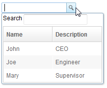
A bandbox is a special text box that embeds a customizable popup window (aka., a dropdown window). Like comboboxes, a bandbox consists of an input box and a popup window. The popup window is opened automatically, when users presses Alt+DOWN or clicks the magnifier button.
Unlike comboboxes, the popup window of a bandbox could be anything. It is designed to give developers the maximal flexibility. A typical use is to represent the popup window as a search dialog.
Example
<bandbox id="bd">
	<bandpopup>
		<vbox>
			<hbox>
				Search
				<textbox />
			</hbox>
			<listbox width="200px"
				onSelect="bd.value=self.selectedItem.label;    bd.closeDropdown();">
				<listhead>
					<listheader label="Name" />
					<listheader label="Description" />
				</listhead>
				<listitem>
					<listcell label="John" />
					<listcell label="CEO" />
				</listitem>
				<listitem>
					<listcell label="Joe" />
					<listcell label="Engineer" />
				</listitem>
				<listitem>
					<listcell label="Mary" />
					<listcell label="Supervisor" />
				</listitem>
			</listbox>
		</vbox>
	</bandpopup>
</bandbox>
Supported Events
| Event: OpenEvent
Denotes user has opened or closed a component. Note: unlike onClose, this event is only a notification. The client sends this event after opening or closing the component. |
- Inherited Supported Events: Textbox
Supported Molds
Available molds of a component are defined in lang.xml embedded in zul.jar.
Supported Children
* Bandpopup
Use Cases
| Version | Description | Example Location |
|---|---|---|
Version History
| Version | Date | Content |
|---|---|---|
