Treerow"
From Documentation
Jimmyshiau (talk | contribs) |
Jimmyshiau (talk | contribs) |
||
| Line 65: | Line 65: | ||
</source> | </source> | ||
| − | =Supported | + | =Supported Events= |
{| border="1" | width="100%" | {| border="1" | width="100%" | ||
| Line 74: | Line 74: | ||
| None | | None | ||
|} | |} | ||
| + | |||
| + | *Inherited Supported Events: [[ZK_Component_Reference/Base_Components/XulElement#Supported_Events | XulElement]] | ||
=Supported Children= | =Supported Children= | ||
Revision as of 08:30, 16 November 2010
Treerow
Employment/Purpose
Treerow is a single row in the tree, it is the main content of treeitem. Treerow can contains multiple treecell, each treecell represent one column in this row by sequencial. A treecell can contains any component in it, such as label, image, textbox etc.
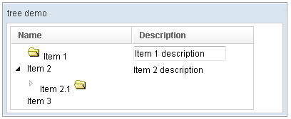
Example
<window title="tree demo" border="normal" width="400px">
	<tree id="tree" width="90%">
		<treecols sizable="true">
			<treecol label="Name" />
			<treecol label="Description" />
		</treecols>
		<treechildren>
			<treeitem>
				<treerow>
					<treecell>
						<image src="/img/folder.gif" />
						Item 1
					</treecell>
					<treecell>
						<textbox value="Item 1 description" />
					</treecell>
				</treerow>
			</treeitem>
			<treeitem>
				<treerow>
					<treecell label="Item 2" />
					<treecell label="Item 2 description" />
				</treerow>
				<treechildren>
					<treeitem open="false">
						<treerow>
							<treecell label="Item 2.1">
								<image src="/img/folder.gif" />
							</treecell>
						</treerow>
						<treechildren>
							<treeitem>
								<treerow>
									<treecell label="Item 2.1.1" />
								</treerow>
							</treeitem>
						</treechildren>
					</treeitem>
				</treechildren>
			</treeitem>
			<treeitem label="Item 3" />
		</treechildren>
	</tree>
</window>
Supported Events
| None | None |
- Inherited Supported Events: XulElement
Supported Children
* Treecell
Use cases
Version History
| Version | Date | Content |
|---|---|---|
| 5.0.1 | March 2010 | Allow the context, tooltip and popup properties to be specified in Treerow. |
