Box"
| Line 12: | Line 12: | ||
A box can lay out its children in one of two orientations, either horizontally or vertically. A horizontal box lines up its components horizontally and a vertical box orients its components vertically. You can think of a box as one row or one column from an HTML table. | A box can lay out its children in one of two orientations, either horizontally or vertically. A horizontal box lines up its components horizontally and a vertical box orients its components vertically. You can think of a box as one row or one column from an HTML table. | ||
| + | |||
| + | A box is the generic component that can be used for horizontal and vertical layouts. However, it is generally more convenient by use of [[ZK Component Reference/Layouts/Hbox|hbox]] and [[ZK Component Reference/Layouts/Vbox|vbox]] directly. | ||
| + | |||
| + | Notice that [[ZK Component Reference/Layouts/Hbox|hbox]] and [[ZK Component Reference/Layouts/Vbox|vbox]] are designed to provode more sophisticated layout, such as splitter, alignment and packing. If you need only the layout feature, it is suggest to use [[ZK Component Reference/Layouts/Hlayout | Hlayout]] and [[ZK Component Reference/Layouts/Vlayout | Vlayout]] instead, since the performance is much better (due to the use of HTML DIV instead of TABLE). | ||
= Example = | = Example = | ||
Revision as of 08:36, 22 December 2010
Box
Employment/Purpose
The box model of XUL is used to divide a portion of the display into a series of boxes. Components inside of a box will orient themselves horizontally or vertically. By combining a series of boxes and separators, you can control the layout of the visual presentation.
A box can lay out its children in one of two orientations, either horizontally or vertically. A horizontal box lines up its components horizontally and a vertical box orients its components vertically. You can think of a box as one row or one column from an HTML table.
A box is the generic component that can be used for horizontal and vertical layouts. However, it is generally more convenient by use of hbox and vbox directly.
Notice that hbox and vbox are designed to provode more sophisticated layout, such as splitter, alignment and packing. If you need only the layout feature, it is suggest to use Hlayout and Vlayout instead, since the performance is much better (due to the use of HTML DIV instead of TABLE).
Example
 <zk>
     <box orient="vertical">
         <button label="Button 1"/>
         <button label="Button 2"/>
     </box>
     <box  orient="horizontal">
         <button label="Button 3"/>
         <button label="Button 4"/>
     </box>
 </zk>
Properties
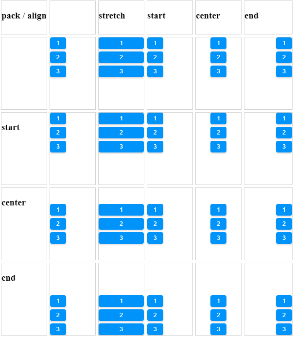
Align and Pack
<zk xmlns:n="http://www.zkoss.org/2005/zk/native">
	<zscript><![CDATA[
		Map map = new LinkedHashMap();
		String[] packs = new String[]{"", "start", "center", "end"};
		String[] aligns = new String[]{"", "stretch", "start", "center", "end"};

		for (int i = 0; i < aligns.length; i++) {
			String align = aligns[i];
			List list = new ArrayList();
			for (int j = 0; j < packs.length; j++) {
				list.add(packs[j]);
			}
			map.put(align, list);
		}

	]]></zscript>
	<tablelayout columns="6">
		<tablechildren >
			<panel border="normal" height="150px" width="100px"
				forEach='"pack / align", "", "start", "center", "end"'>
				<panelchildren>
					<n:h3>${each}</n:h3>
				</panelchildren>
			</panel>
		</tablechildren>
		<tablechildren forEach="${map}">
			<variables key="${each.key}"/>
			<panel border="normal" height="150px" width="100px">
				<panelchildren>
					<n:h3>${key}</n:h3>
				</panelchildren>
			</panel>
			<panel border="normal" height="150px" width="100px" forEach="${each.value}" >
				<panelchildren>
					<box align="${key}" pack="${each}" height="90%" width="100%">
						<button label="1" />
						<button label="2" />
						<button label="3" />
					</box>
				</panelchildren>
			</panel>
		</tablechildren>
	</tablelayout>
</zk>
[Since 5.0.0]
Cell Component
In ZK5, we have introduced a new component named Cell which can be embedded into a Grid or Box (Hbox and Vbox) to fully control the layout and the style. You can now use the rowspan or the colspan property to layout your Grid, for example a content cell can now cross over multiple rows. The code below demonstrates how to do this:
<box>
    <cell sclass="years">
        ...
    </cell>
</box>
[Since 5.0.0]
Supported Events
| None | None |
- Inherited Supported Events: XulElement
Supported Molds
Available molds of a component are defined in lang.xml embedded in zul.jar.

|
Supported Children
*ALL
Use Cases
| Version | Description | Example Location |
|---|---|---|
Version History
| Version | Date | Content |
|---|---|---|
| 5.0.4 | August, 2010 | Add a sizedByContent method for splitter to resize smoothly |

